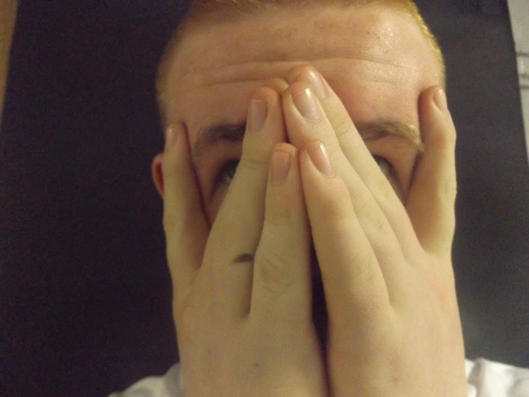
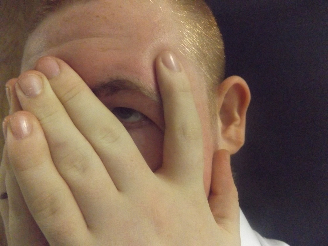
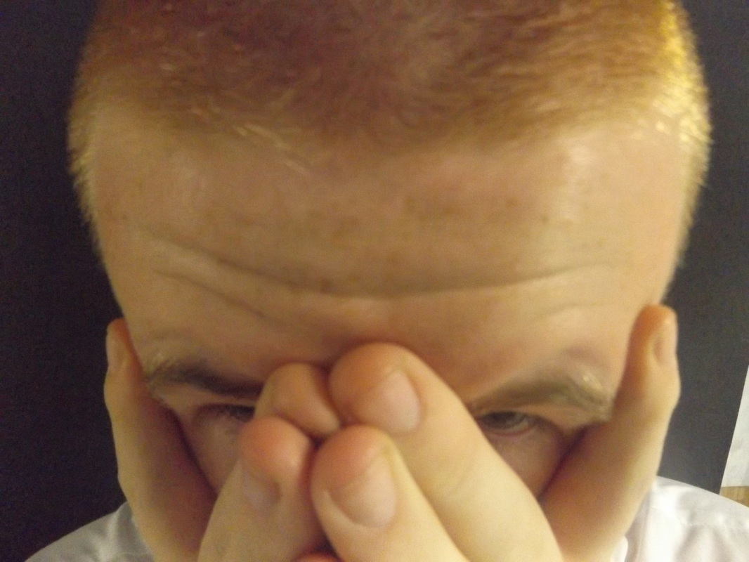
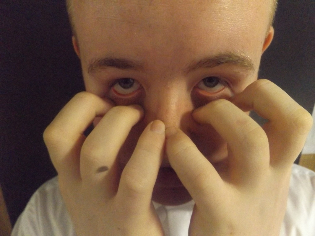
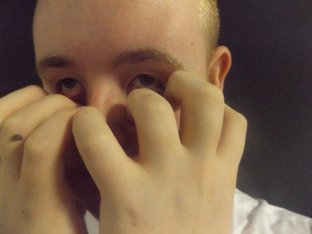
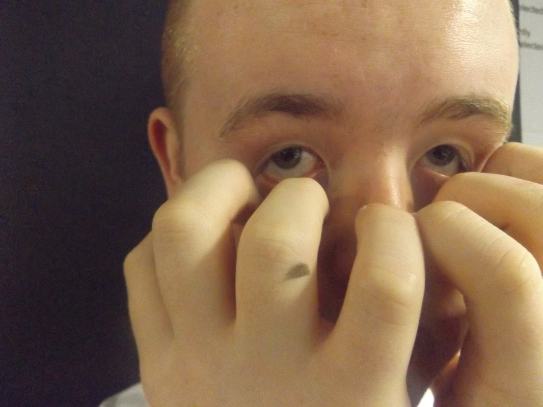
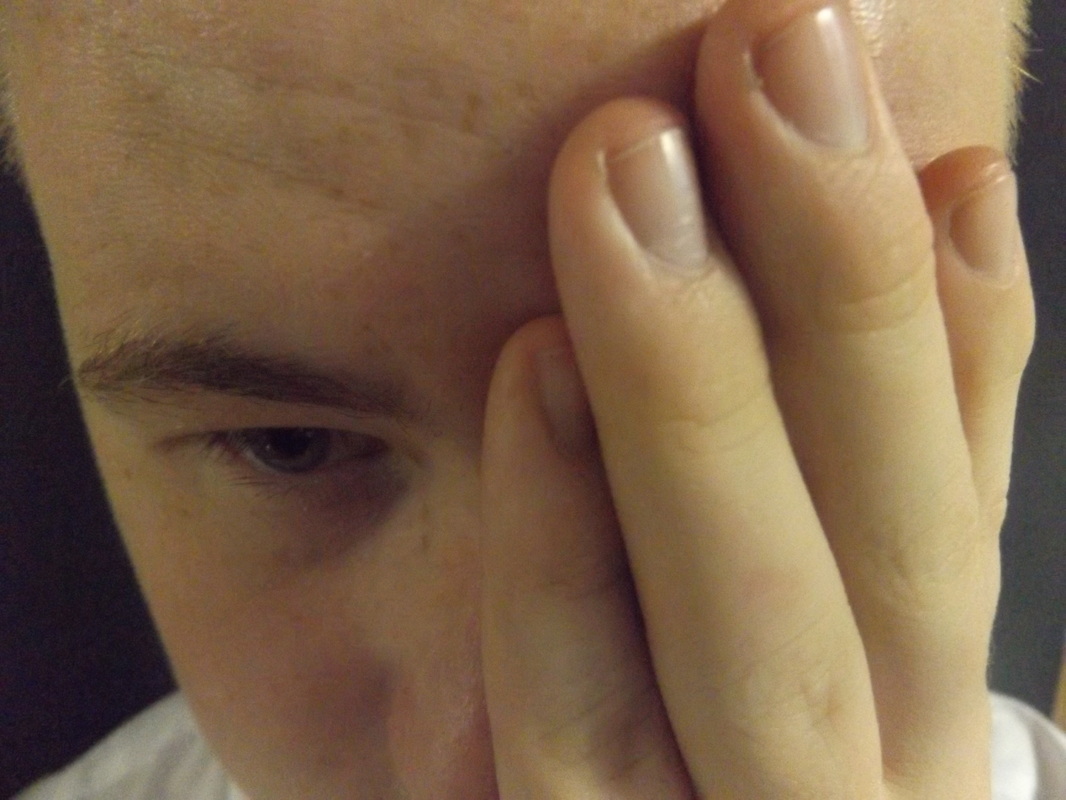
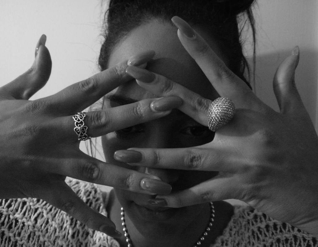
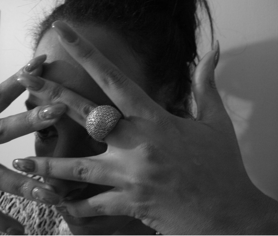
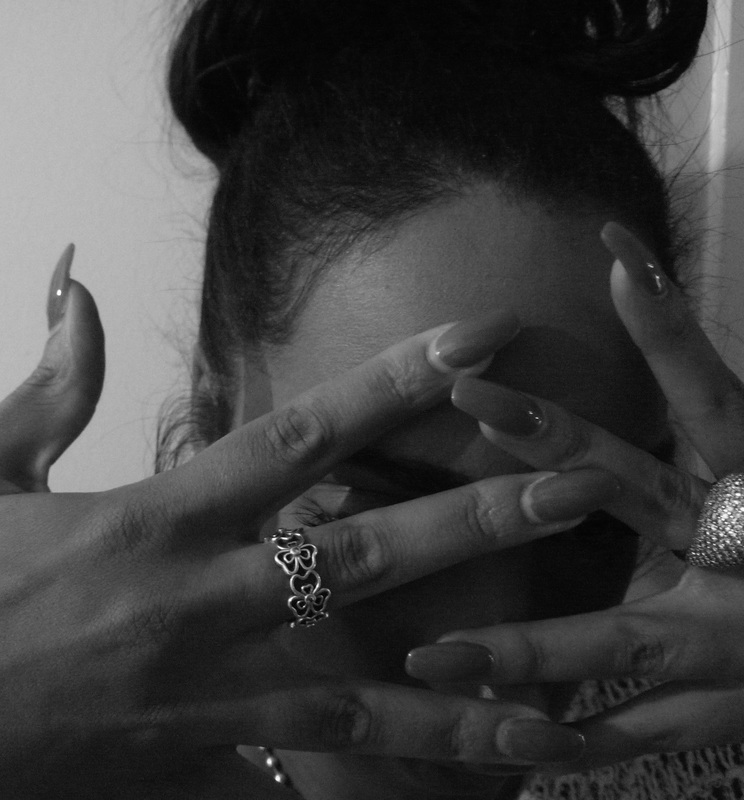
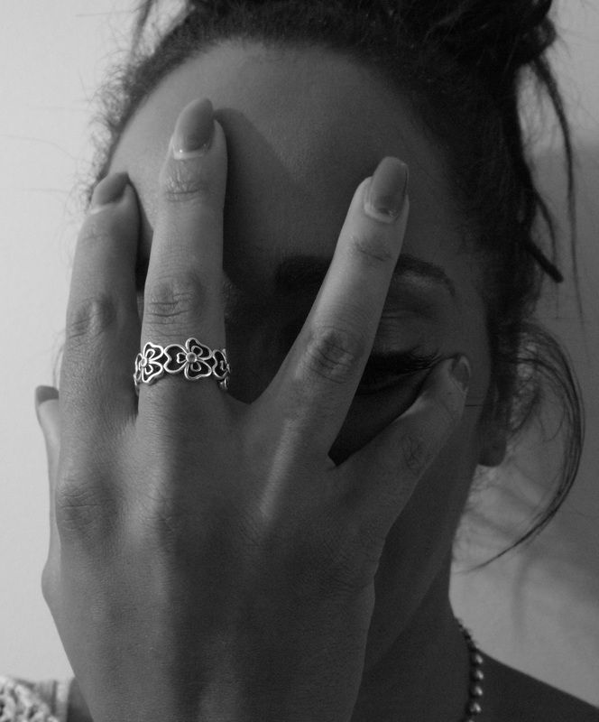
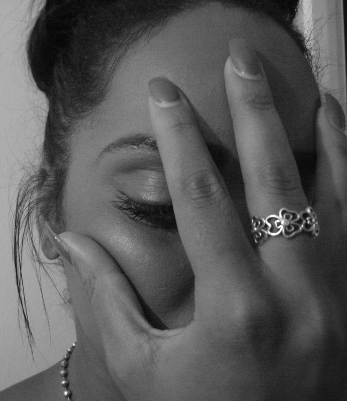
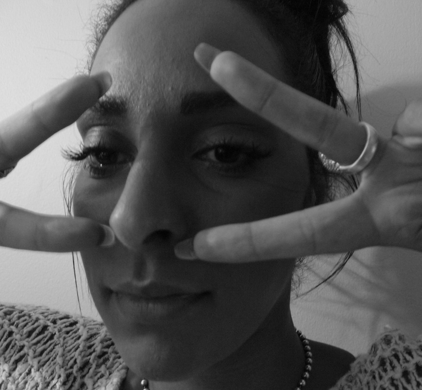
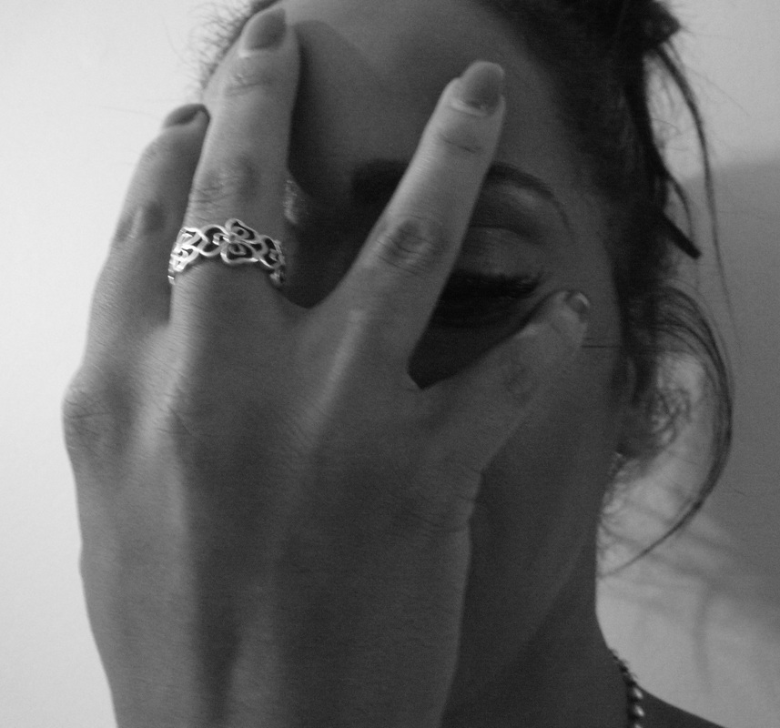
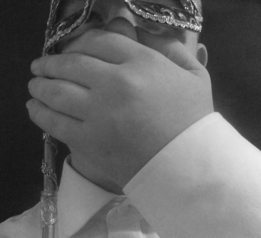
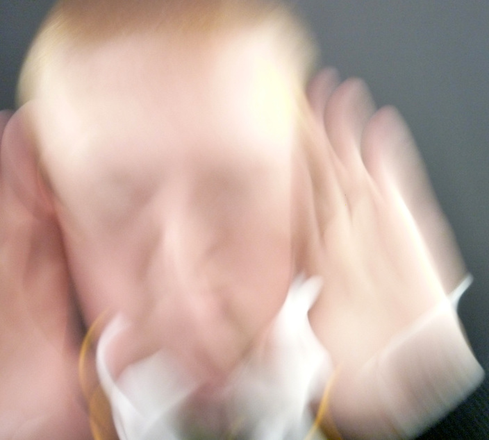
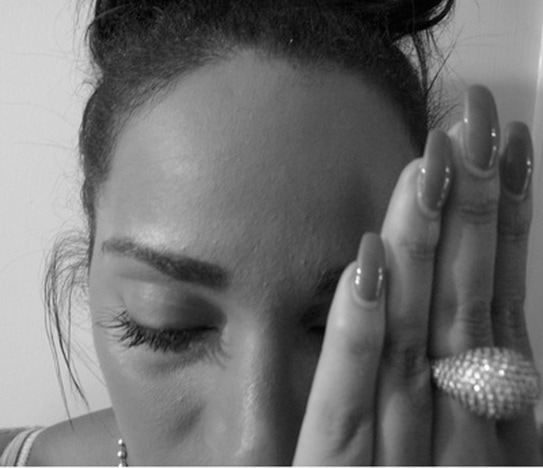
Hands
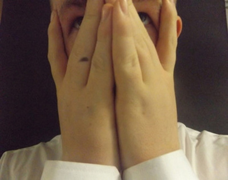
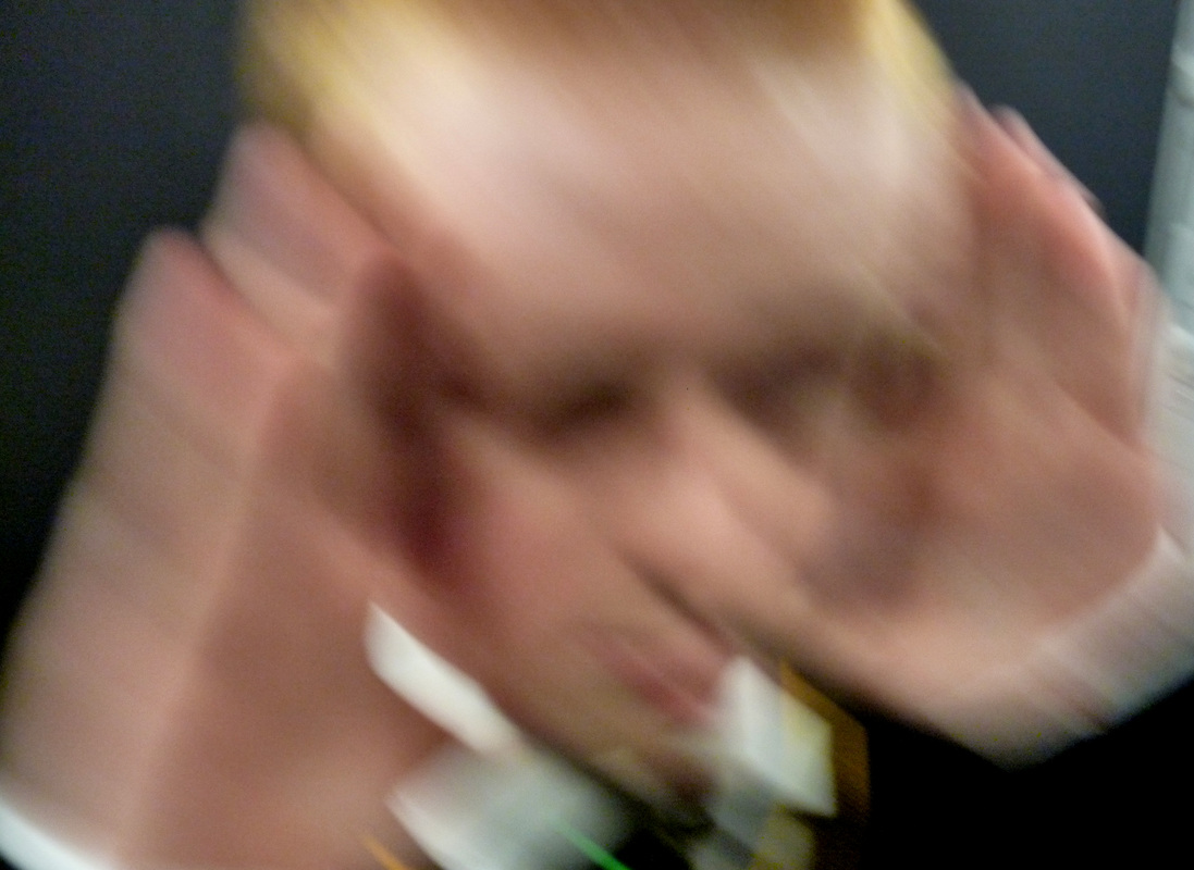
I made these photos by making someone cover their face with their hands in different styles and positions and I stuck a piece of black paper on the wall for the background. What I like about these photos is that each photo is in different angles and some are close up and some are far away. What I don't like about these photos is that the black background isn't big enough so you can see behind the black paper. From these photos I learned to try to fit all of the background in.

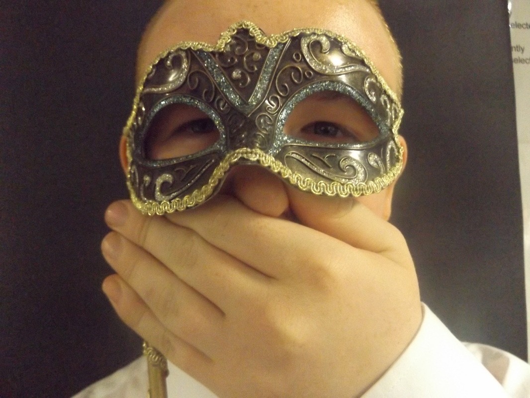
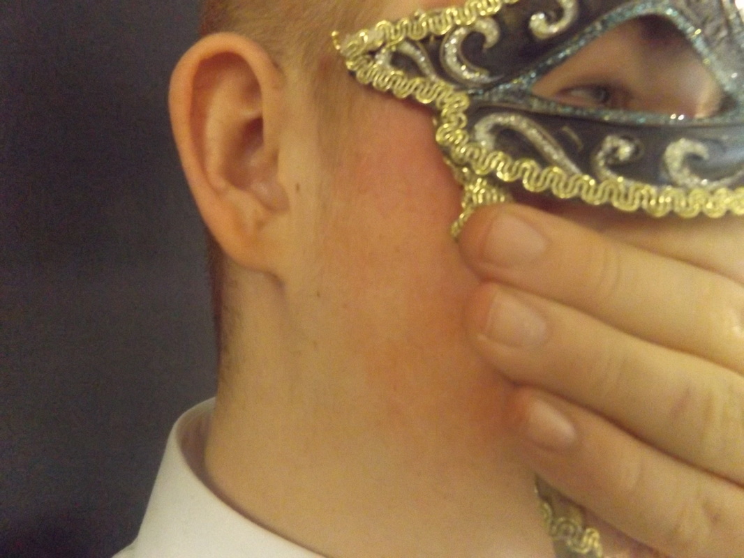
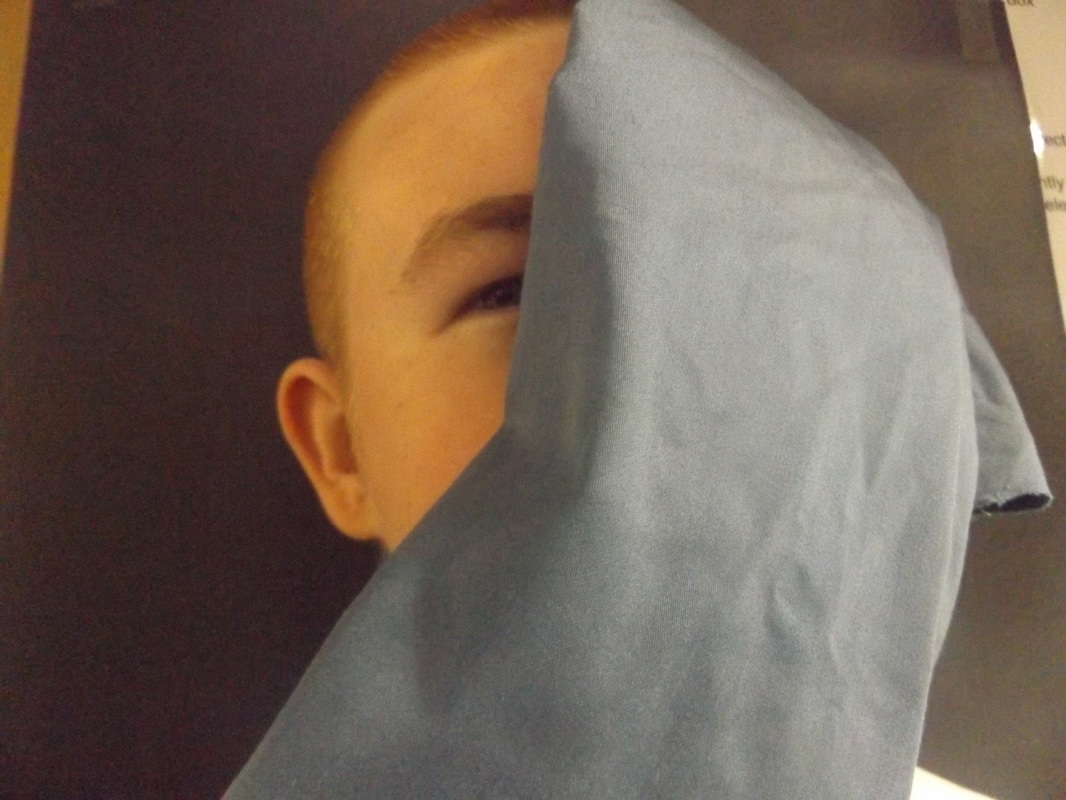
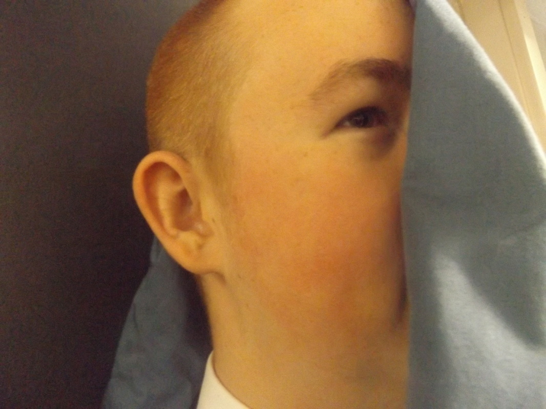
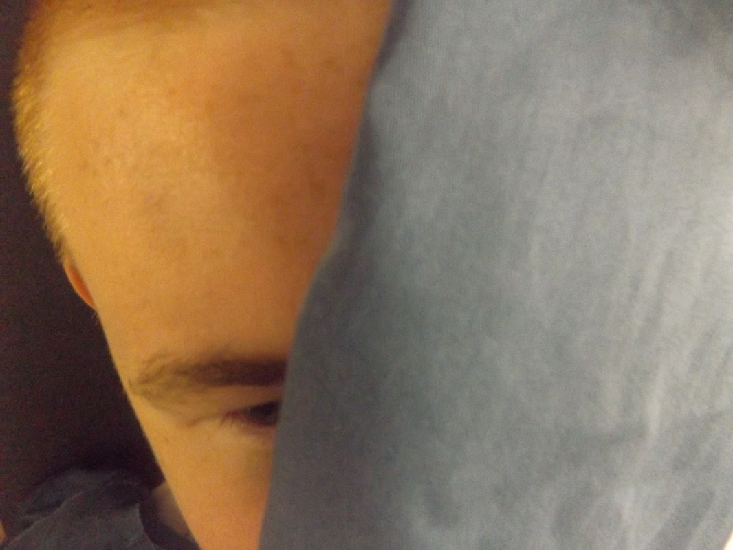
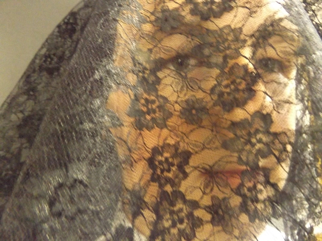
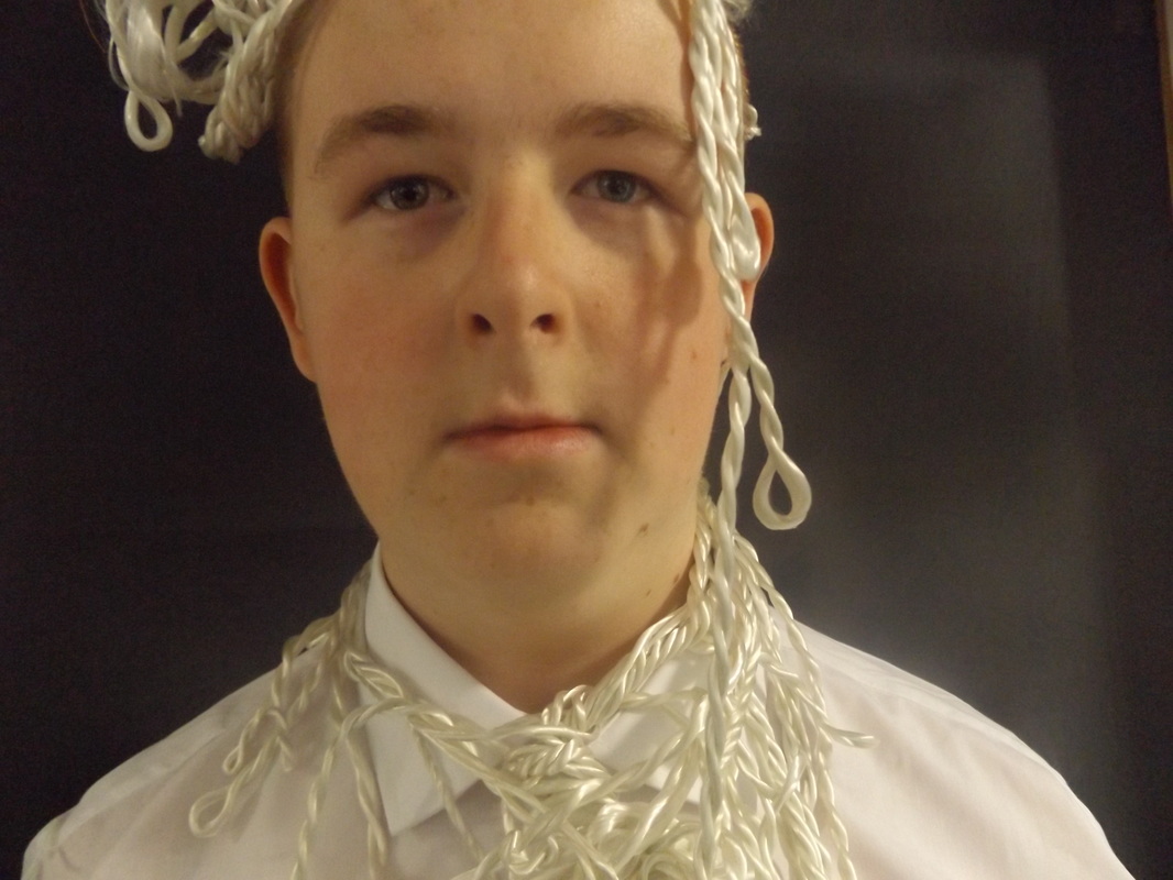
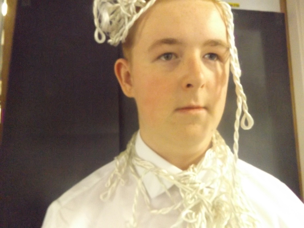
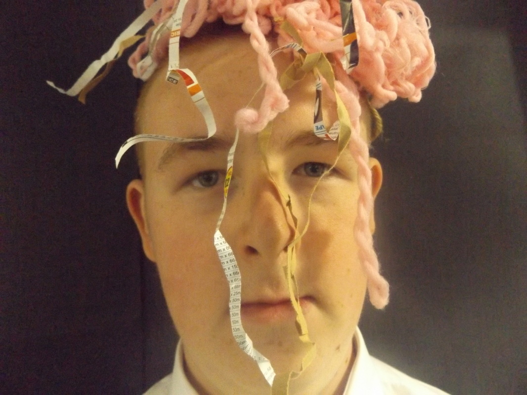
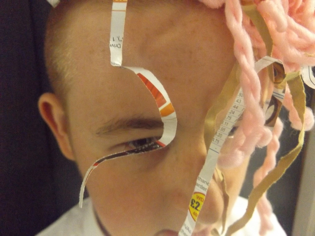
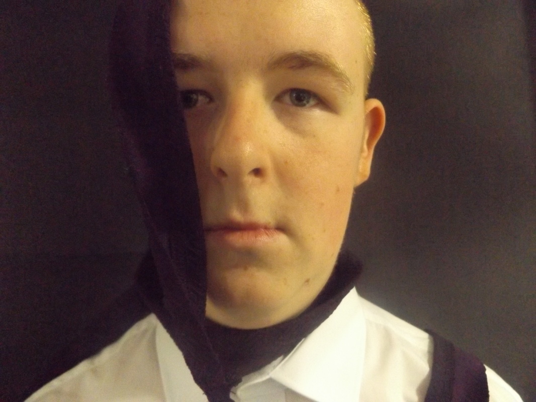
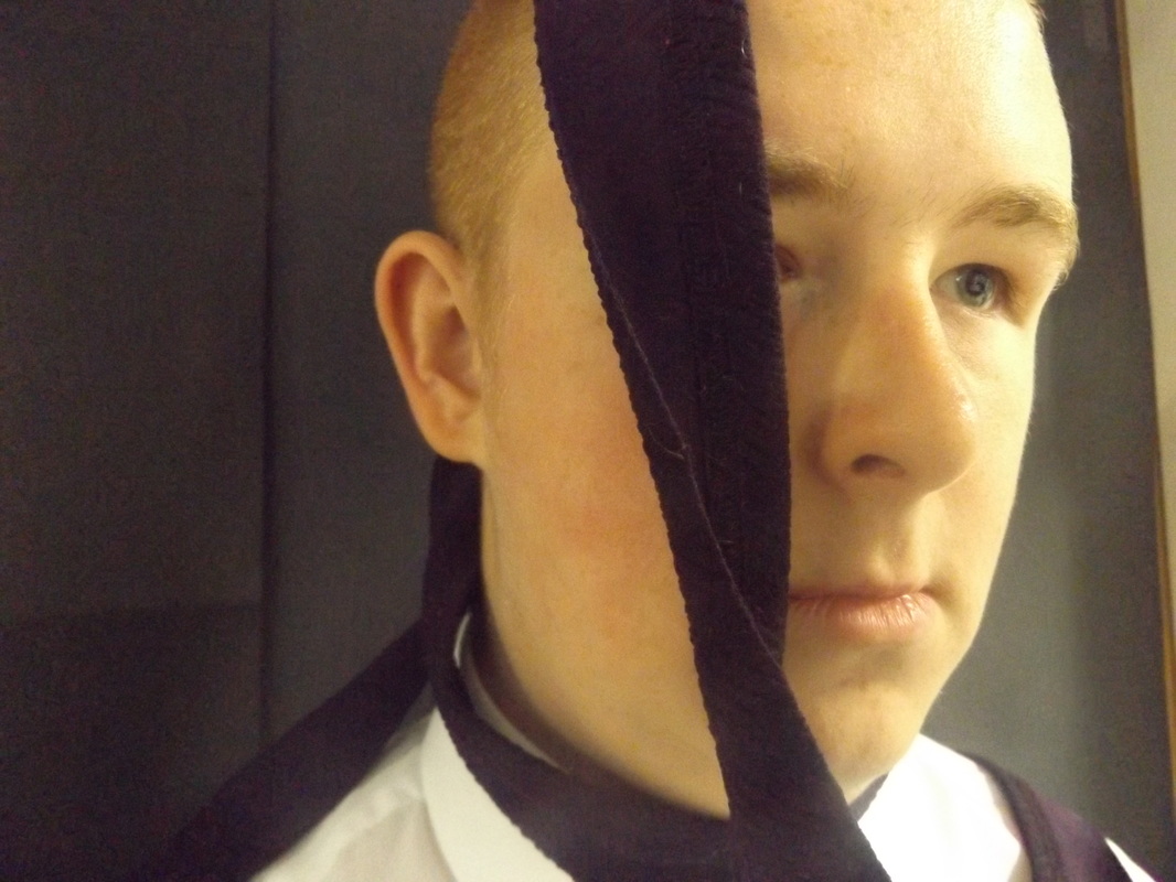
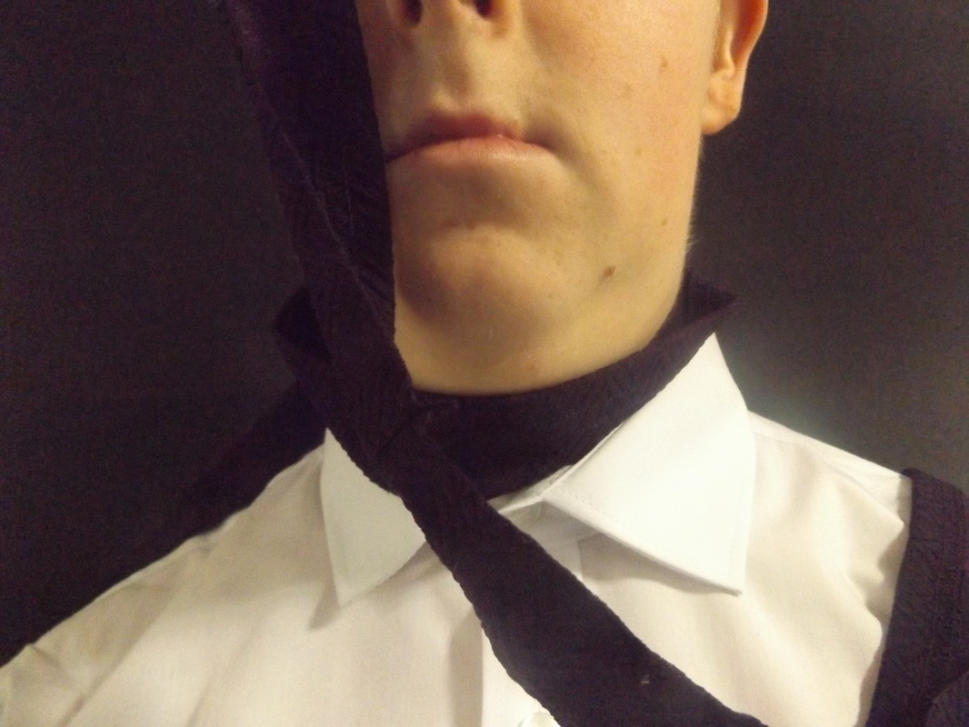
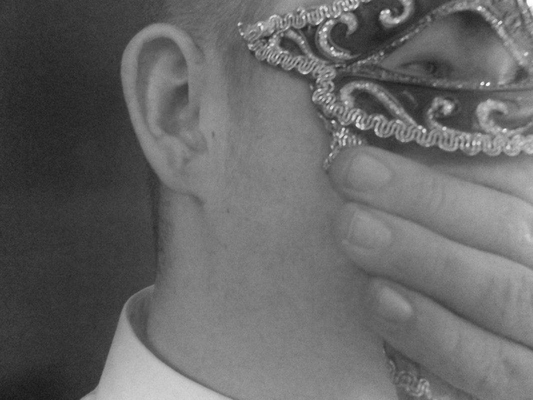
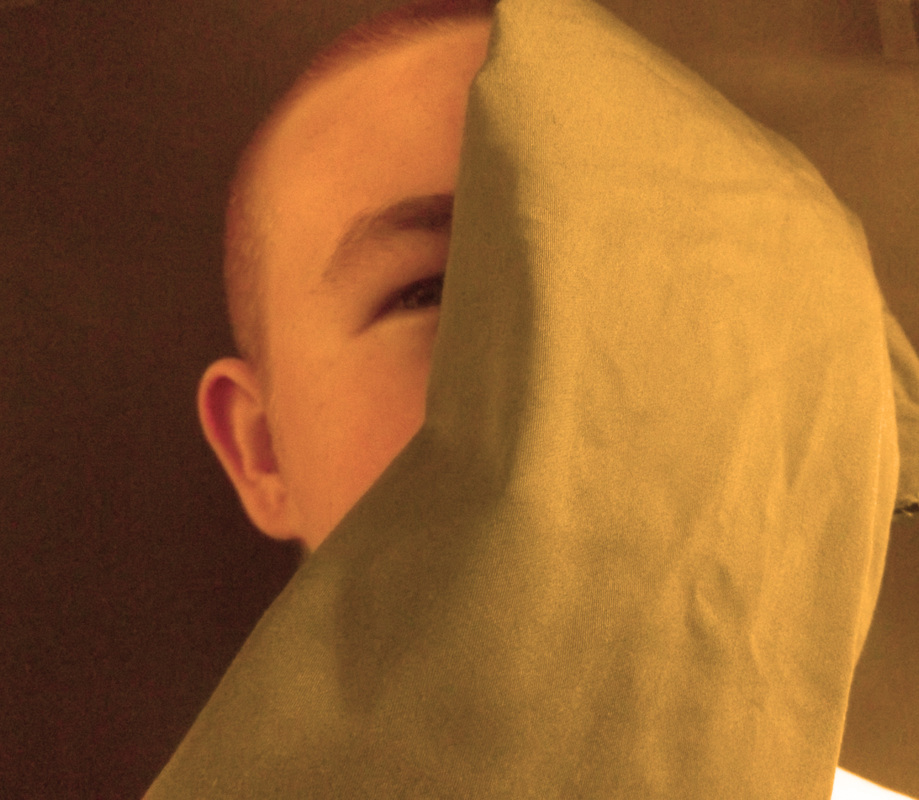
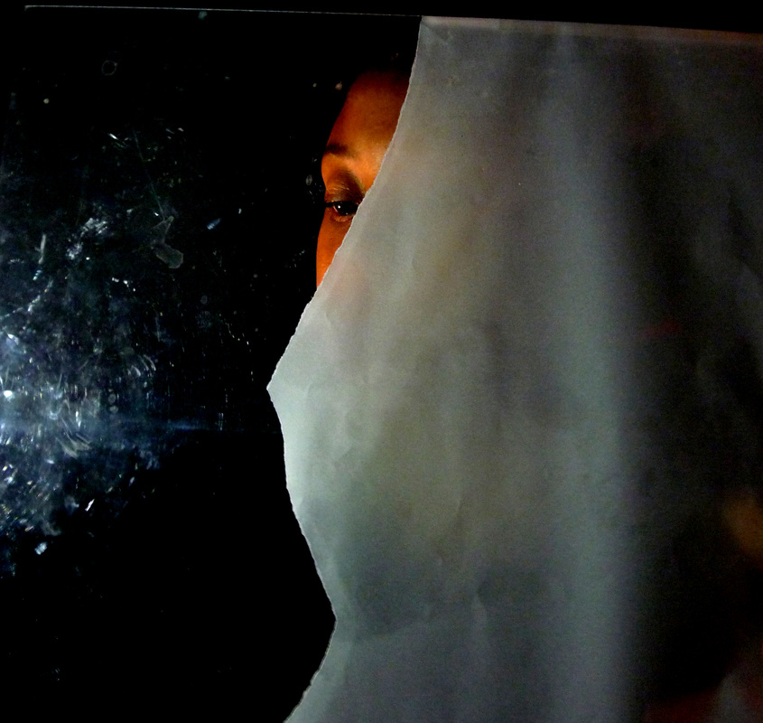
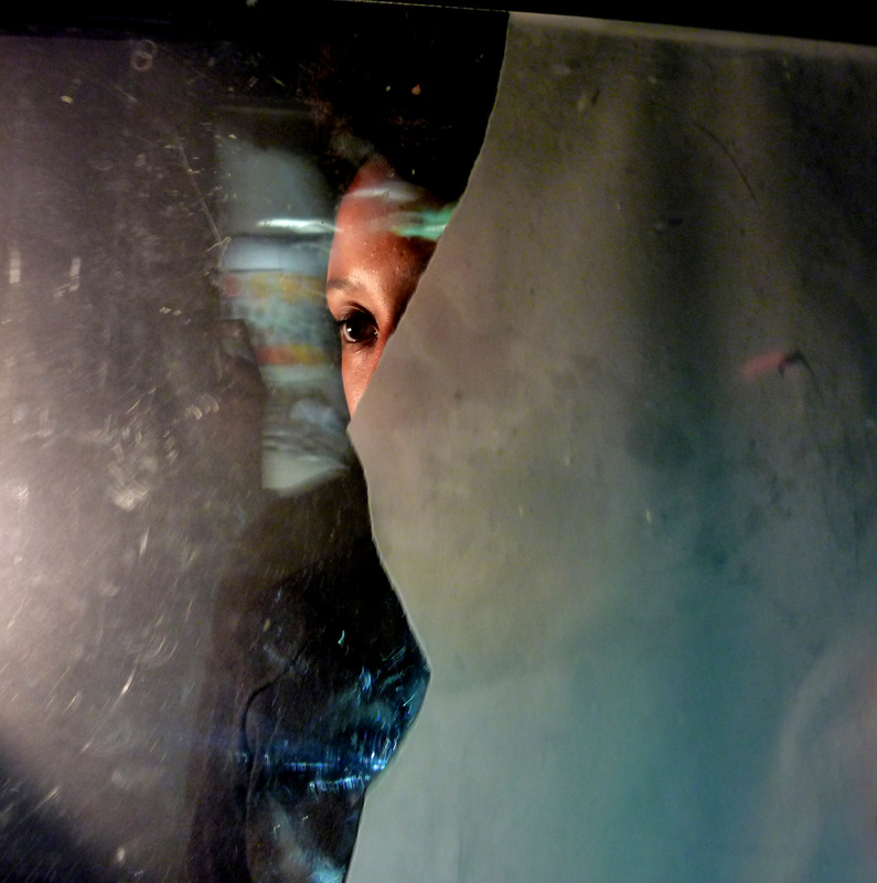
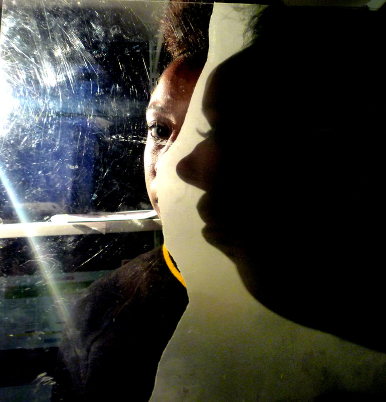
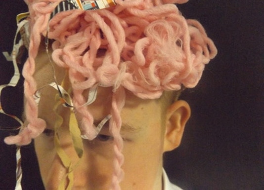
Props and Veils
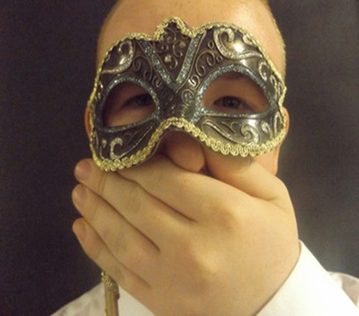
I made these photos by getting someone to wear different items of clothing or masks and making them stand in front of a black piece of paper. What o like about these photos is that the photos are all different angles and positions. What I font like about these is that some of the pictures are too close and some look a bit blurry. I learnt from this not to take photos too close an to try to fit the background.
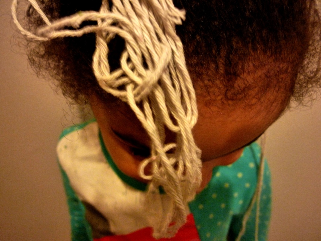
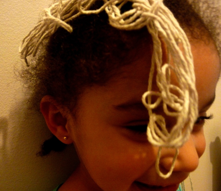
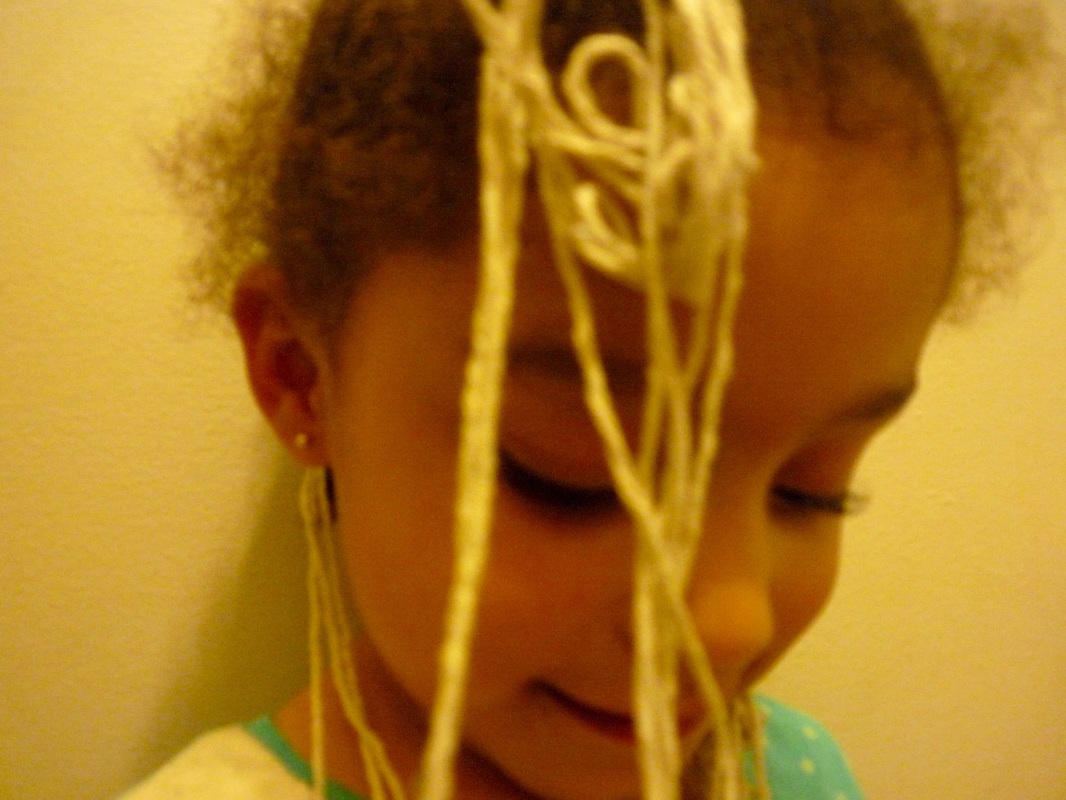
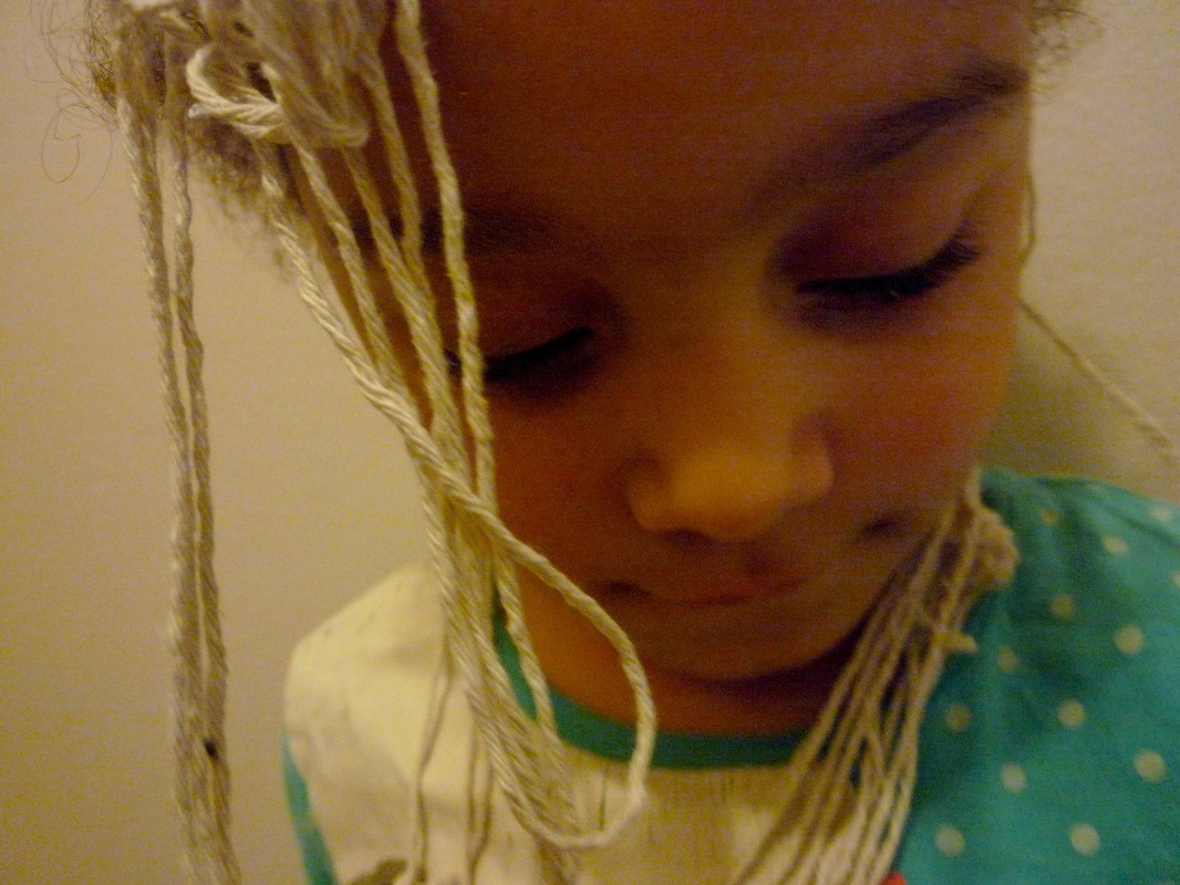
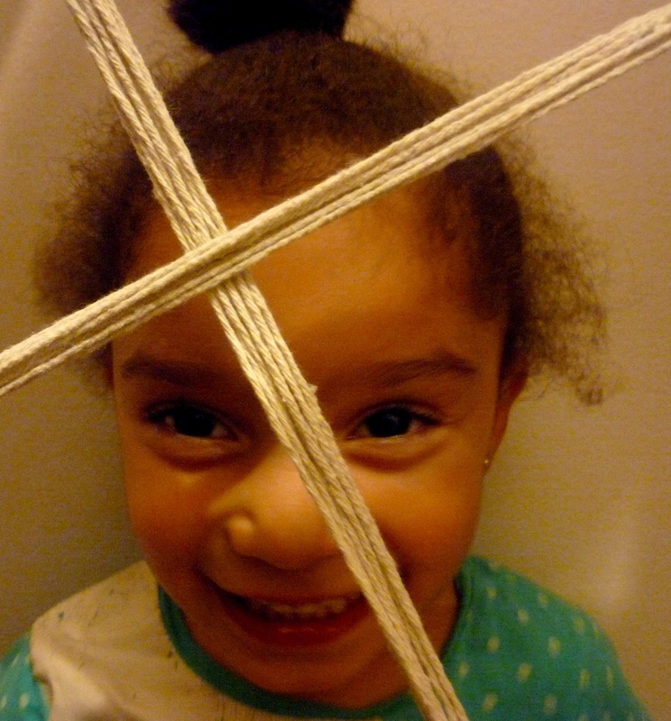
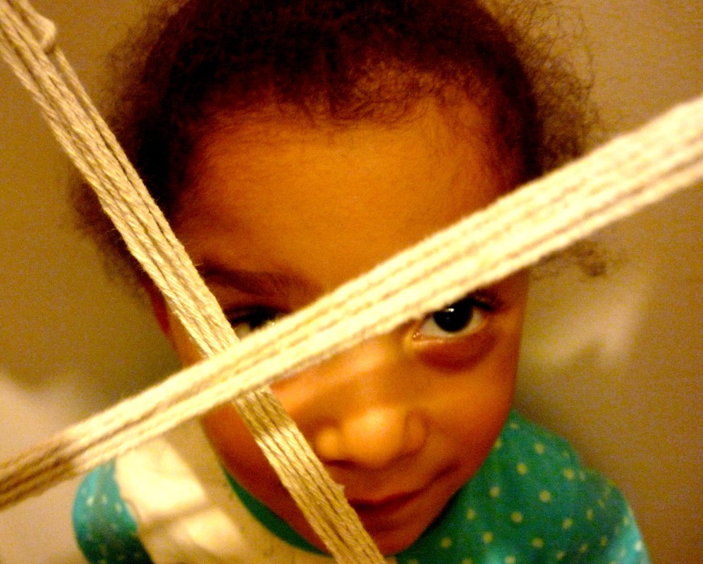
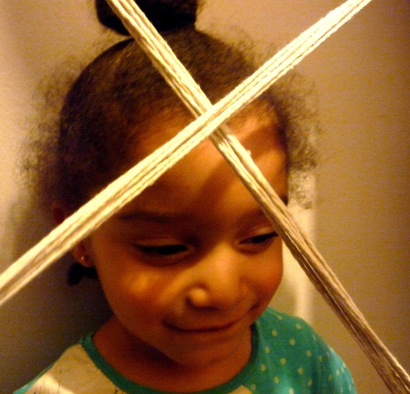
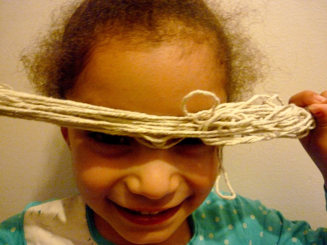
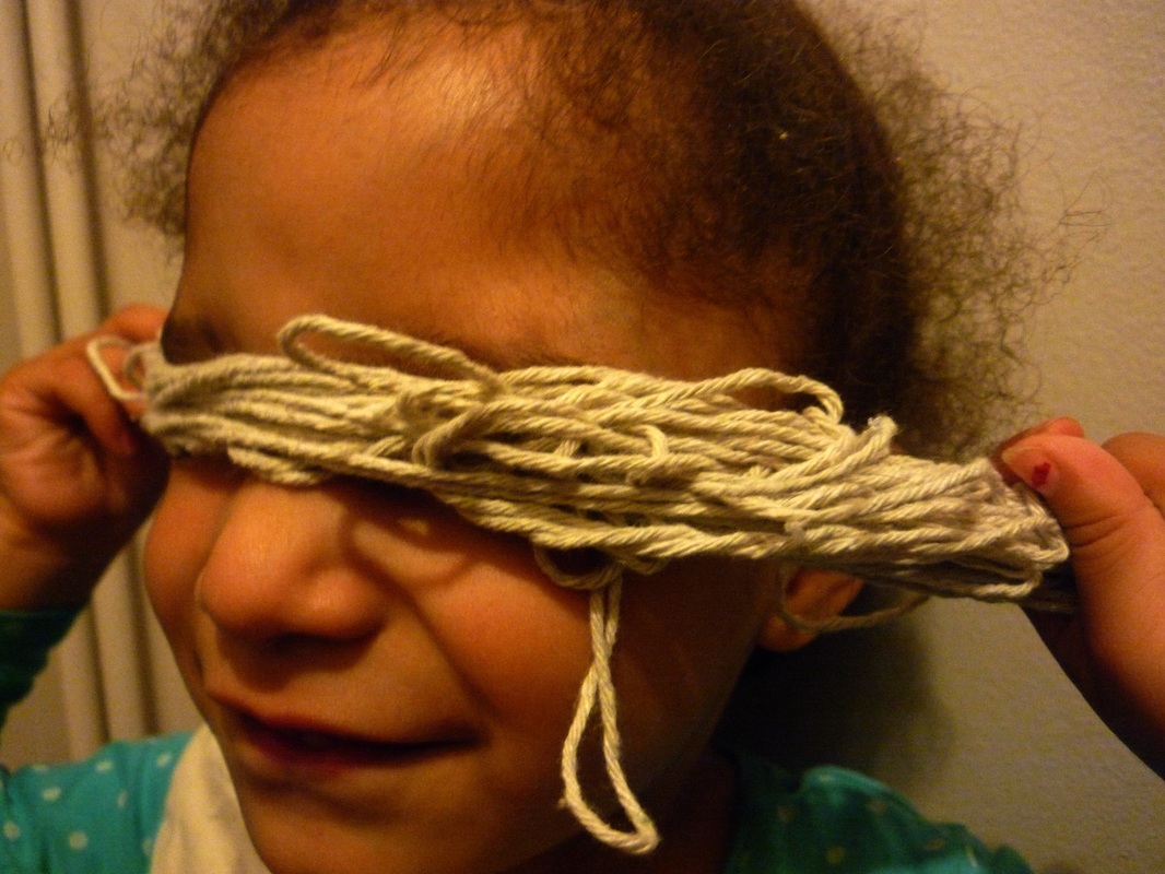
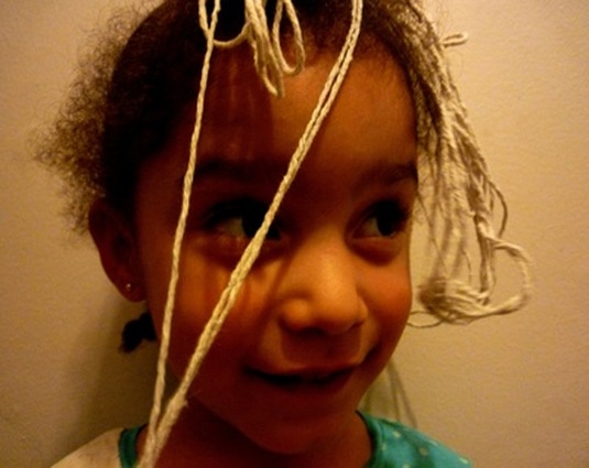
String

I made these photos by getting someone and standing them in front of a black piece of paper. I then got some string and threw it at them and took photos. For each photo i threw the string again to make it look different. Although for most of them I placed the string or rope myself. What I like about these photos is that they are taken at different camera angles. What I don't like about these photos is that you can see the background behind the black paper. Also I don't like that its a bit plain, not enough colour. I learned from these photos is to add more colour to make to it look more creative.

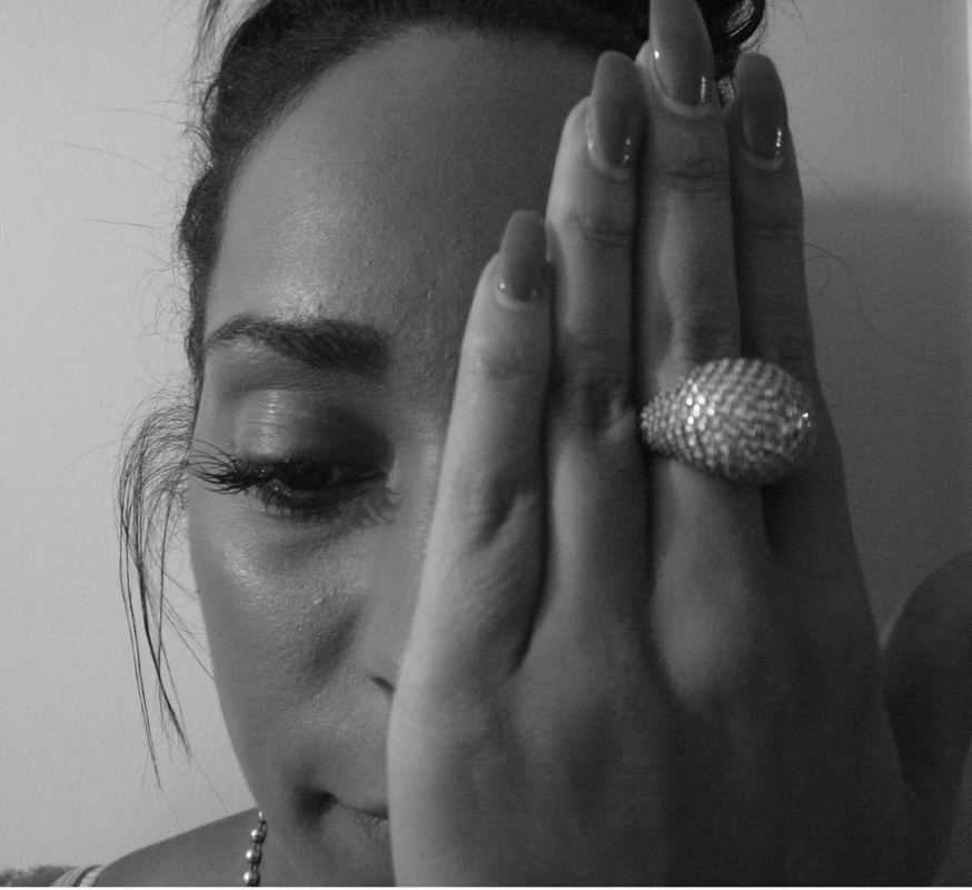
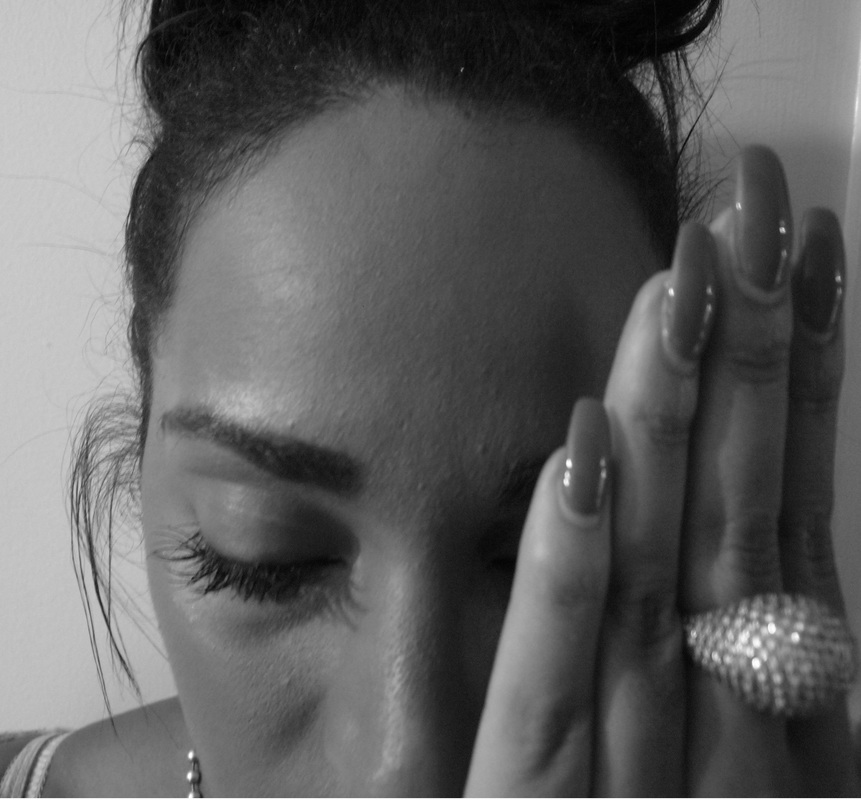
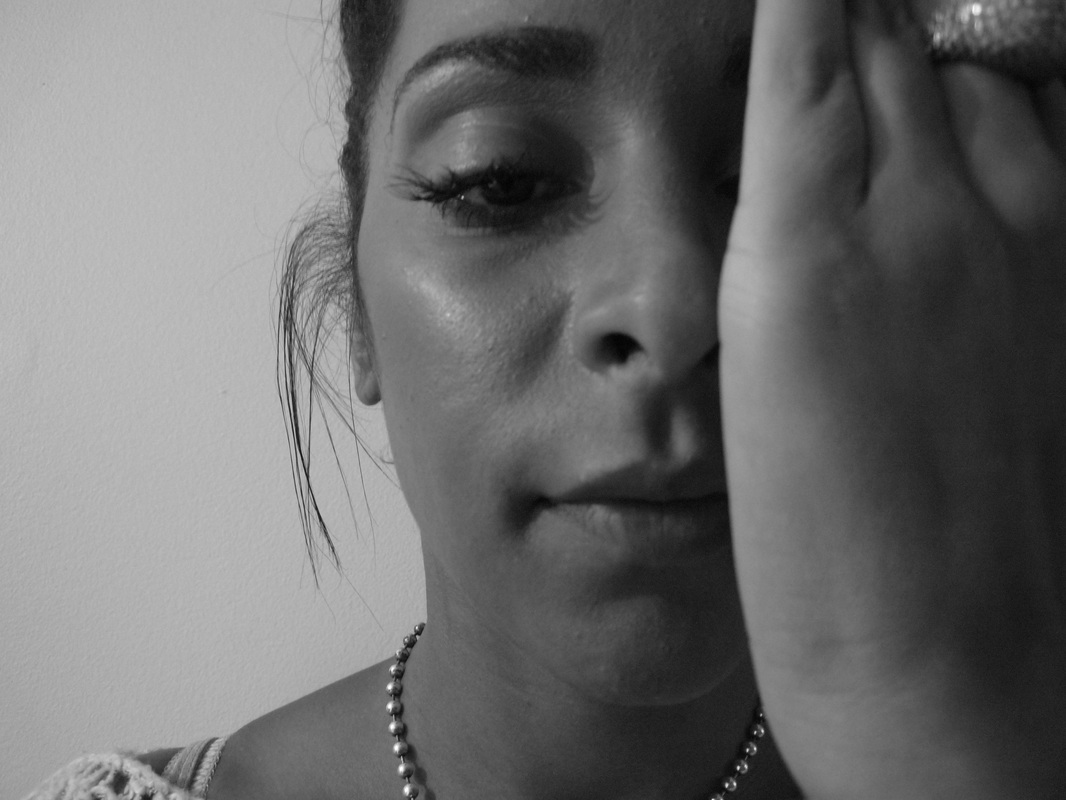
Black&White
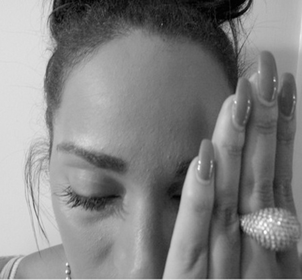
I made these photos by going on photo shop and going on hue and saturation. I turnt the saturation down to make it black and white. What I like about these photos is the quality, texture and angles. What I don't like about these photos is that I don't think enough hand gestures were used and I could've used more. I learnt from these photos is to take alot of pictures with different poses and angles.
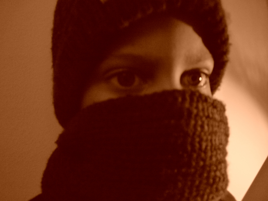
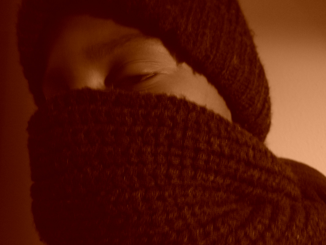
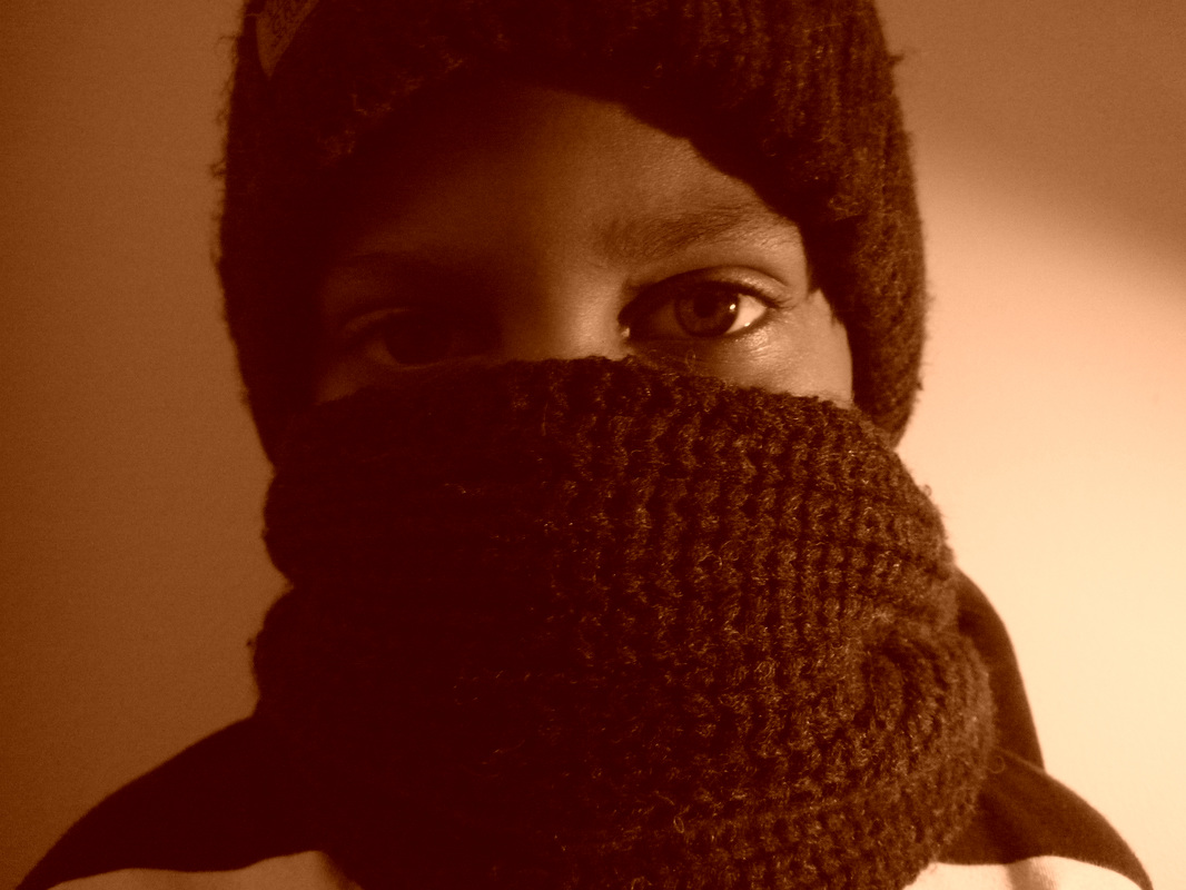
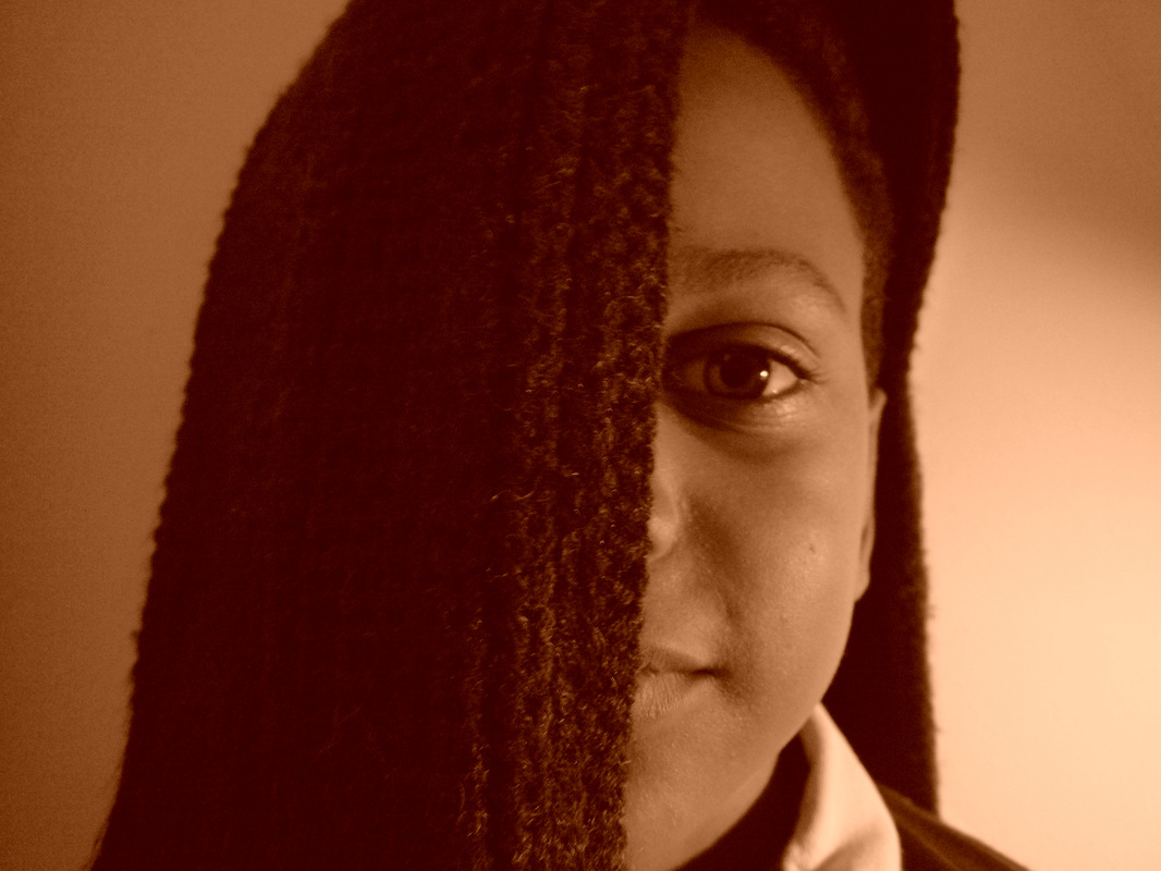
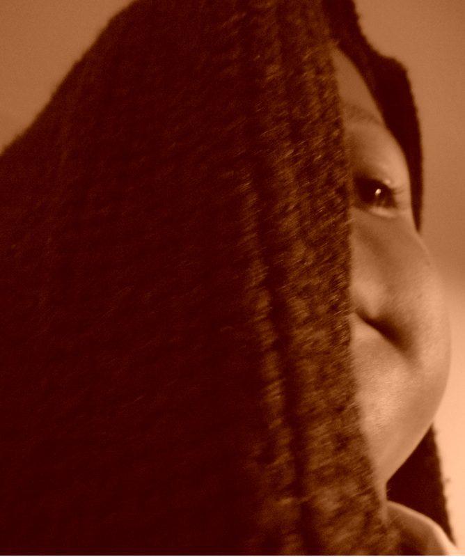
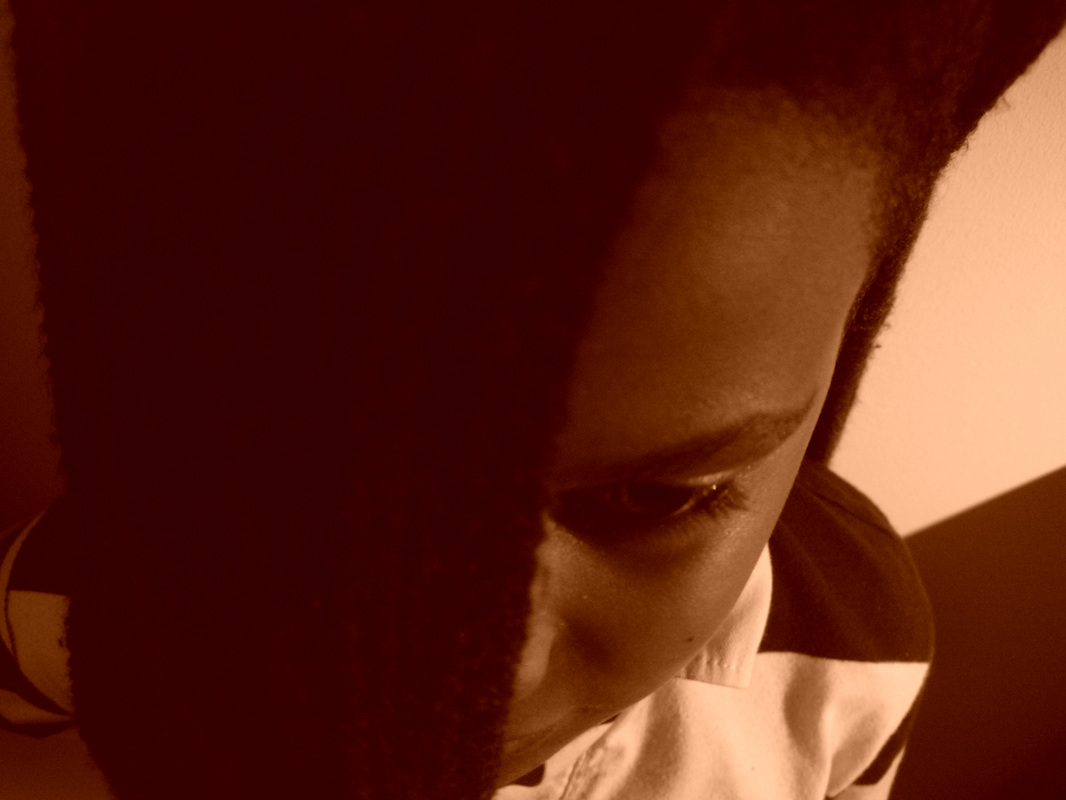
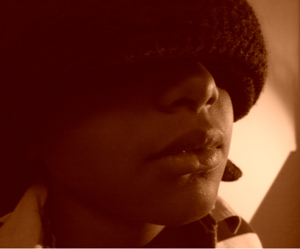
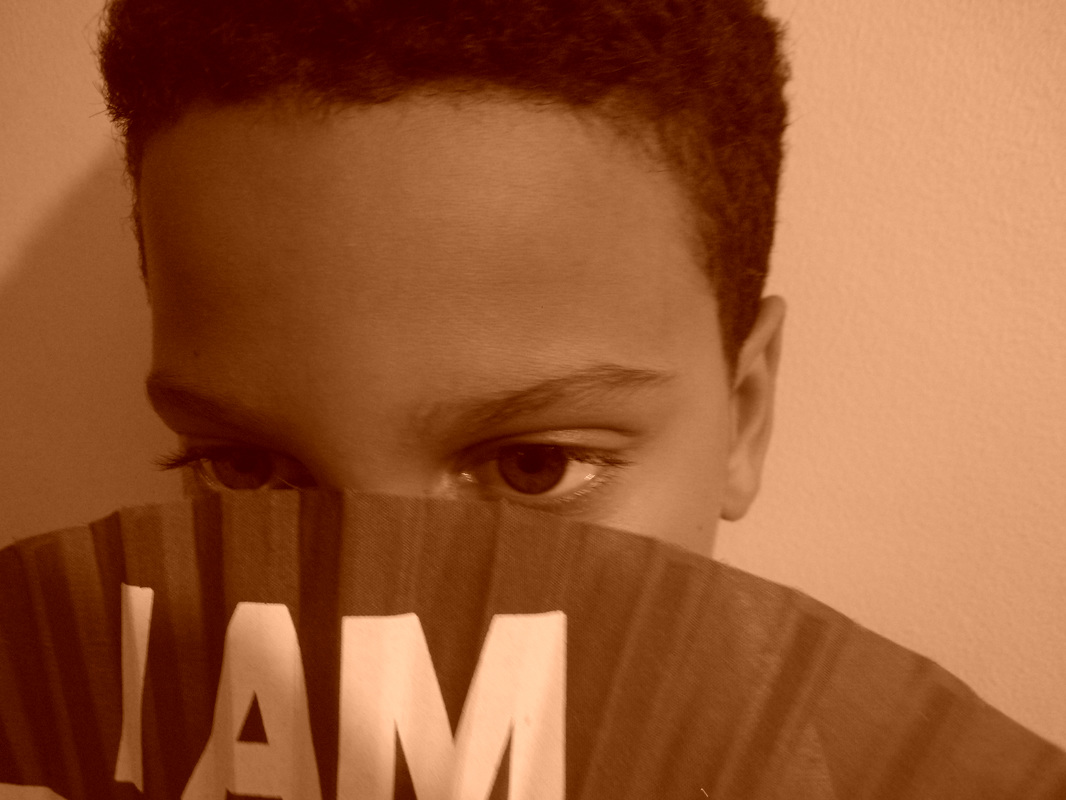
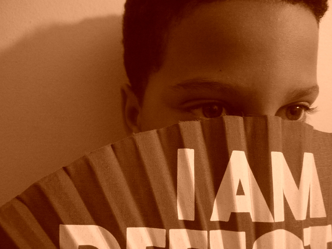
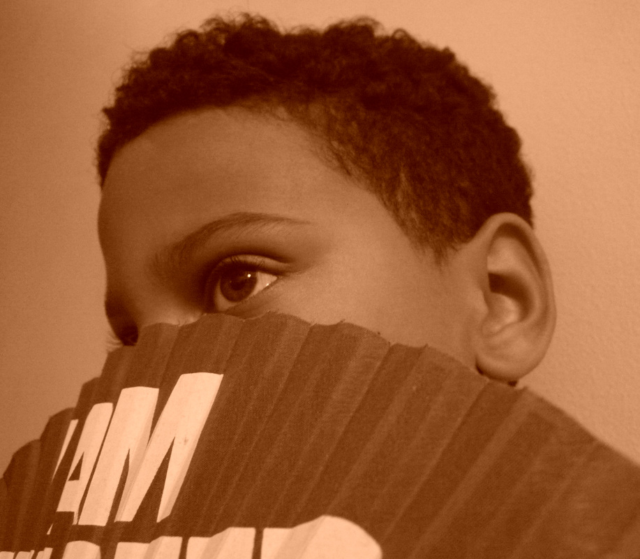
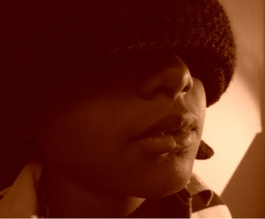
Sepia

I made these photos by going on photo shop and going on photo filter and selecting the colour brown and turning hte intensity up. What i like about these photos is the angles, texture and colour. What I dislike about these photos is that some of them are a different kind of brown which I think ruins the gallery. I learned from these photos to try and make the same type of photos the same shade or colour.
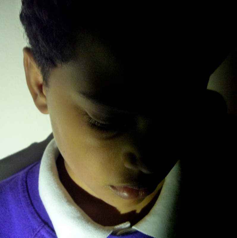
Levels

I made these photos by going on photo shop and going levels. I then adjusted the levers to give it enough lighting ans dark areas and to give it effect. What I like about these photos is the shading, texture, lighting and angles. I don't think I dislike anything about these photos. I learned from these photos that different lighting and shading can give my pictures a good effect.
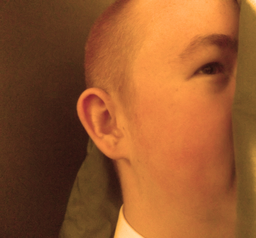
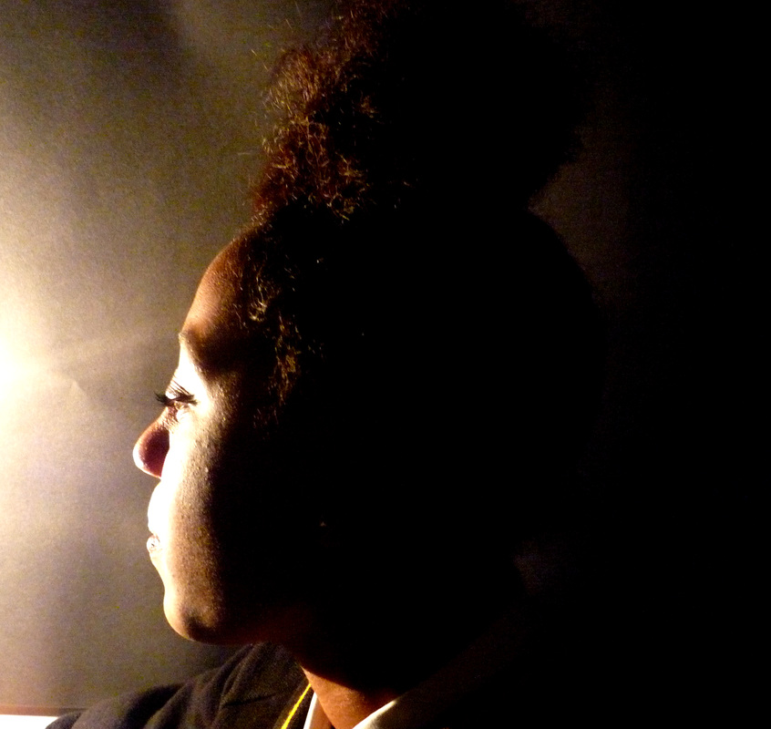
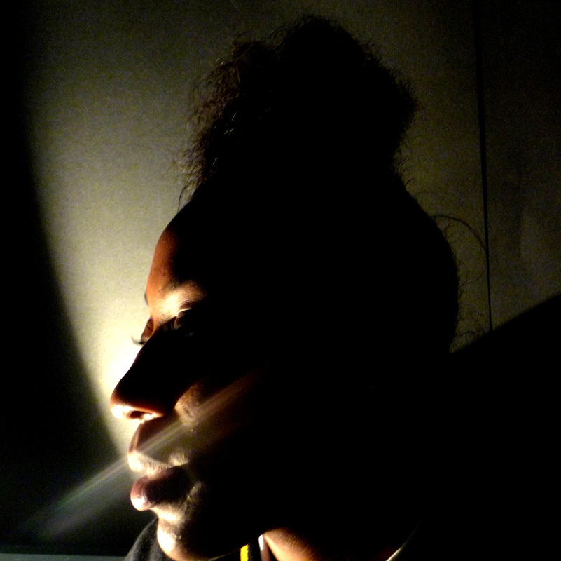
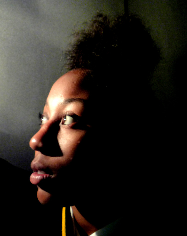
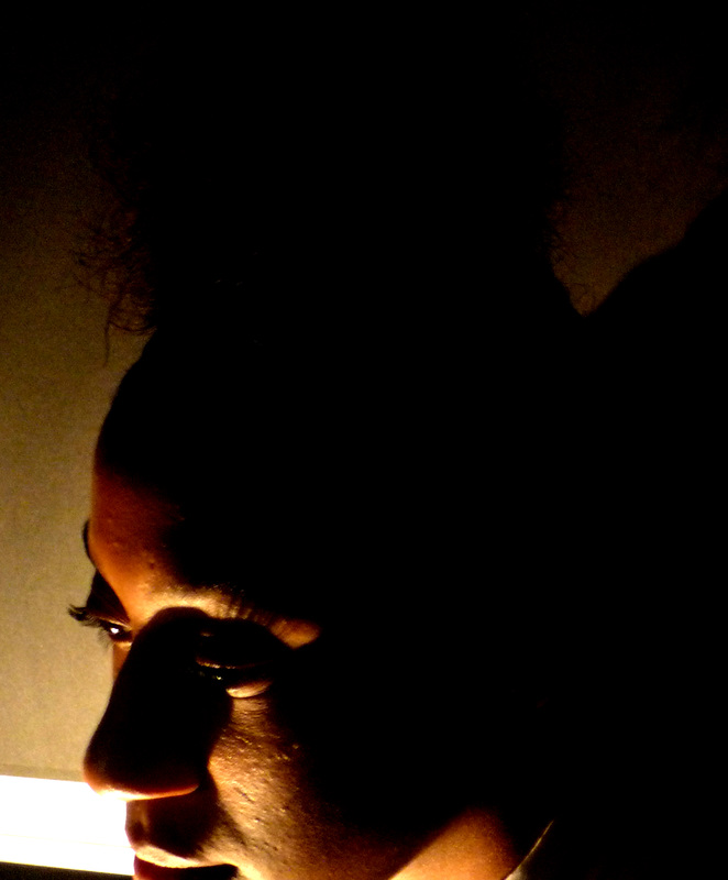
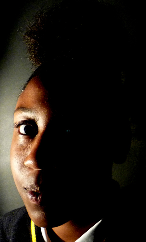
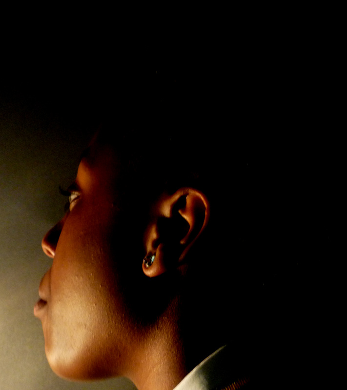
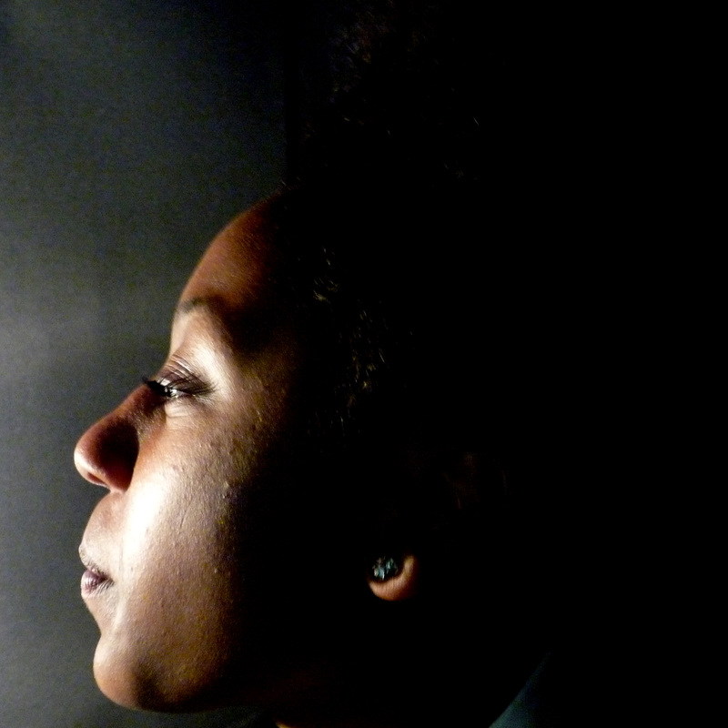
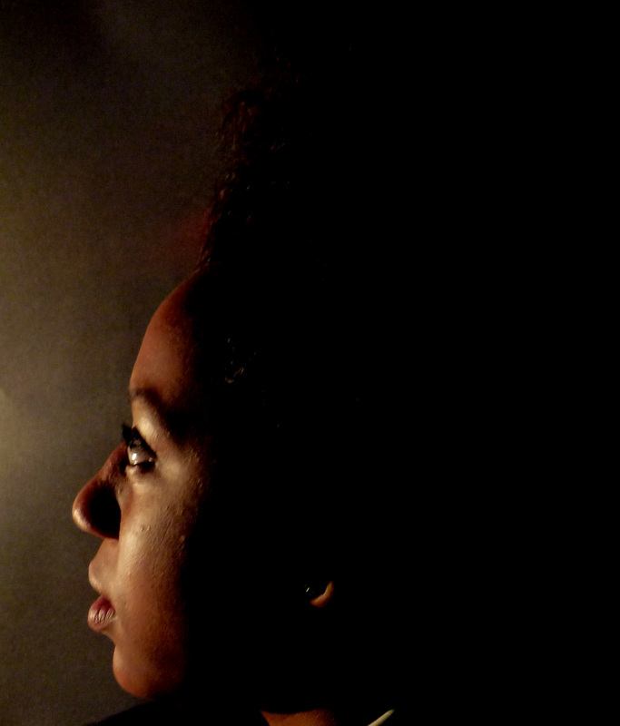
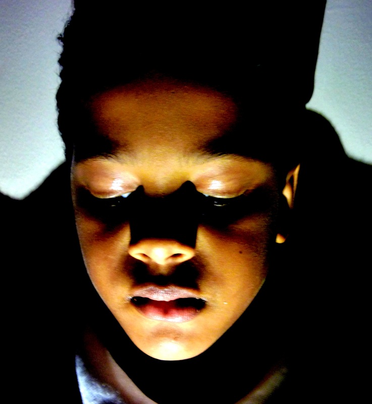
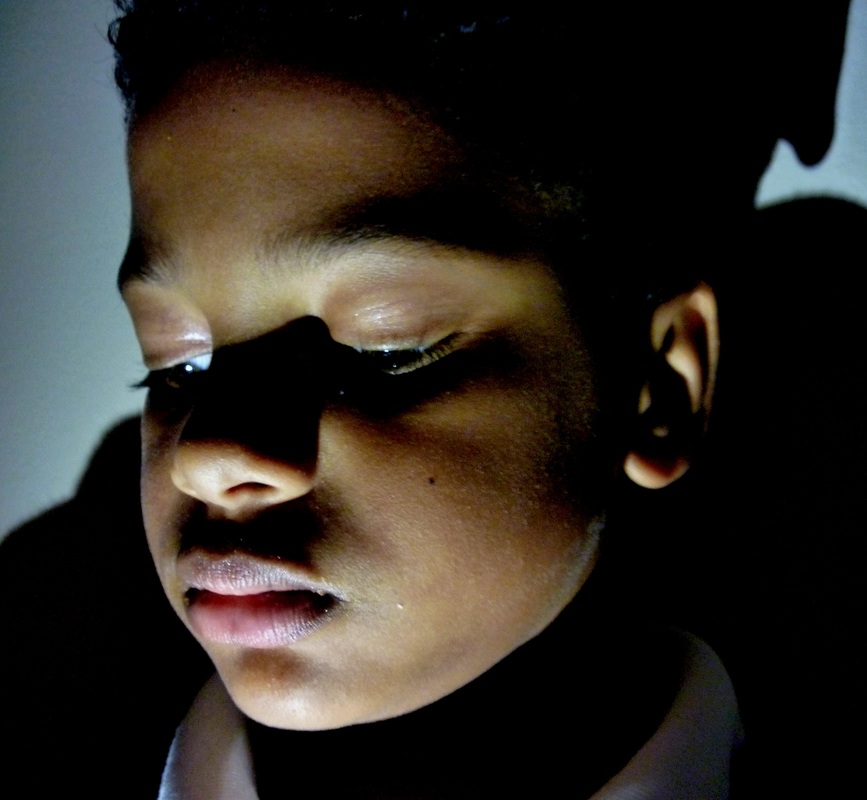
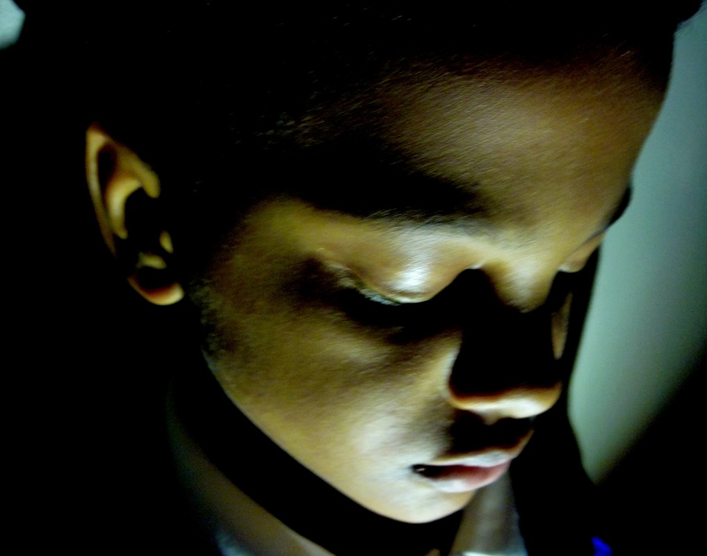
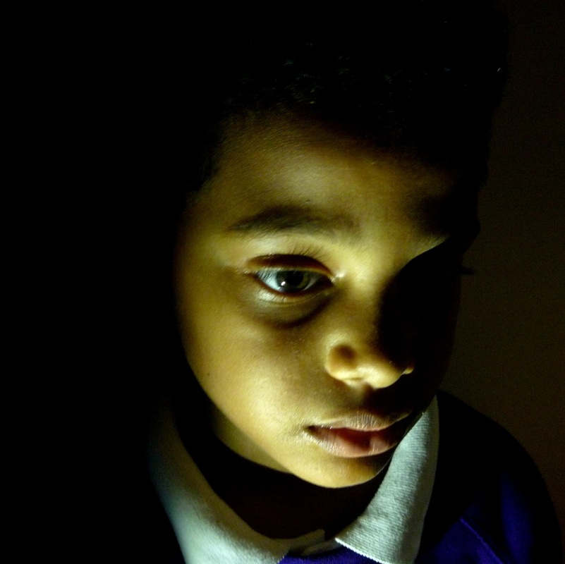
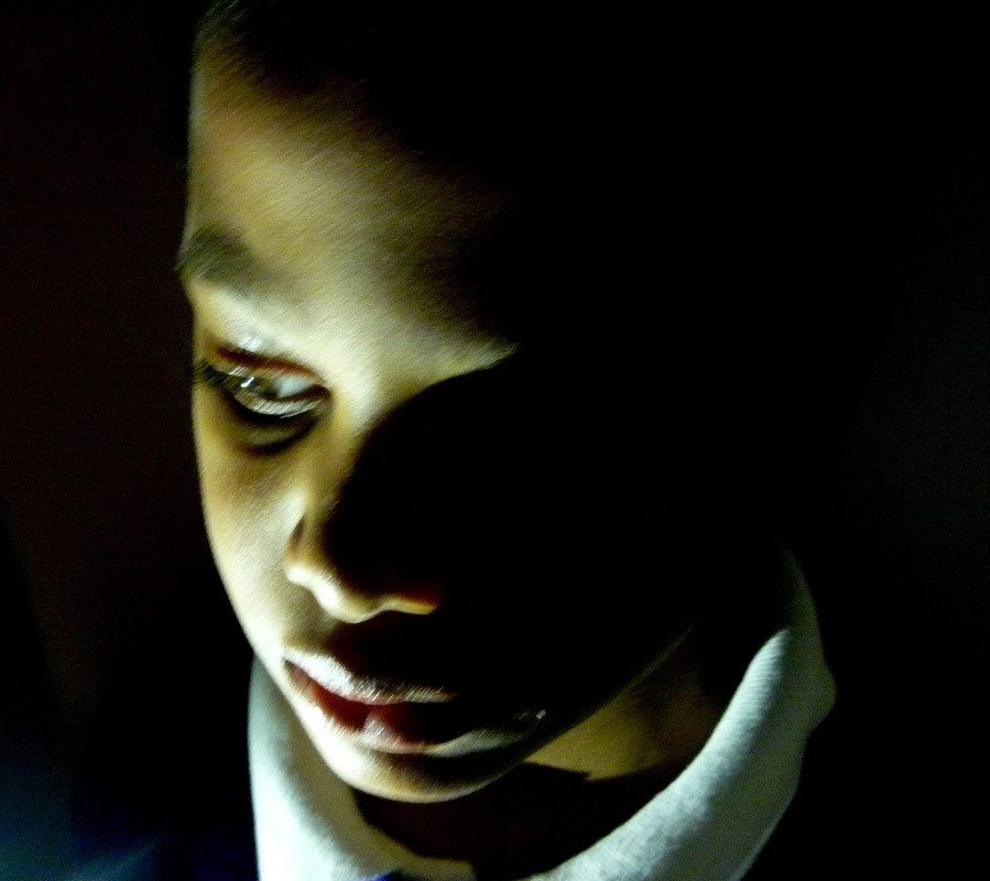
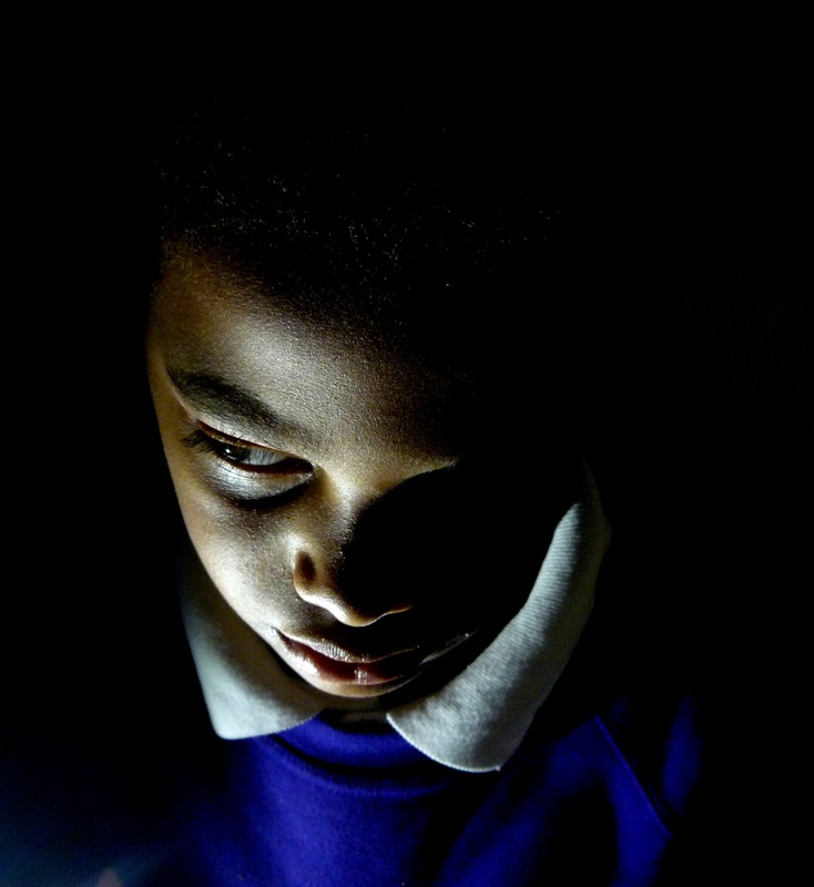
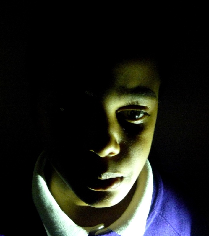
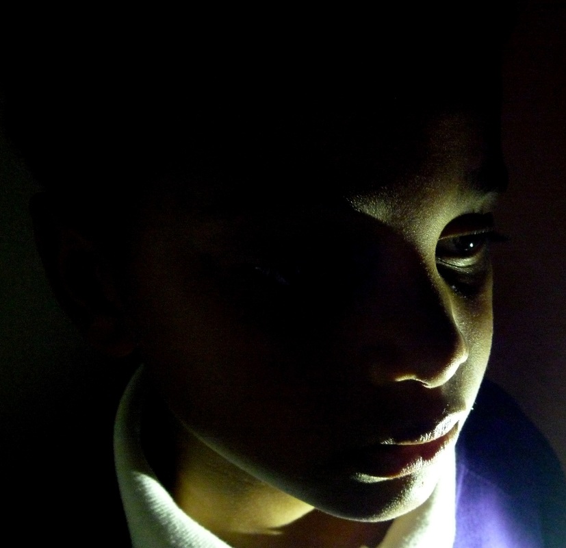
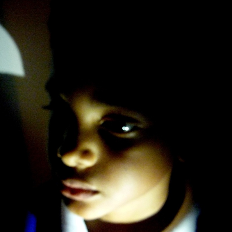
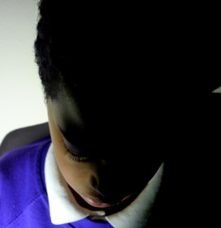
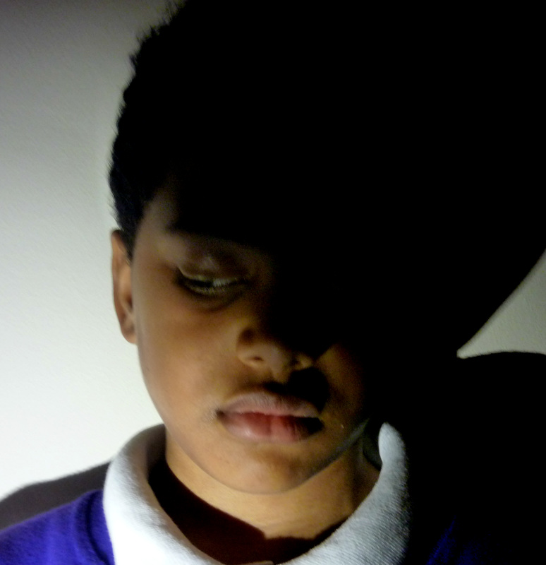
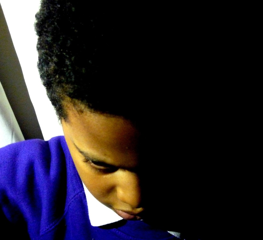
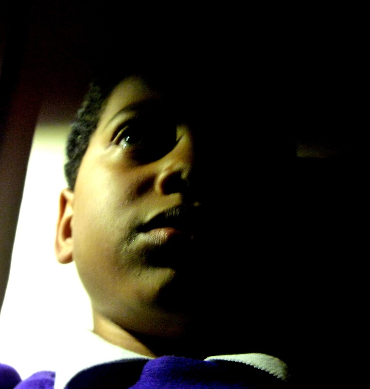
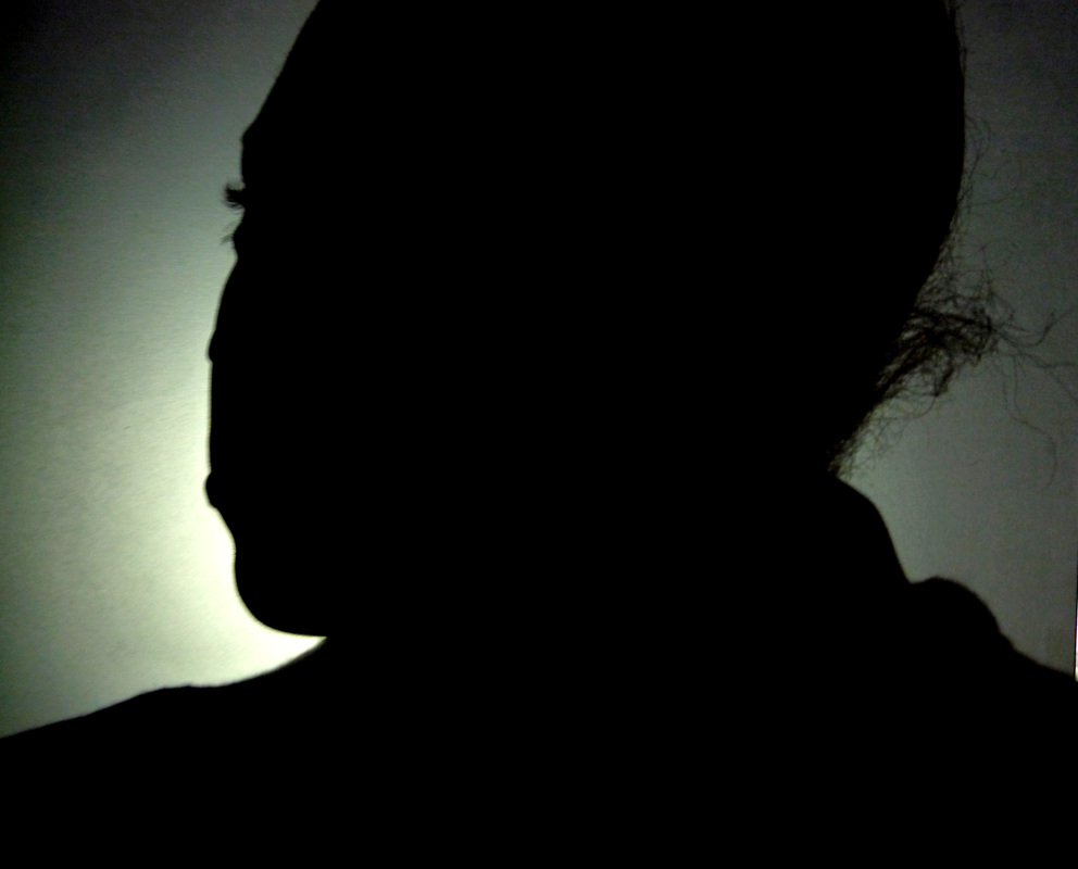
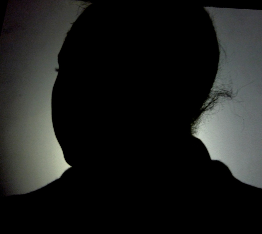
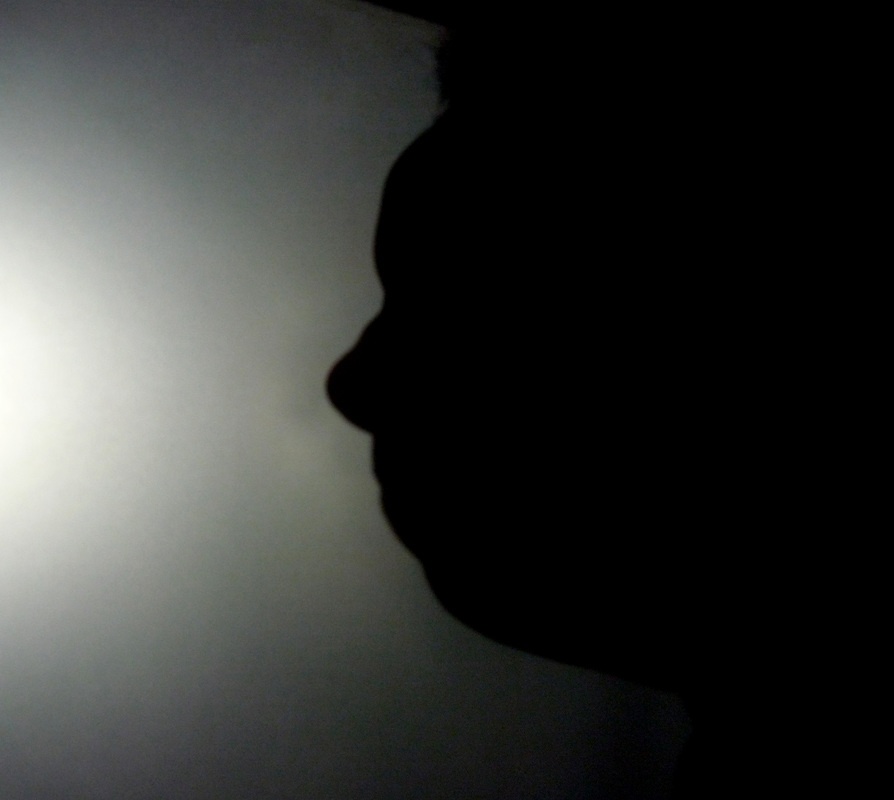
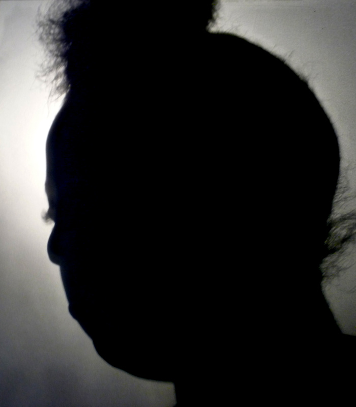
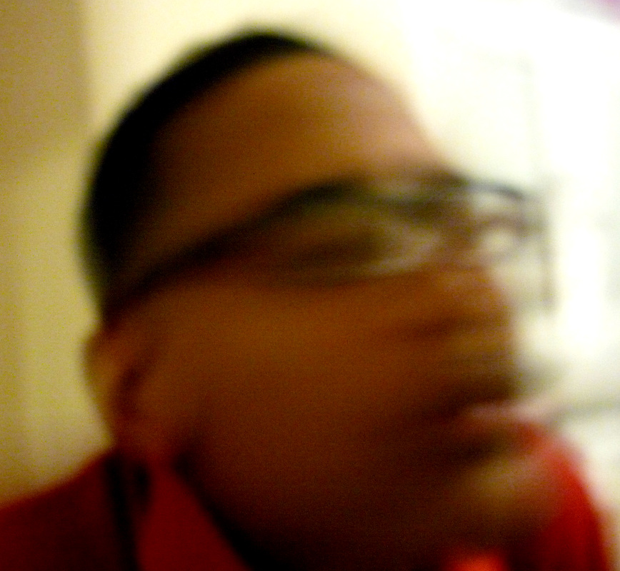
Lighting
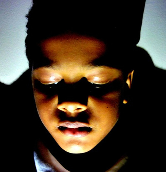
I made these photographs by getting someone to stand in front of a screen and to shine a bright light at different angles, pointing at their face. What I like about these photographs is the lighting, how one side is dark while the other is light. What dislike about these photographs is that you can see the rays of the light in some of the photos which I think makes it look ugly. I don't think I learnt anything new from these photos.
Lighting HW
Screen

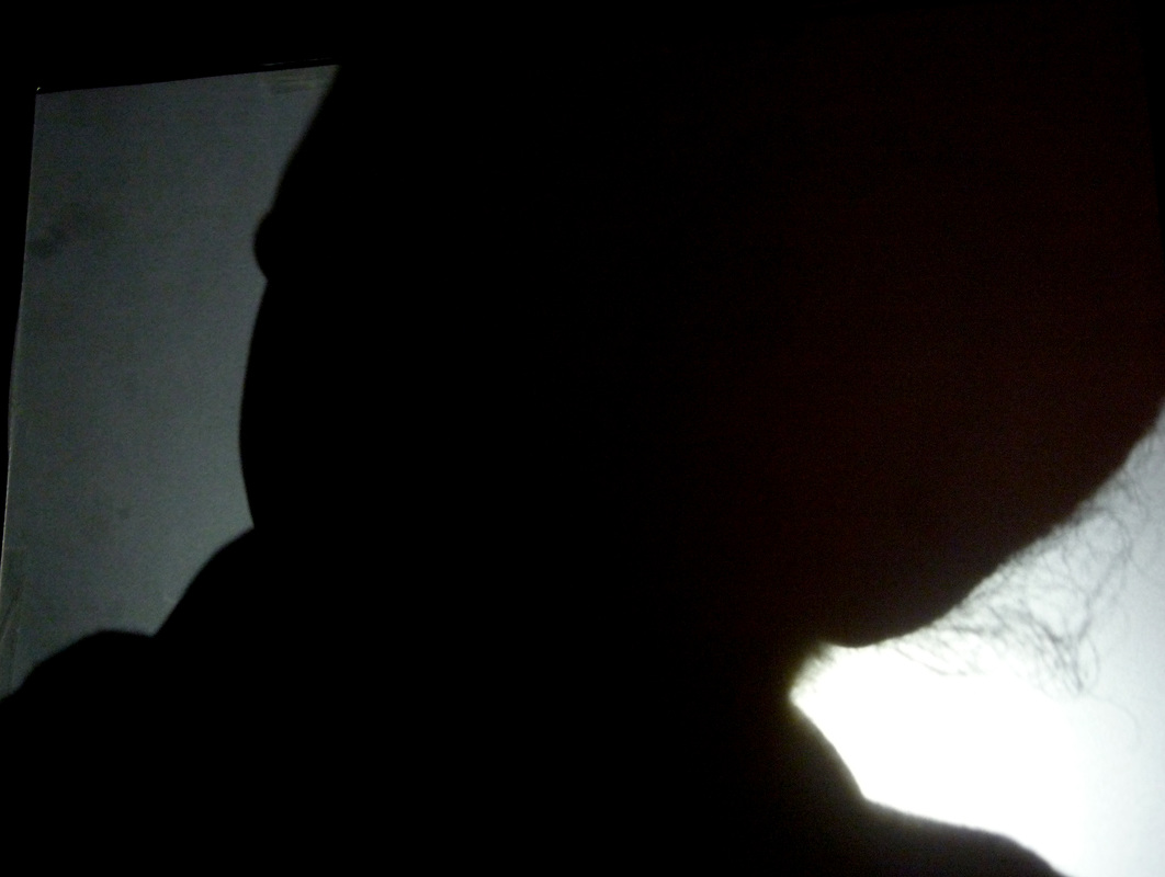
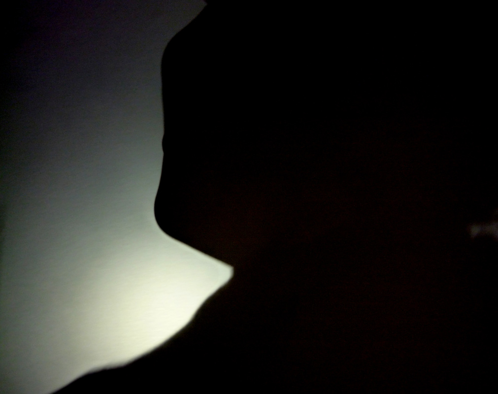
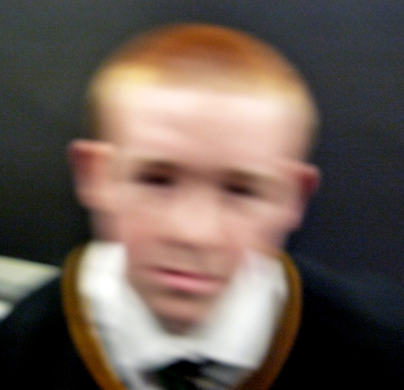
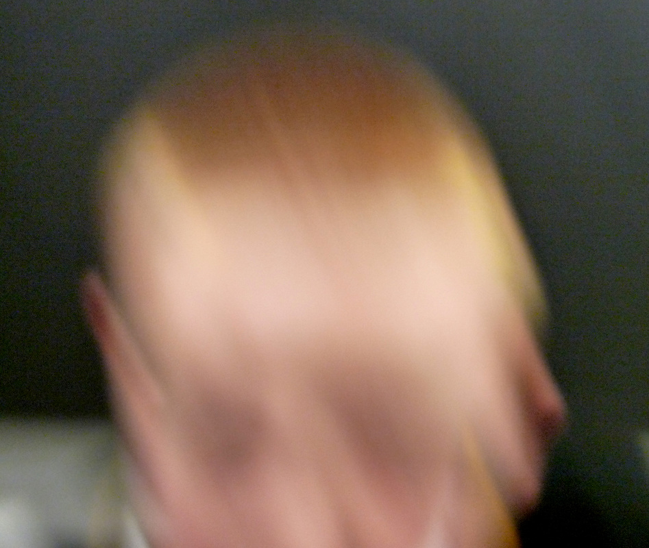
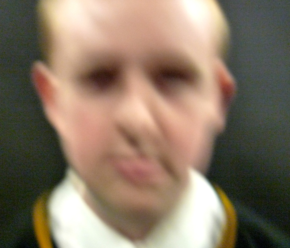
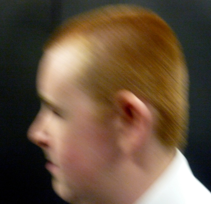
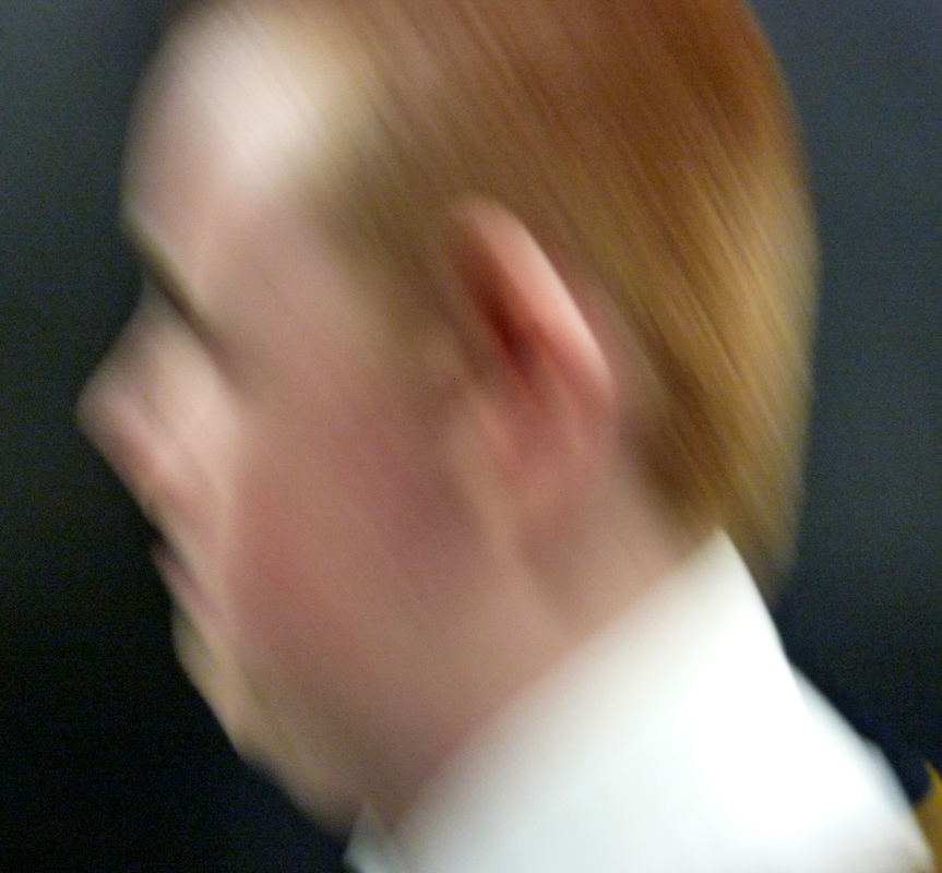
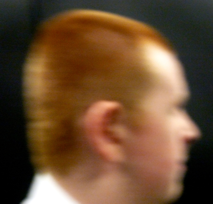
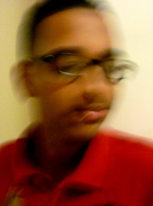
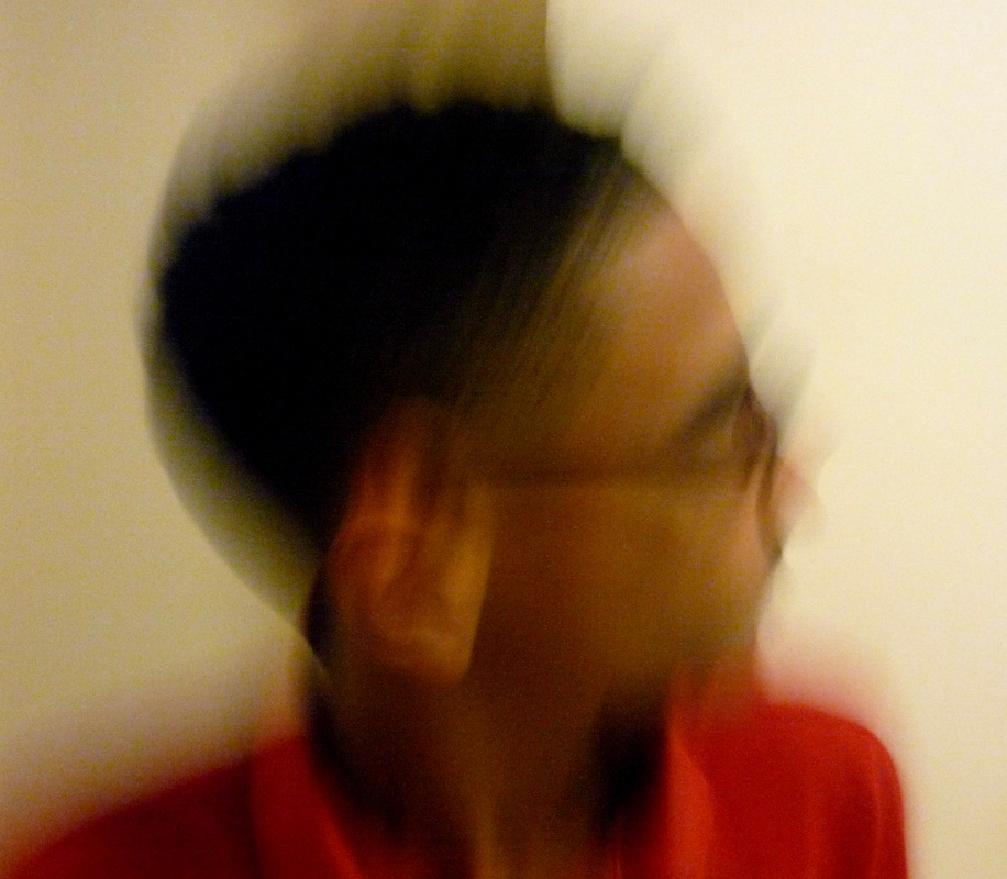
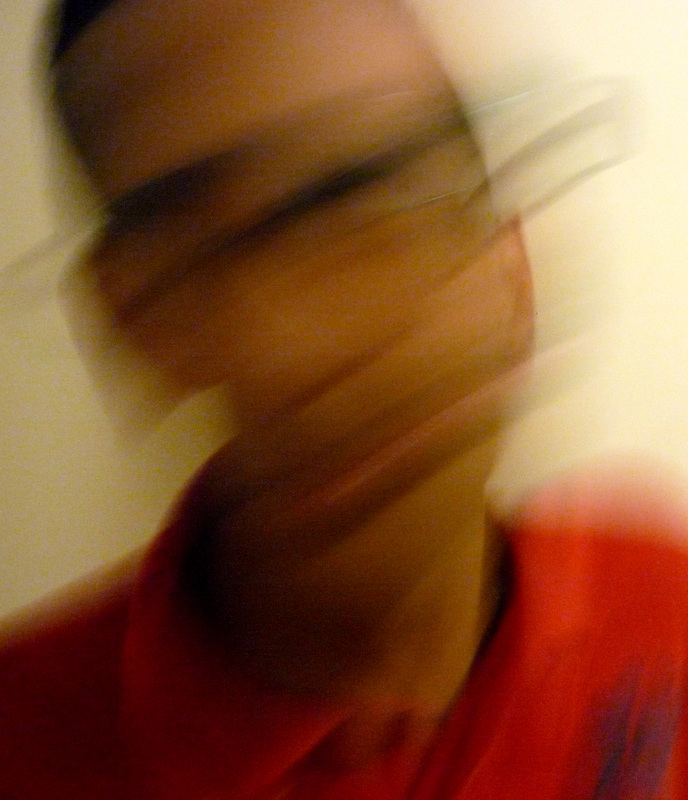
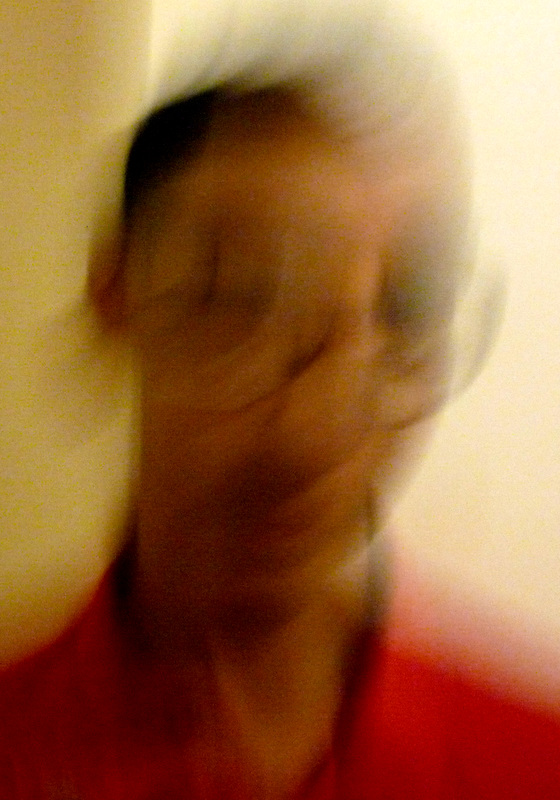
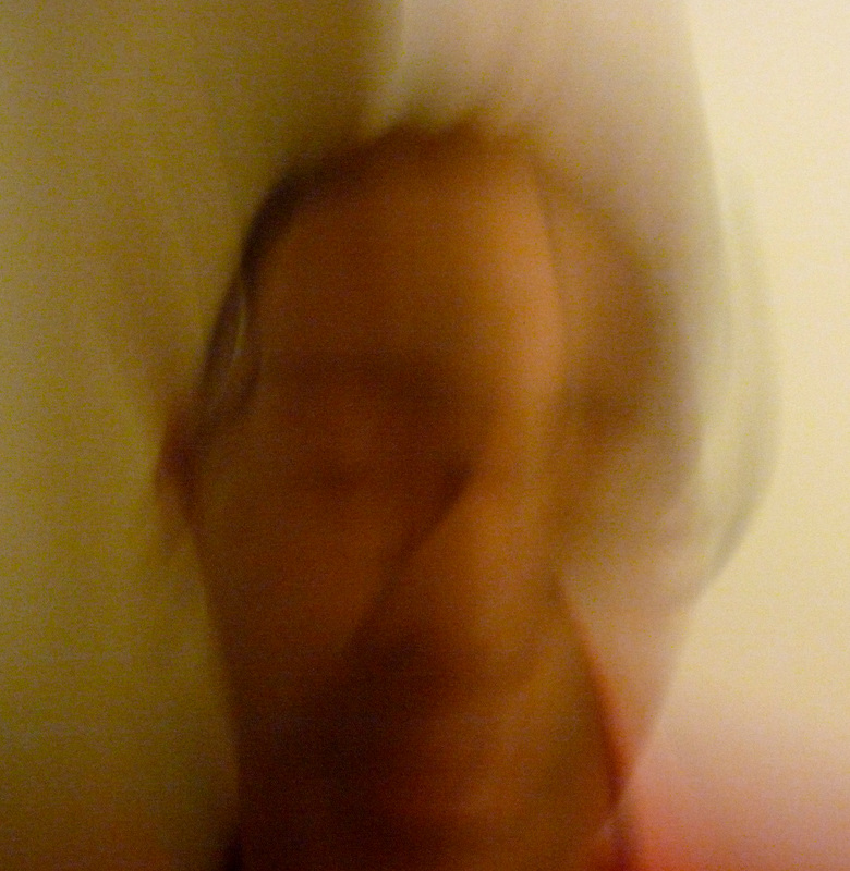
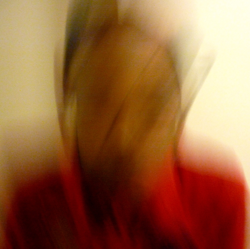
Movement
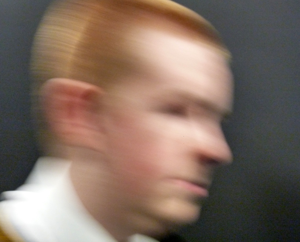
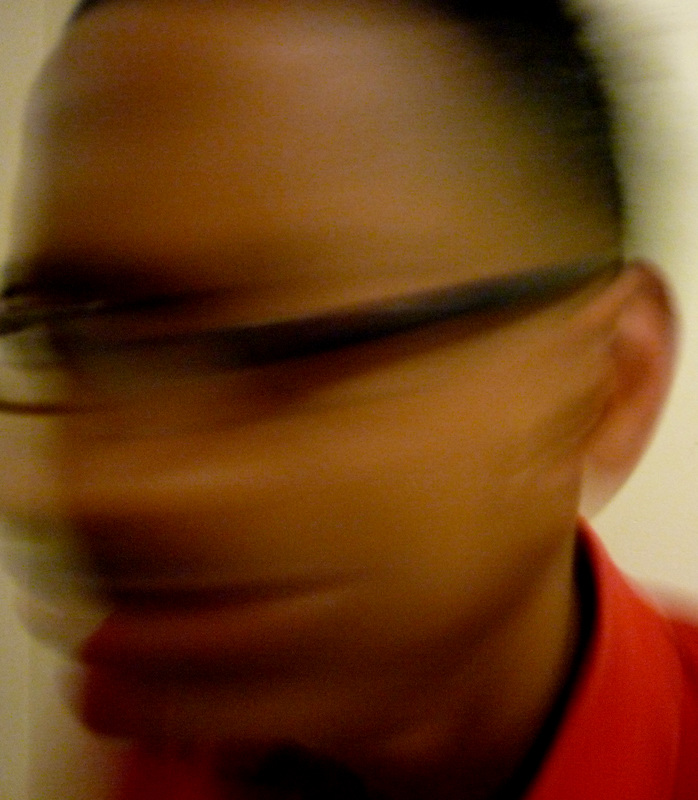
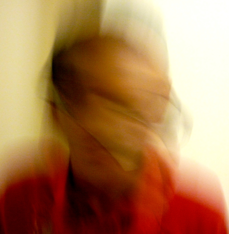
I made these photos by getting someone to stand in front of a screen. I then took the picture while shaking the camera to make the picture look blurry. What I like about these photos is that the blur gives it effect as you can see two of the image a bit but its fainter. What I don't like about these photographs is that for a few of them aren't as blurry as the others. I learnt from these photographs that the faster I shake the camera the better the effect of blur there is.
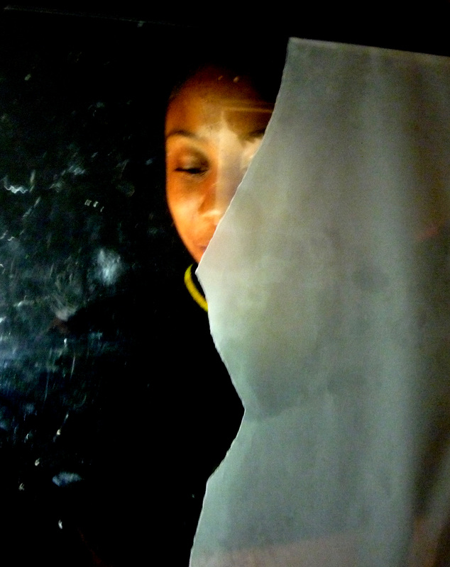
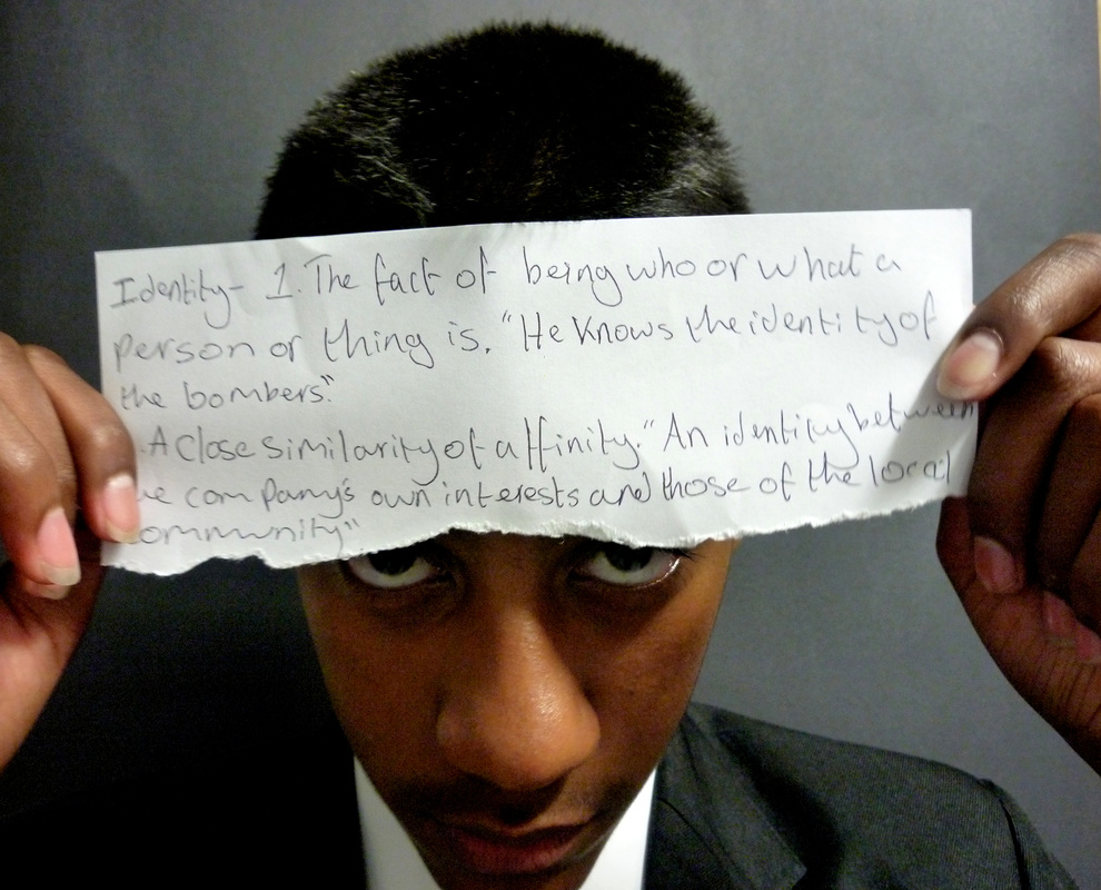
Developing My Own Ideas
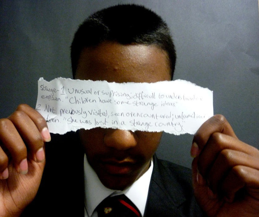
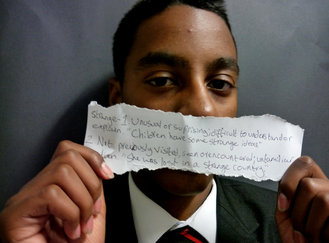
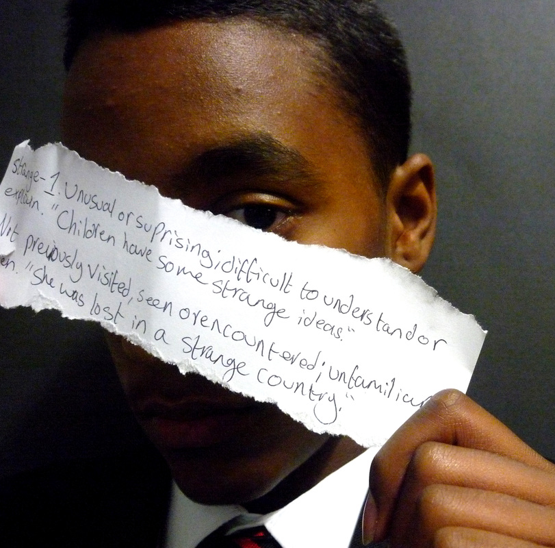
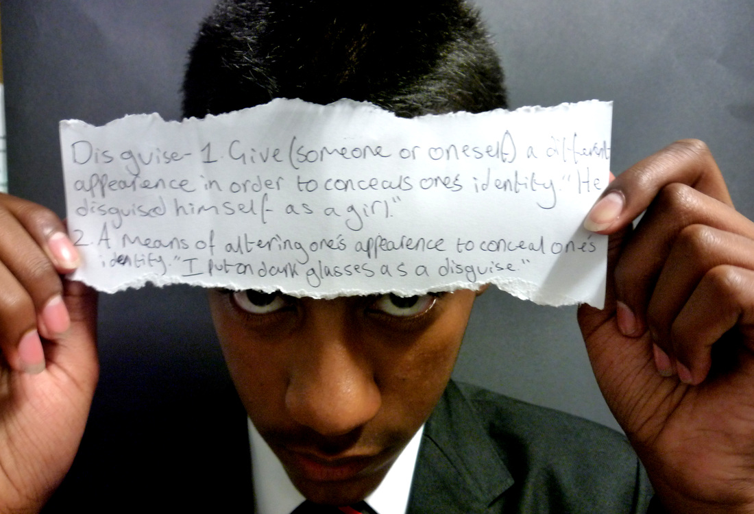
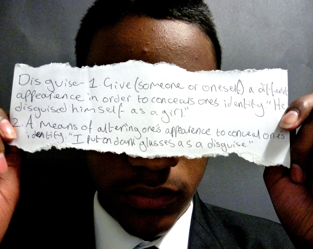
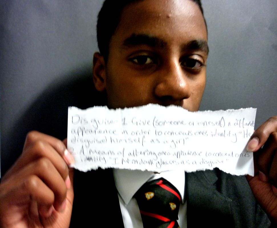
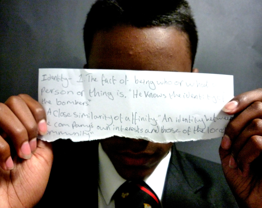
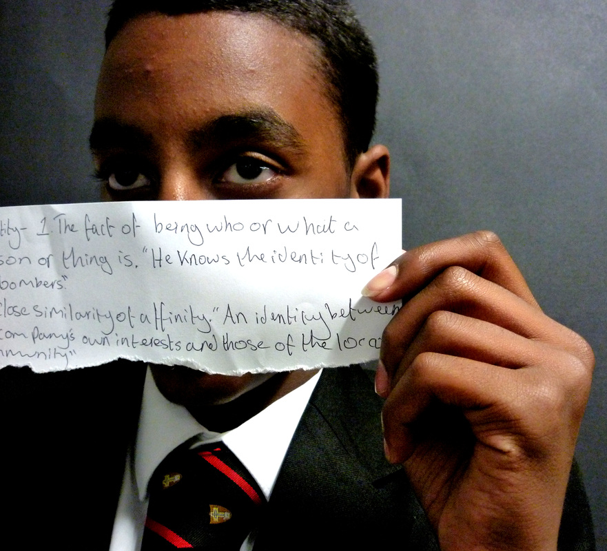
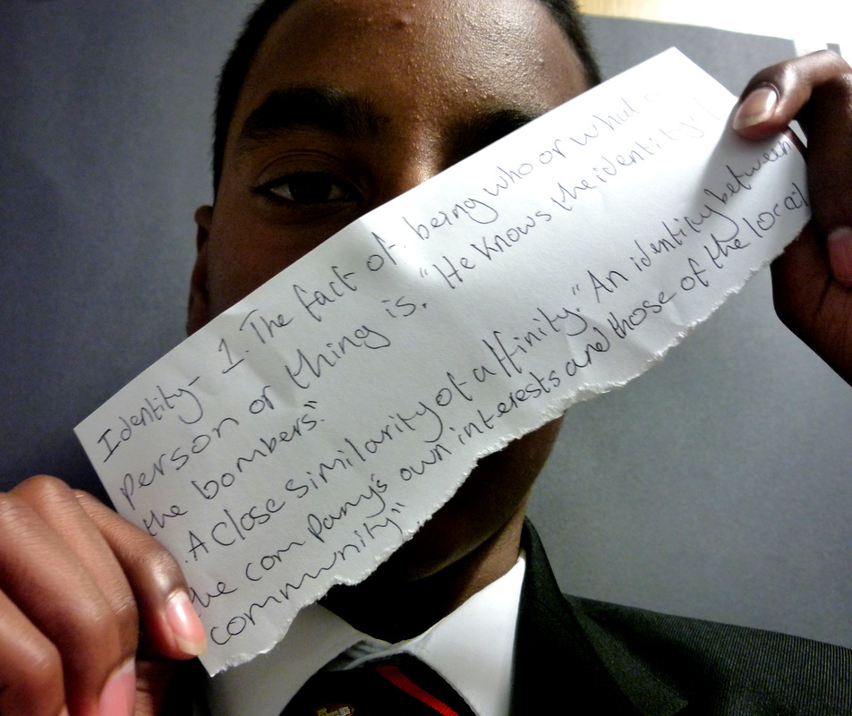
I made these photographs by getting someone to stand in font of black screen and then I wrote some definitions of the words Strange, Disguise and Identity. After that I got the person to hold the papers I different positions. What I like about these photographs is the lighting, angles and how the words are different and are held in different positions. What I dislike about these photographs is that for some of the photos it is a bit too dark on one side. From these photographs I didn't really learn anything new.
My Top 10 Photographs

I chose this photo to be in the top 10 because in the hands category I thought that this photo had the best pose, quality and positioning. What went well with this photo is the pose, quality, colour and angle. I learnt from this photo that even a simple angle can make a photograph look good.

I chose this photograph to be in the top 10 because the props category I thought this had the best prop. What went well with this photo is the lighting, quality, angle and the prop. I learnt from this photograph the same from the previous one that even a simple angle can make a photograph look good.
I chose for this photograph to be in the top 10 because I thought that this one had the best colour and angle in the string category. What went well with this photograph is the colours, angle and quality. I learnt from this photograph that using different colours in a photo can make it look good.
I chose this photograph to be in the top 10 because I thought it had the best angle in the black and white category. What went well with this photograph is the quality, texture, angle and colour. From this photograph I didn't learn anything new.
I chose this photograph to be in the top 10 because I thought that this one had the best angle in the sepia category. What went well with this photograph is the angle, colour, texture and quality. From this photograph I learnt how to use sepia effectively.
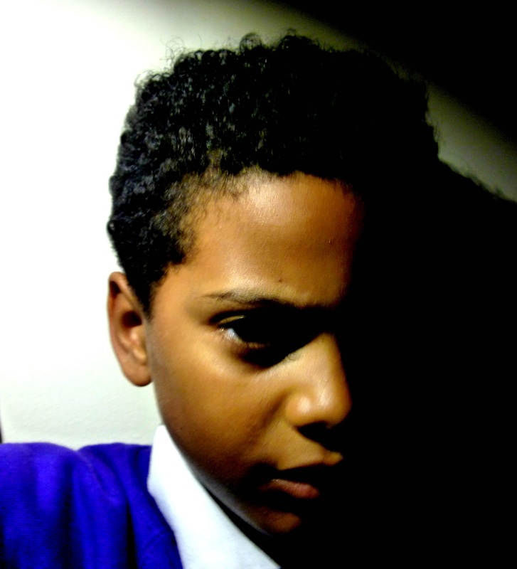
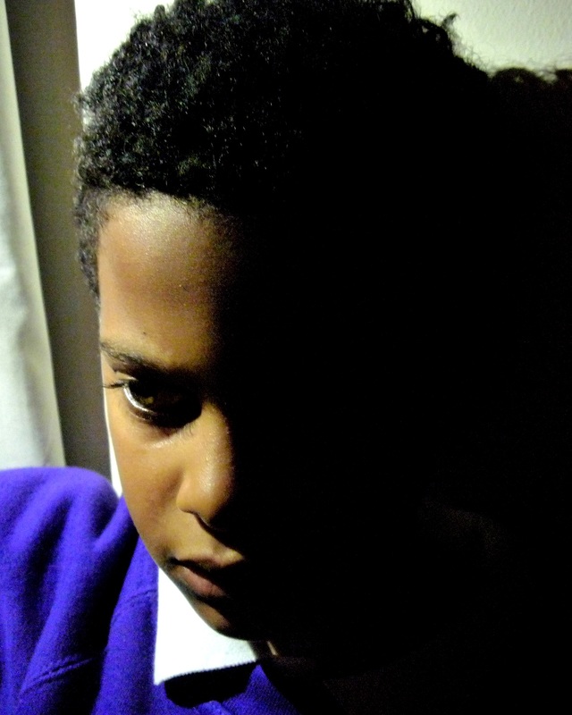
I chose this photograph to be in the top 10 because I thought this one had the best lighting. What went well with this photograph is the lighting, angle, colour and quality. I learnt from this photo how to use levels effectively.

I chose this photograph to be in the top 10 because I thought it had the best lighting in the lighting category. What went well with this photograph is the lighting, angle and quality. From this photograph I didn't really learn anything new.

I chose this photograph to be in the top 10 because I thought it had the best lighting in the screen category. What went well with this photograph is the lighting, quality and texture. From this photograph I learnt how to take effective screen photos.

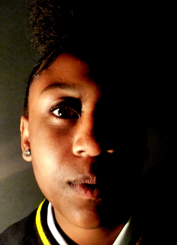
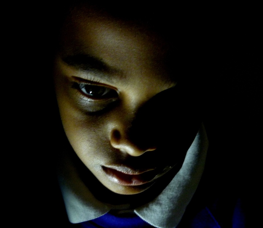
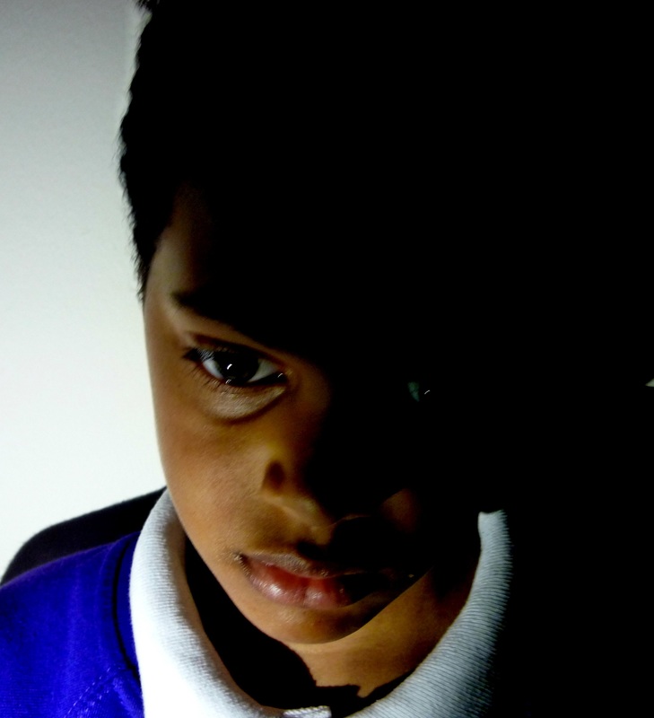
I chose this image to be in the top 10 because I thought it had the best lighting and shading in it's category. What I like about this photograph is that there is light in the middle of the person's face and darkness all around and there is a few dark patches around their nose, eyes and ears. From this photo I didn't really learn anything new.

I chose for this photograph to be in the top ten because I thought it was the best in it's category. The reason for this is because it has the most effect of blur and it's so blurry you can't see the persons face. What I like about this image is the effect of the blur. I don't think there is anything I dislike about this photograph.
