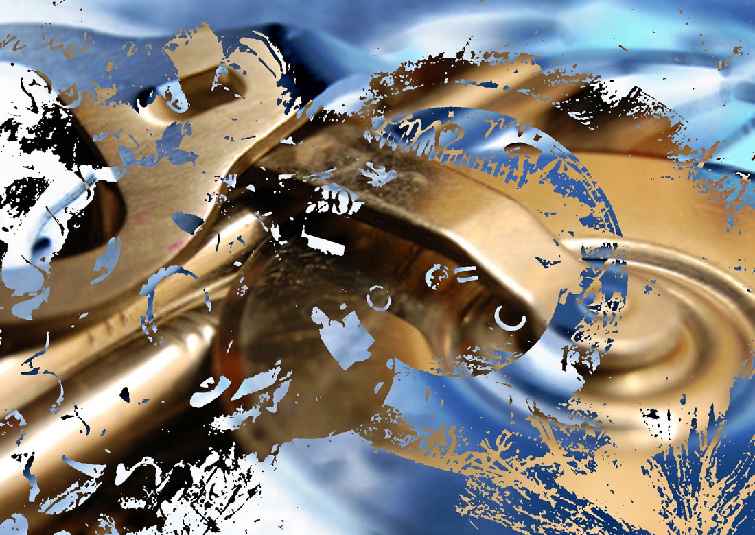
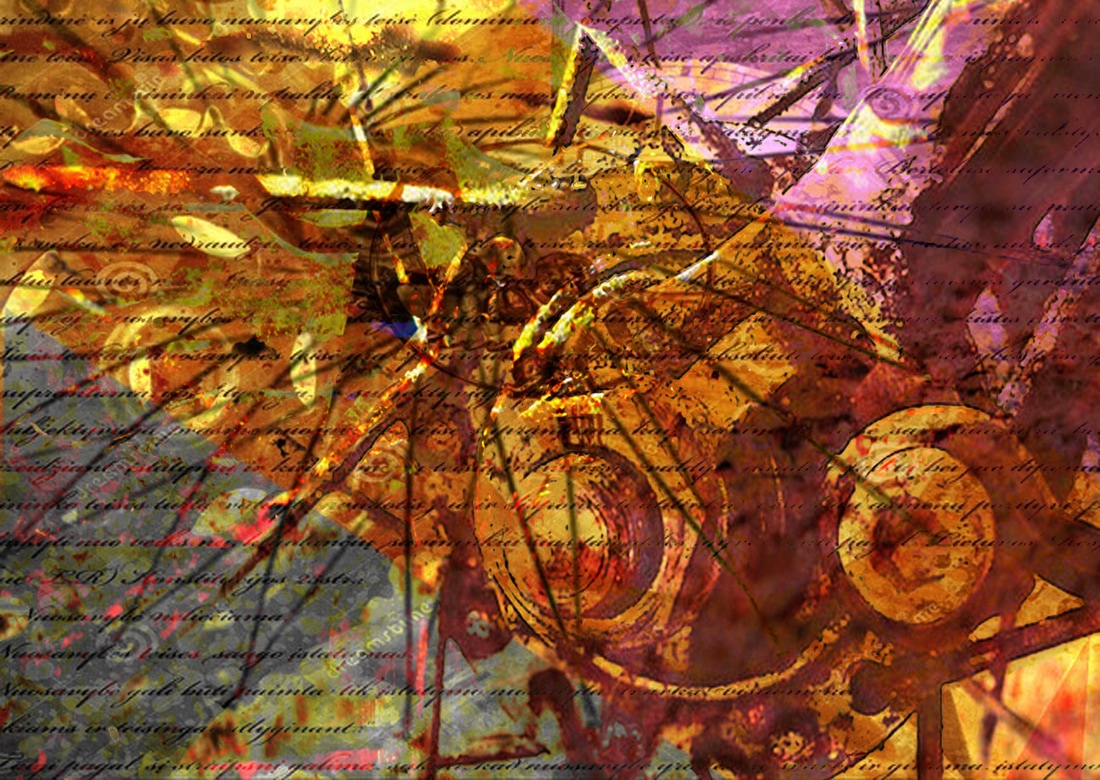
This first picture I made using photo shop, I got all the images from the internet to get an idea on how to do it with my work. I used the polygonal lasso tool on photo shop to make triangles. When I made the triangles, I went on hue and saturation to change one black and white and I went on photo filter to change the other triangle purple. The strong points with this image is the colour and lighting. The flaw with this photo is that the cogs look blurry and you can't see all the layers as clearly.
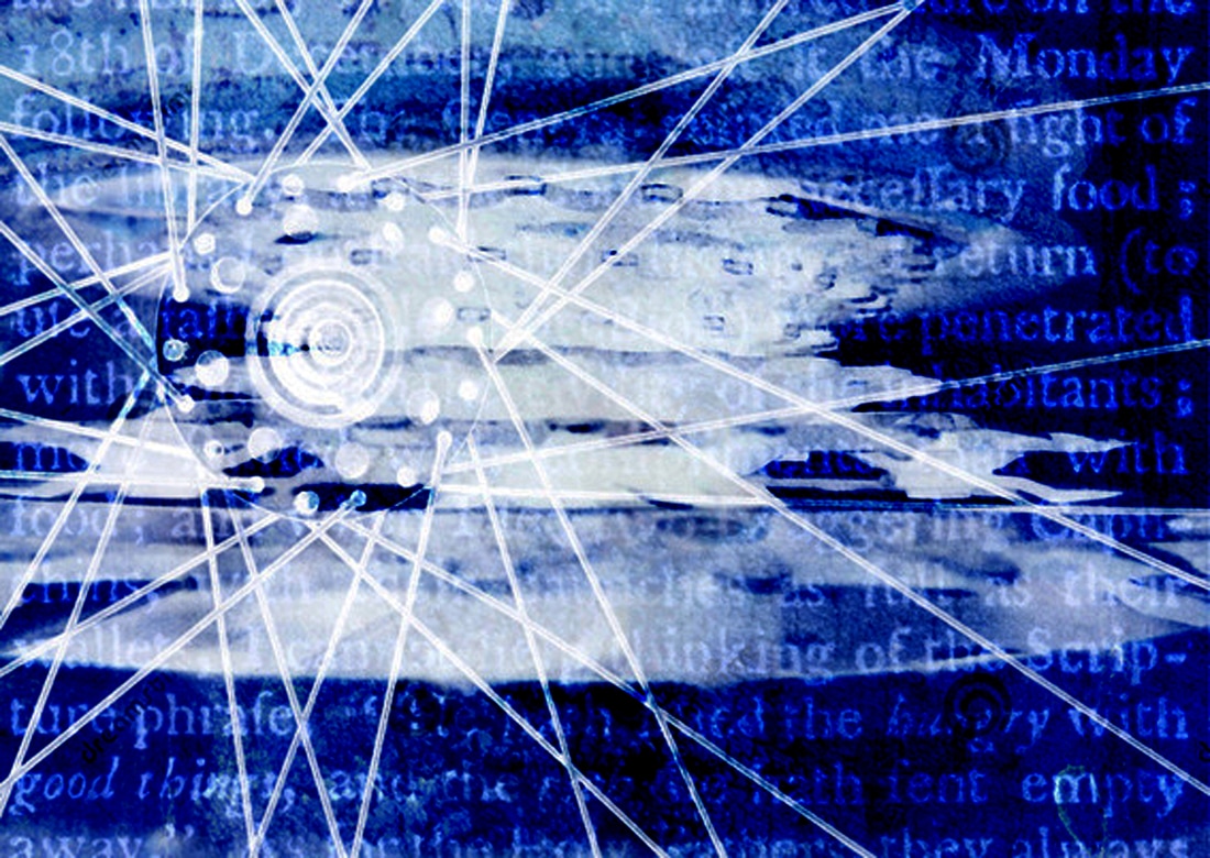
In this photo I went on the internet to get the background, which was old text, and afterwards I got one the photos I took and pasted it over. I then went on blend modes to blend the pictures in. After that I got another one of my photos and did the same thing and flattened it. The strong points with this image is the colour, lighting and style, and how you can see all the layers clearly. The flaws with this photo is that you can't see the old text (background) as clearly from the rest of the image.

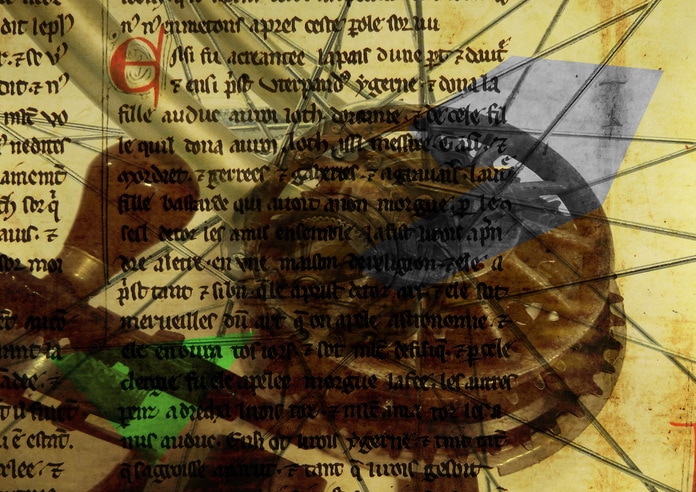
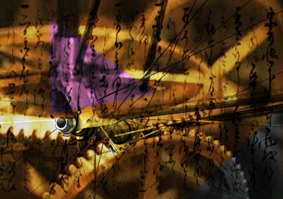
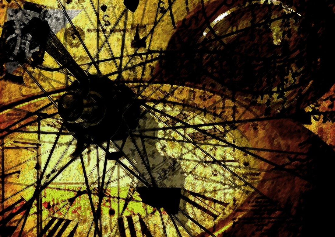
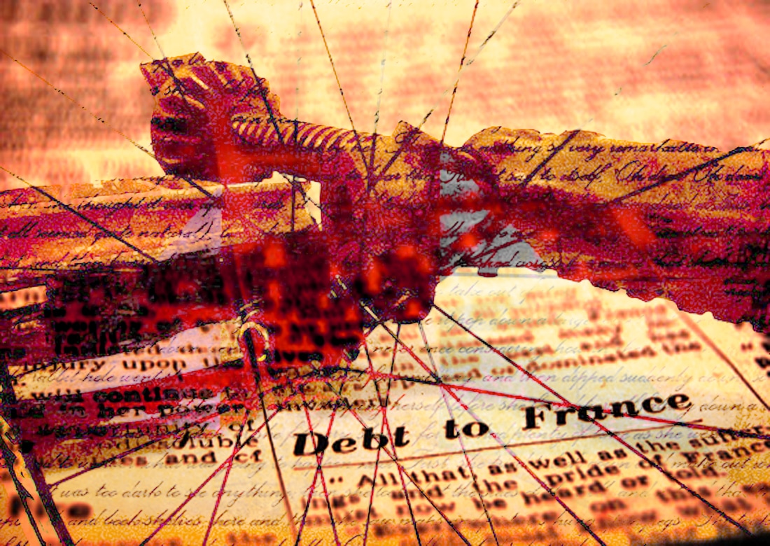
In this photo I went on the internet to get the background, old text, and got one of my photos and pasted it on top. I then went on the blend tools to blend then together. Afterwards I went on the internet again to get a picture of bike spokes and blended it in. I flattened it and went on the polygonal tool to make a triangle and an irregular shape. I went on photo filter to change the triangle green and went on hue and saturation to change the irregular shape black and white. The strong points with this image is the lighting, colour and texture. The flaws with this image is that the background, old text, gets in the way of the foreground and centre.
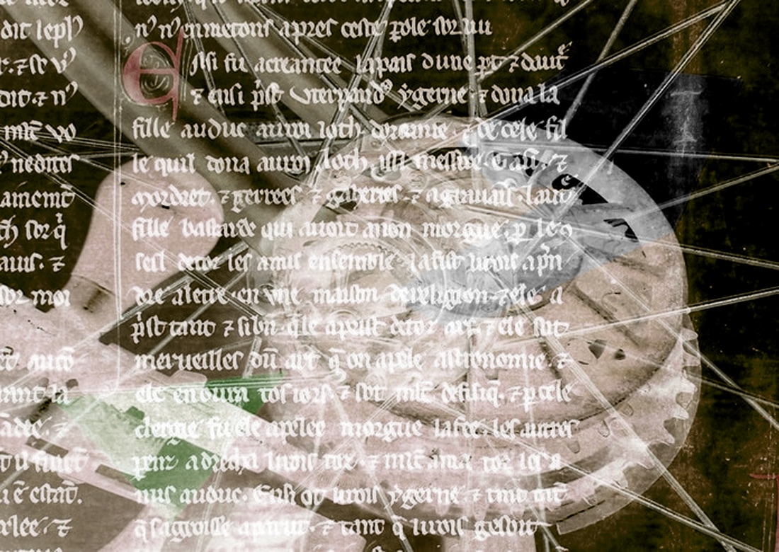
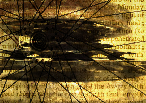
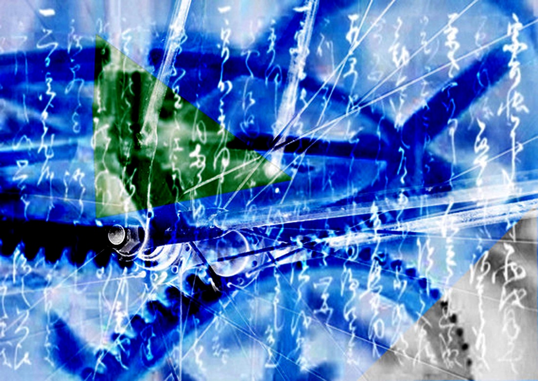
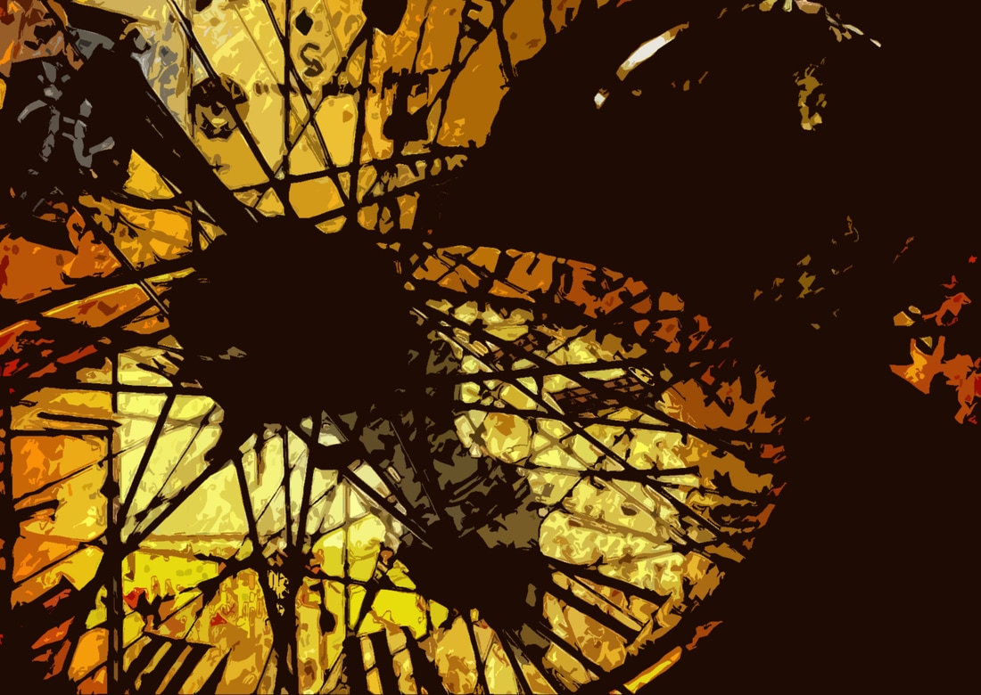
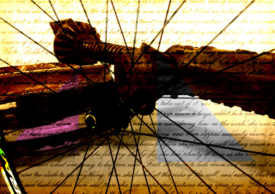
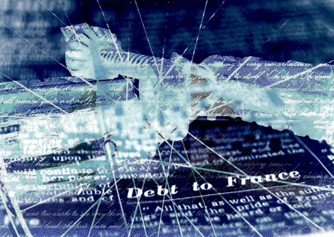
In this image I went on the internet I went on the internet to get an image of old text for the background and blended them together. Afterwards I went on the internet again to get an image of bike spokes, blended it with my image and flattened it. The strong points with this image is that you can see all the layers clearly and the lighting and colour. The flaw with this image is that in the background it looks a bit blurry.

In this picture I went on the internet to get an image of old text for the background and got one of my pictures and blended them together. Afterwards I went on the internet again to get an image of bike spokes and blended it with my image. Then I went on the polygonal tool and made a triangle and a rectangle. With the rectangle I went on hue and saturation to change it to black and white and with the rectangle I went on posterize to posterize it. The strong points with this image is the lighting and texture, and you can see all the layers clearly. The flaws with this photo is that you can't see the rectangle as clearly and I should of made it bigger.
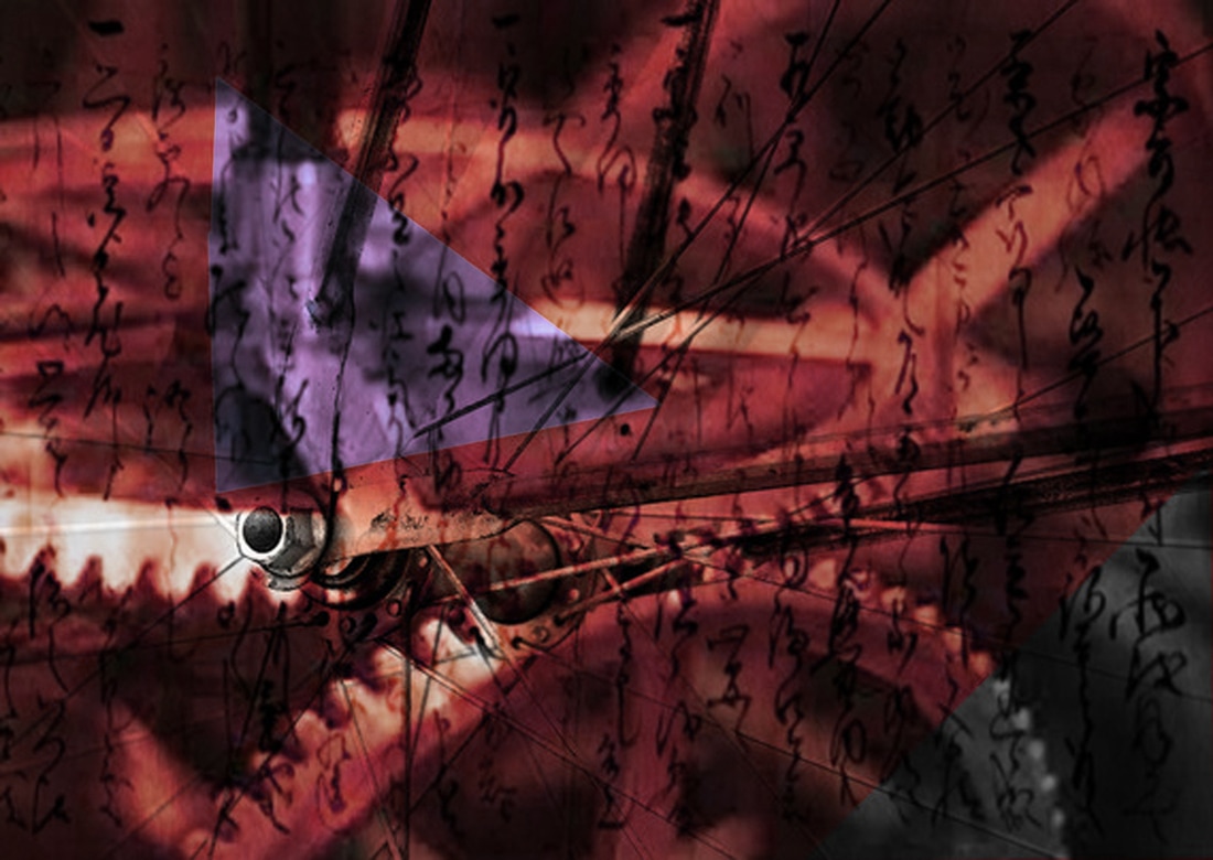
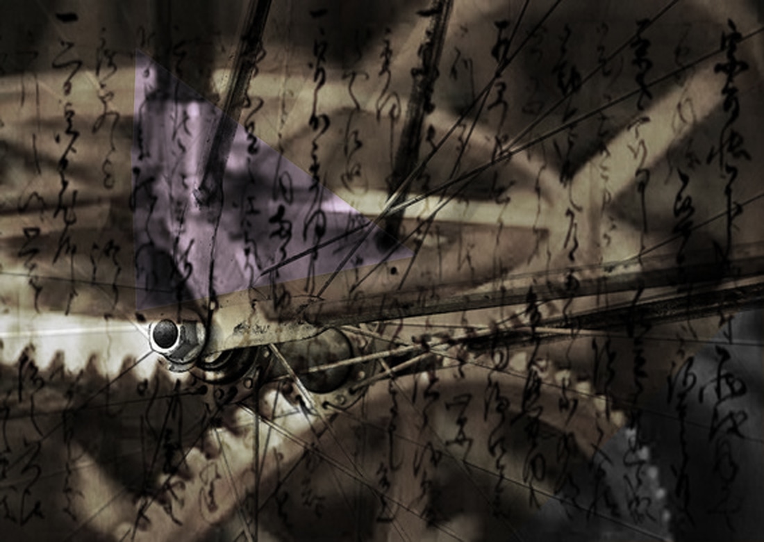
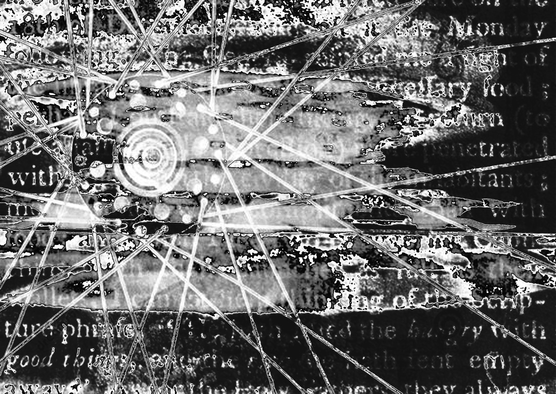
In this photo I went on the internet to get an image of old text for the background and got one of my photos to blend them together. When I blended them I went on the internet again to a picture of bike spokes and blended them again. Afterwards I went on the polygonal tool to make two big triangles. For one of the triangles I went on hue and saturation to change it black and white and for the other triangle I went on photo filter to change it to purple. The strong points with this photo is the colour, texture and lighting. The flaw with this photo is that you cant see all the layers as clearly as the others.
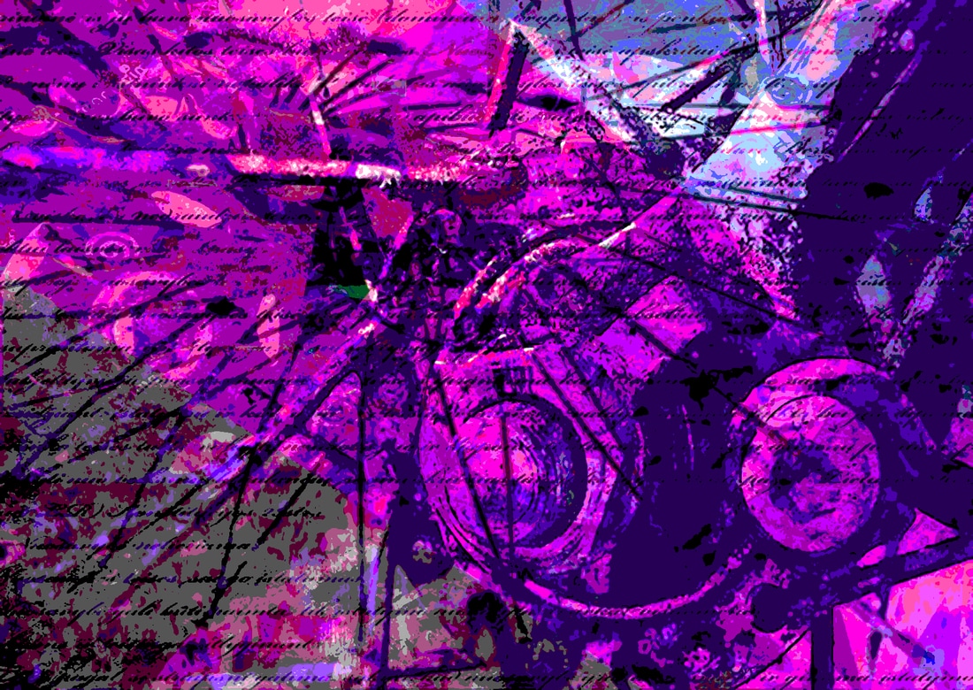
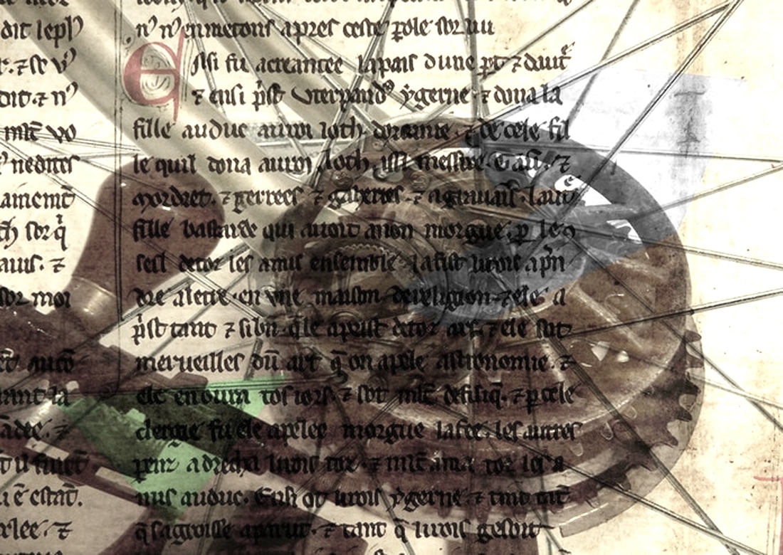
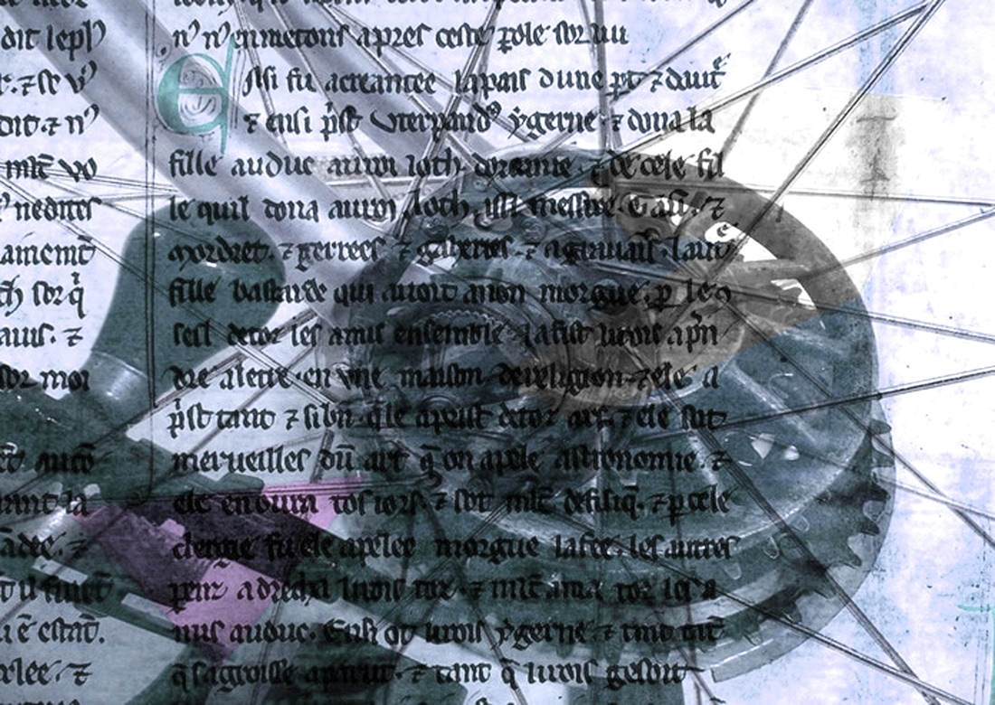
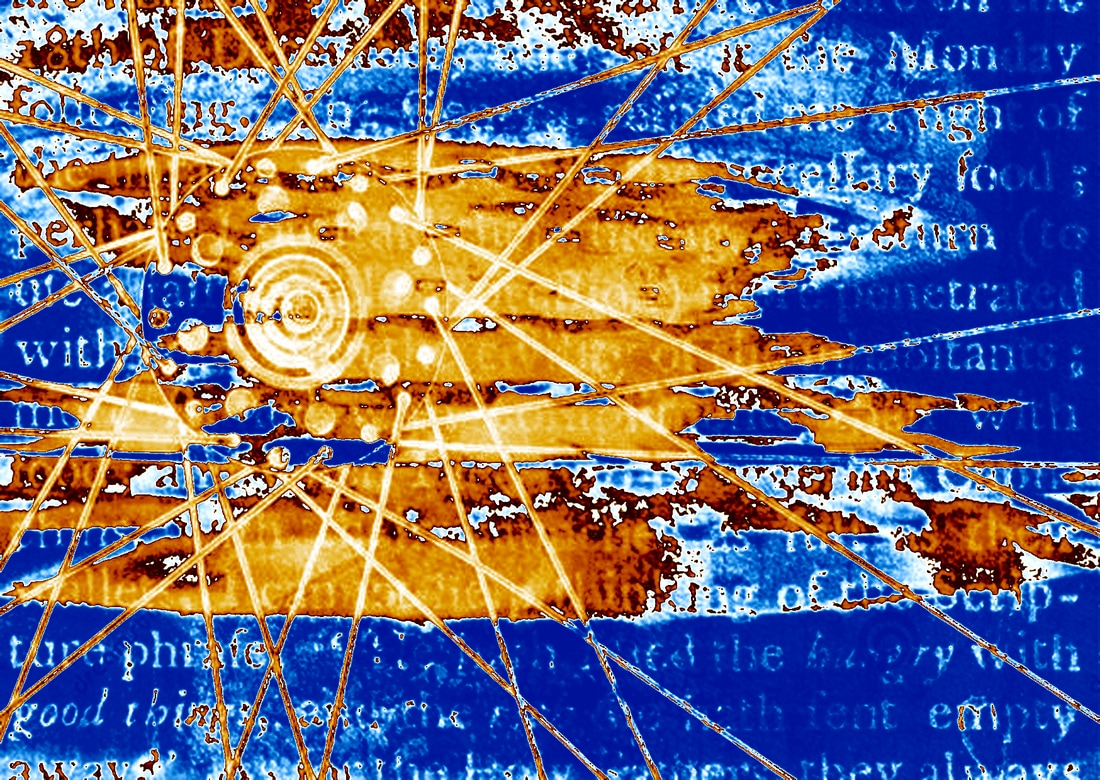
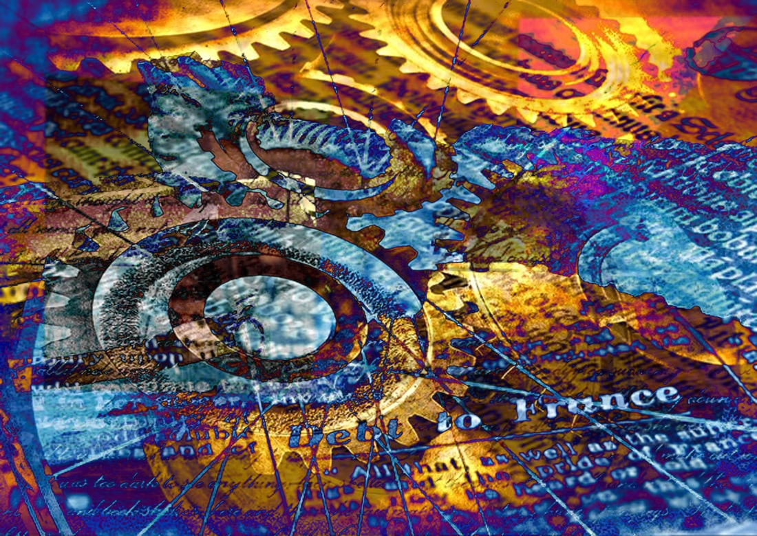
For this picture I went on the internet to get an image of old text and got one of my photos and blended them together. Afterwards I went on the internet again and got an image of bike spokes and blended it again. I then went on the polygonal tool and made two triangles and went on photo filter to change on pink and the other light blue. The strong points with this photo is that you can see clearly all the layers. The flaw with this photo is that in the top right hand corner it is too bright.


I made this photo by going on the internet to get images of old text as the background, and then I rotated it to the side to give it effect. Afterwards I got one of my photos and blended it together. Next I went on the internet again to get a picture of cogs and blended it with my photo. I then went on the polygonal tool and made an uneven square and a triangle. I went on hue and saturation to change the square black and white and went on posterize to posterize the triangle. The strong points with this image is that you can see all the layers well and clearly and the shapes give it more effect. The flaw with this photo is that the clock doesn't really fit in well with the image.


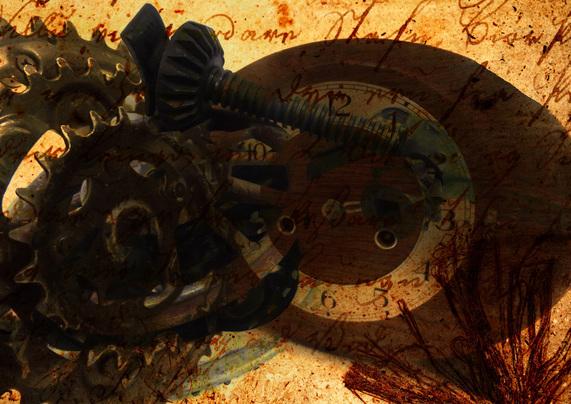
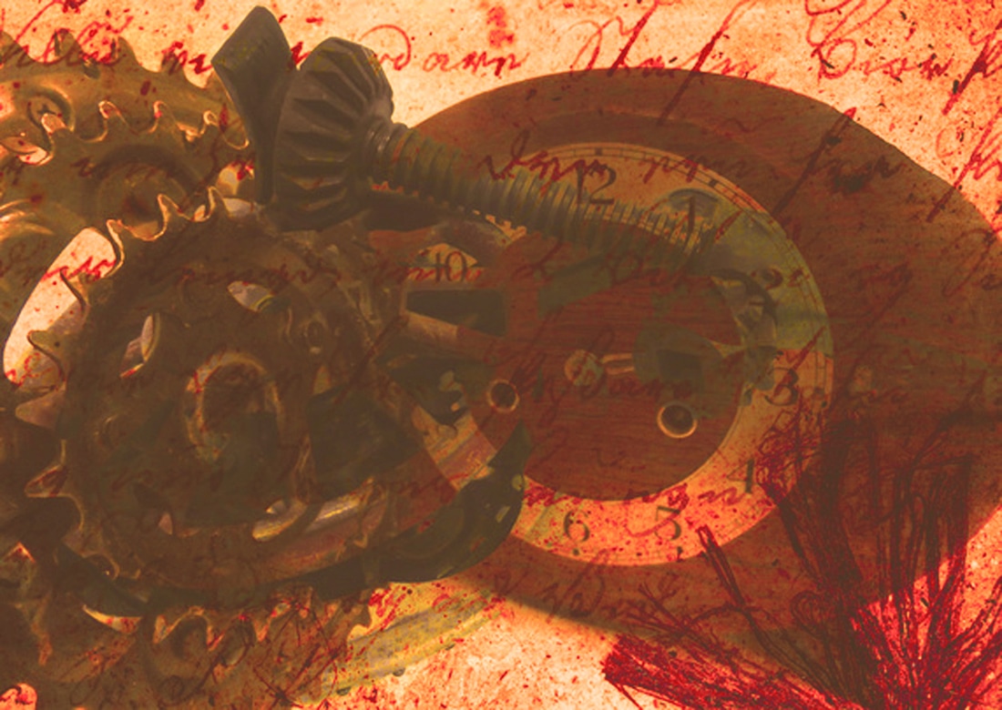
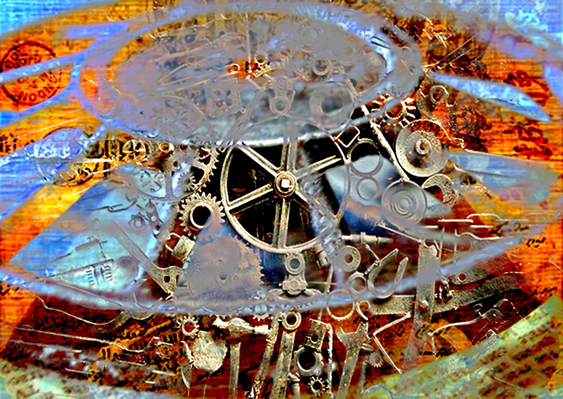
For this photo I went on the internet and got an image of an old postcard for my background. I then got one of my pictures that I took and blended it with the background. Afterwards I went on the internet again and got a picture of cogs and blended it with my photo. The texture and lighting are the strong points of this image and the flaw is that the cogs is covering most of the image so you can't really see my photo or the postcard as well.


Final Piece