Context
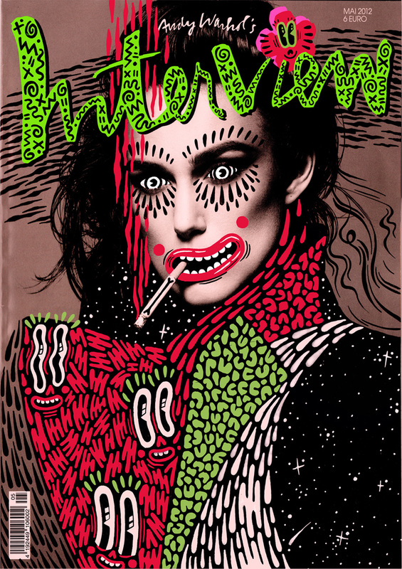
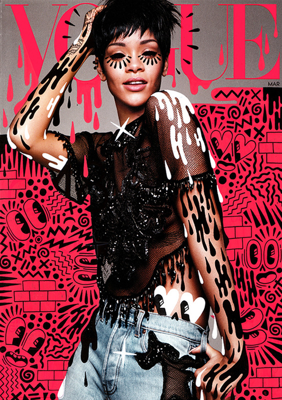
Hattie Stewart is known as a 'professional doodler', from Essex. She had graduated from Kingston University and since then she has worked on projects with House of Holland, Marc Jacobs and Adidas. Her work has exhibited from Miami, New York, Berlin and London. She said in an interview that she has no idea where her ideas come from when doodling. She said she just draws whatever comes too. She was inspired by the Dandy, Beano and Beryl the Peril comics. She started drawing at a young age and her uncle was always drawing comics and taught the style of it. The pens she uses are Posca, the only pens she says she will ever use.
|
|
|
Analysis
What Can I See?
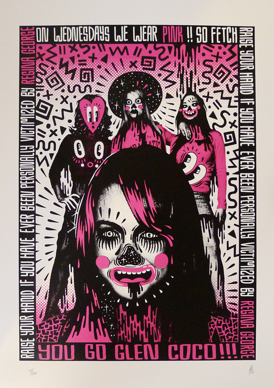
The genre of this photograph is landscape, abstract and portraiture. In the background of this photo are three women standing in different poses. They all have been doodled on. The one on the left has a pink love heart drawn over her face, with big eyes. a nose and a mouth. The expression its giving is a gasping face. The one in the middle has been given an afro with sparkles inside and on her face the artist drew big eyes, pouted lips blushed cheeks. On her shoulders is a black liquid dripping downwards. The lady on the left has had black eyes drawn over her original eyes, an open smiling mouth with pink lipstick and blushes on her cheeks. On all of their jumpers, they is a face. In the foreground is another lady. She is close up, so you can only see her head. She has also been doodled on, her eyes have been given spirals, her nose has been made like how a skeletons looks with stars inside, she has pink lips and blushes on her cheeks. Also she there is black liquid coming out of her mouth, almost like she is drooling. In the background, behind the three girls, are different patterns such as zizags, spirals, crosses and circles.
Feelings & Mood
This photograph reminds me of cartoons, like looney tunes. The reason for this is because of the eyes and mouths. They are drawn the same way in cartoons and looney tunes. It makes me feel childish because of the way it is drawn, with bright colours and is kinda silly with the way the mouths are drawn. My opinions on the work is that it is very childish and that is what makes it really good because it is fun to look at. What makes this interesting is that there are a lot of patterns and that is what also makes it stand out.
Composition
The focal point in this photograph is the foreground because it is the biggest and brightest pat in the picture. There are no leading lines leading me to the focal point. This photograph is asymmetrical. I can tell because in the foreground, the lady's hair on the right is covering half of her face, while on the other side of her face, her hair isn't. When I look at this photograph my eye looks first at the lady in the foreground as she is the biggest and brightest part in the photo. My eyes looks second at the background, the lady in the middle of the three girls because she also has a bright face. My eye looks third at all the patterns around the three women in the background. I look here third because there are a lot of patterns and that takes my eye after I first see the other two.
Colour & Mood
The colours used in this photograph are contrasted and vivid. The mood the colours give the work are love, femininity, nurture, purity, hygiene, security and glamour. The reason for this is because the colours pink, white and black symbolises these moods. The dominant colour is black and pink. I think the artists chose this as there dominant colour because she probably wanted to show glamour, as that what black symbolises, and to show femininity, as that is what pink symbolises. Also the artists probably chose these because on the magazine cover are all women and she changed there clothes, by drawing over them.
Light & Tone
In this photograph I can tell that the direction of light is coming from the back. I can tell because in the background behind the three women is the brightest part, and it is in the centre. The highlight areas are the foreground and background as they are the brightest. The mid-tones are at the top, bottom and on the women's jumper (the colour pink) and the dark shadows are the borders around the photo as that is where the darkest colours are. I don't think that the light and tone of this photo adds weight and depth.
Texture & Pattern
The textures used are reflective, shiny and smooth. I can tell this because picture is from a magazine cover and the covers on magazines are usually this texture. The pattern used is, I think, very random because in the background there are zigzags, spirals, dots, crosses and triangles and when I look closely I can't make out a specific pattern if the artists did use one.
What Have I Learnt
I have learnt:
- That even doodling can be a professional art style
- Different colours give effect to the picture
- That drawing from the top of your head can sometimes be a good thing
