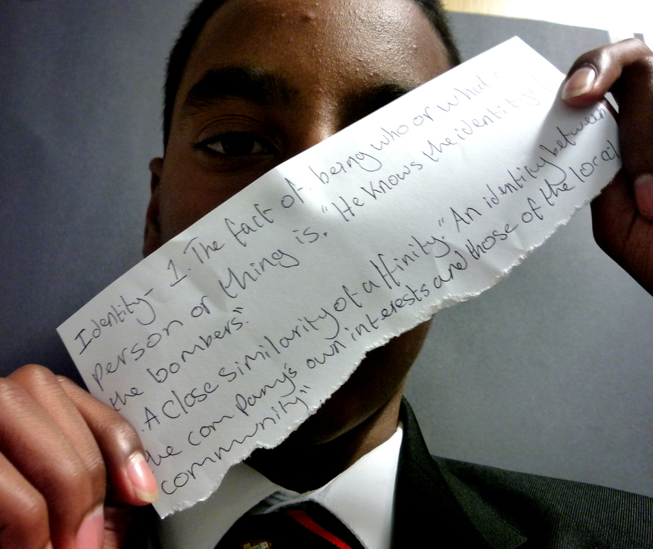
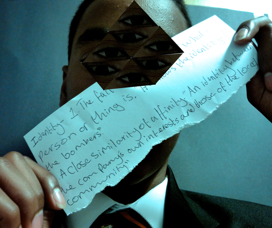
Development 1: Fractured Image
|
|
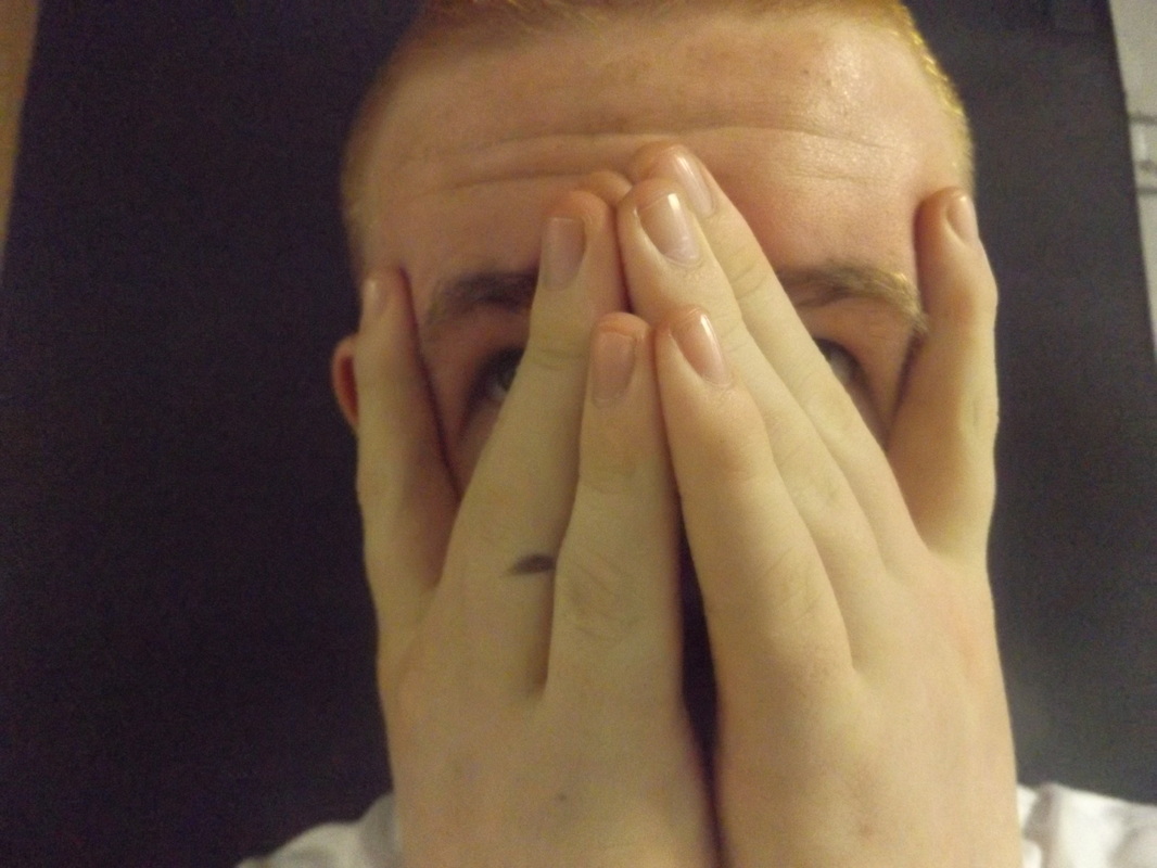
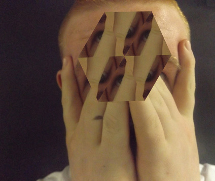
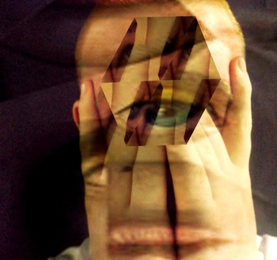
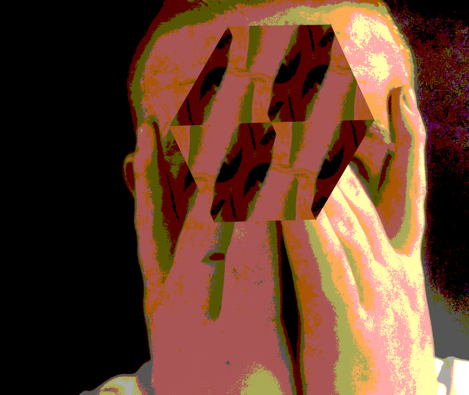
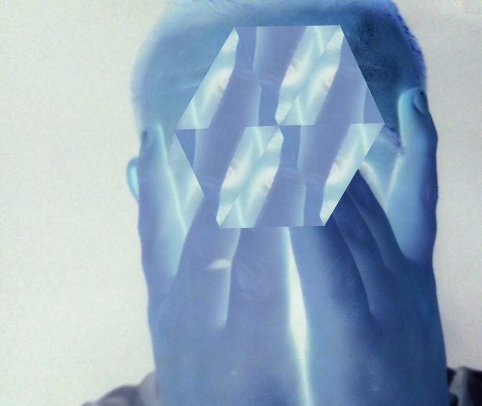
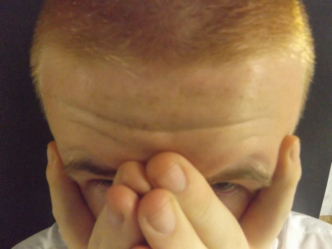
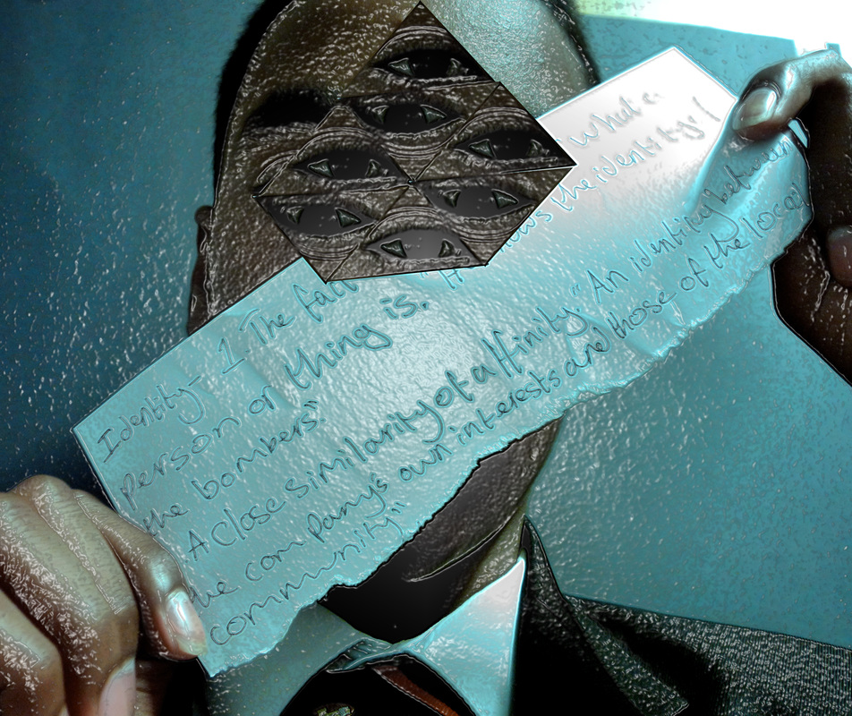
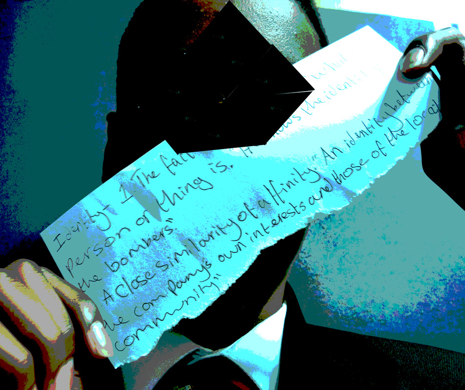
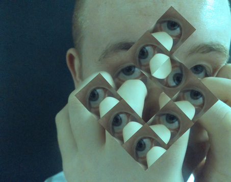
The photo on the left is a photograph taken from my disguised faces, hands column. The photograph on the right is my the developed version, in the style of Jeremy Olson. I used the polygonal lasso tool to make a triangle around my models eye. I then copied and pasted it six times, and fitted them so they would make a hexagon. I made this photograph because it was set as a practical in my lesson and because I wanted to make photos in the style of Jeremy Olson. I made this photograph because I wanted to make a photograph in the style of Jeremy Olson. I learnt from this photograph how to make shapes from an object or person and move it around to make a bigger shape.
|
|
|
Development 2: Angled Disguise
|
|
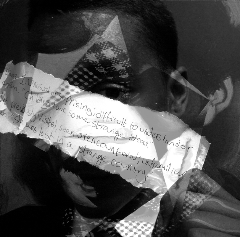
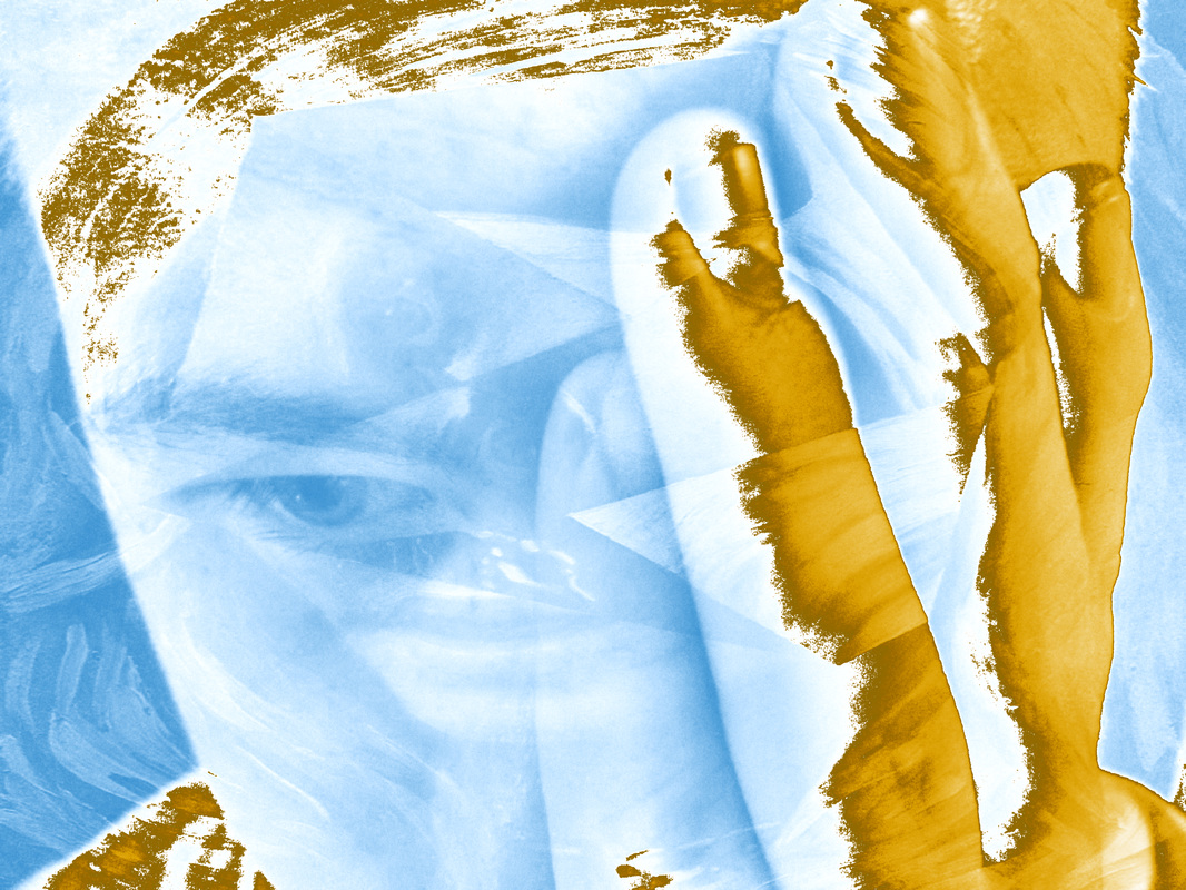
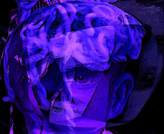
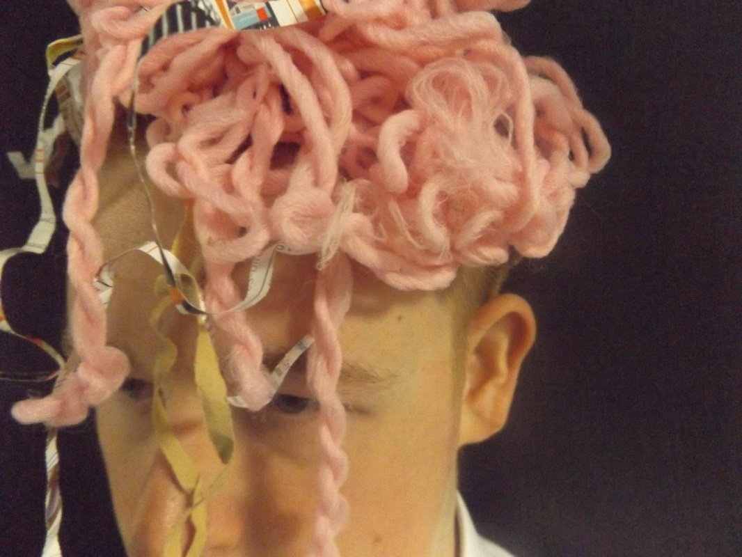
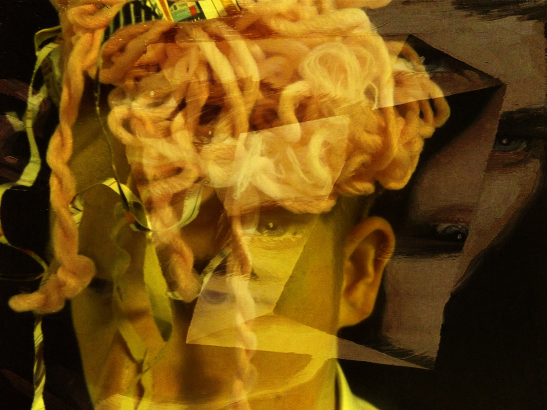
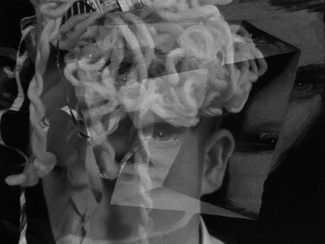
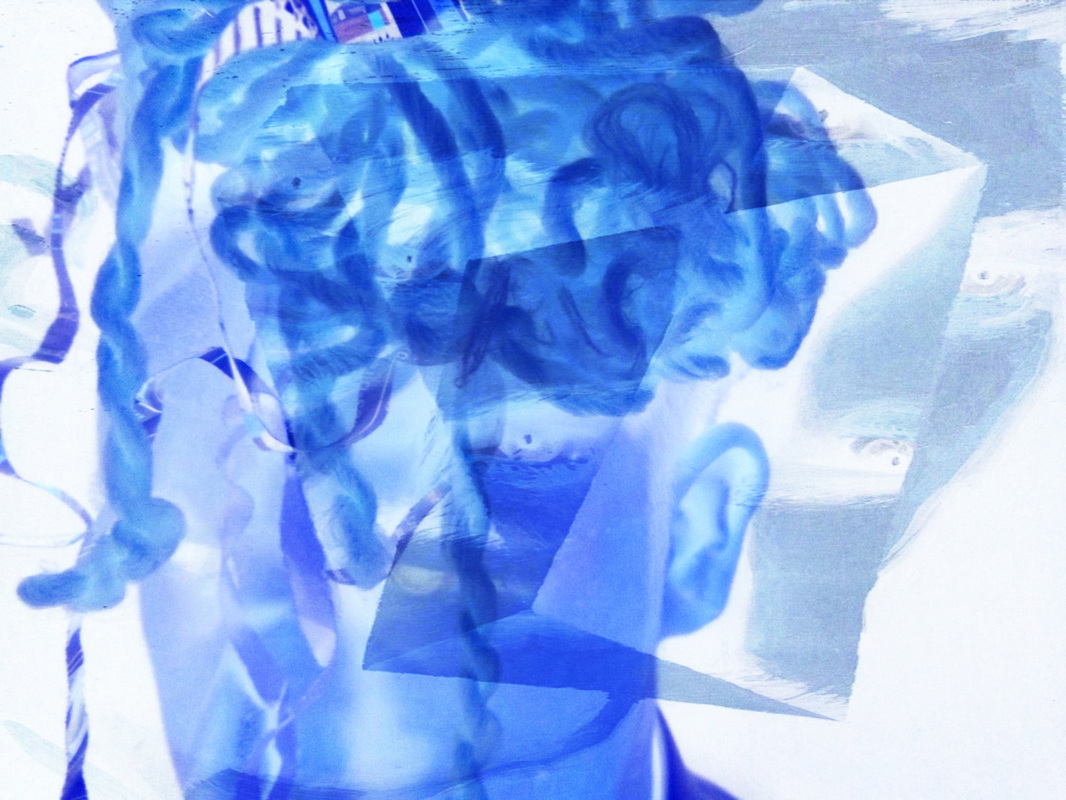
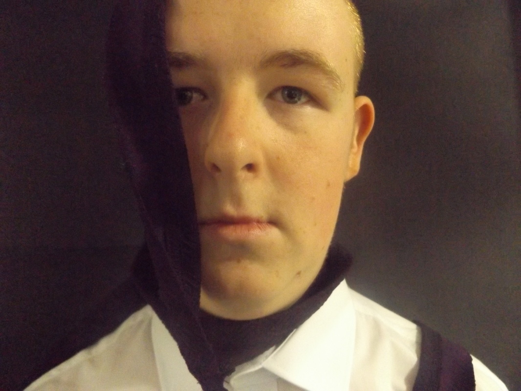
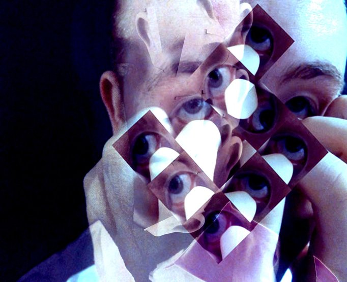
On the left is the original photograph from the own ideas category in the disguised faces section. The one on the right is the developed version. I started by opening photo shop and opening one of my photographs that have a close up face. I then changed the colour of the photograph, using photo filter, to blue. Then I found a Jeremy Olson portrait and pasted it on top of my photograph and blended them together on light colours. What went well with the developed photograph is the texture, quality and lighting. From this photograph I learnt that changing the colour and blending another photo on top of my original can add effect to the photograph. I made this photograph because I wanted to learn how to edit this way and how my photographs would look like, if edited like this.
|
|
|
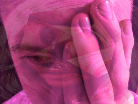
Development 3: Pressure
|
|
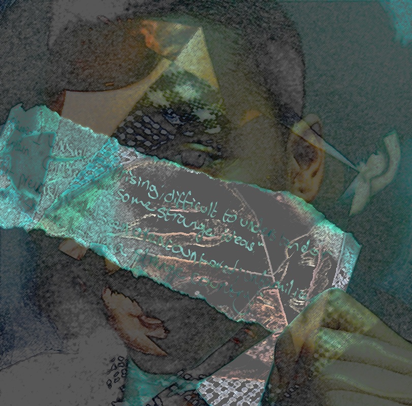
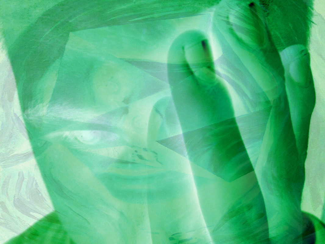
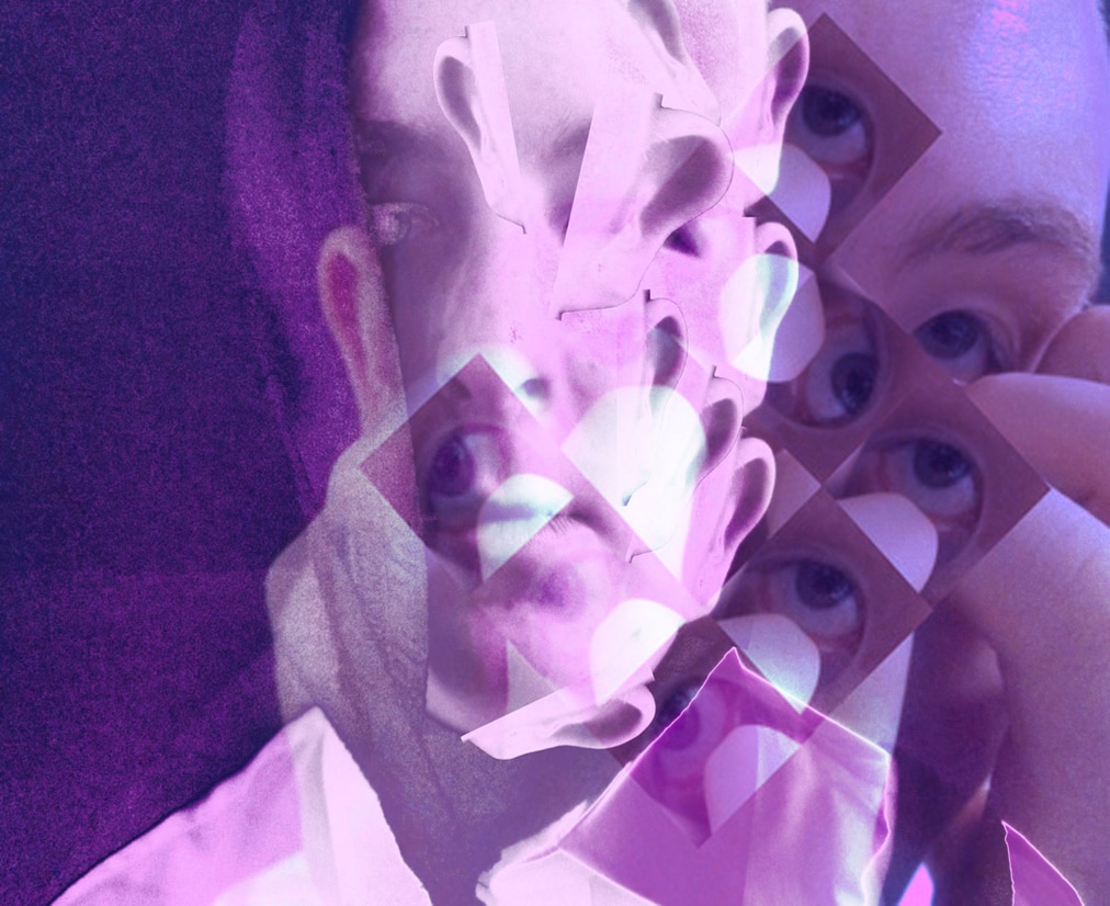
The photograph on the left is a photo from the hands category in the disguised faces category. The one on the right is the developed version. I made this by going on photo shop and opened up the hands photograph. I then changed the colour of the photo using photo filter to purple. Next I got a Jeremy Olson portrait and pasted it on top of my photograph and flattened it. What went well with the photograph is the quality and the blending of the two photos. What I don't like about the developed photograph is the colour. The reason for this is because to me it looks over edited. I learnt from this photograph to not use too bright colours to make the picture look better. I made this photograph because I had wanted to see how a really bright colour would look when edited this way.
|
|
|
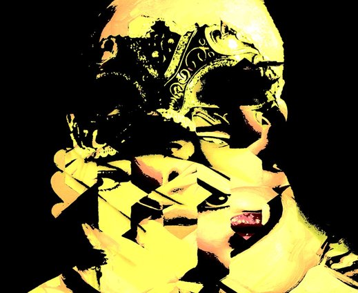
Development 4: Hidden Meaning
|
|
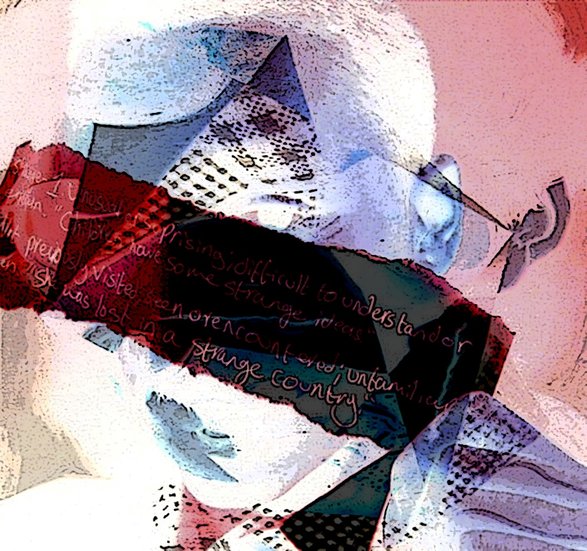
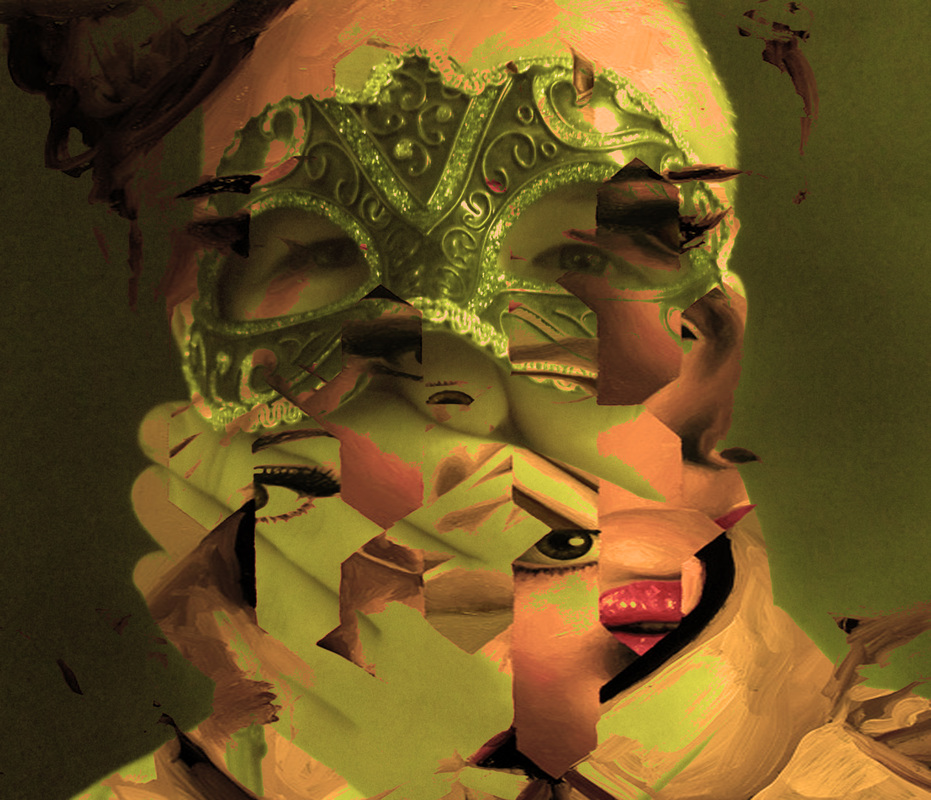
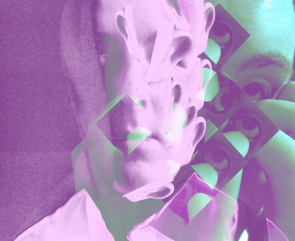
The photograph on the left is from props category in the disguised faces section. The photograph on the right is the developed version. I made it by opening up photo shop and opening up my photo from props. Next I changed the colour of my photo to turquoise using photo filter. After I then found a Jeremy Olson portrait and pasted it on top. Then I blended the two photographs together. What went well with this photograph is the quality, colour and blending. What I don't like about this photograph is the faded out parts around the models face. The reason for this is because to me it looks like something was rubbed out badly. From this photograph I learnt how to blend in two photos effectively. I made this photograph using the two pictures because I had experimented with other photos and different colours and I thought this one was one of the ones that looked the best.
|
|
|
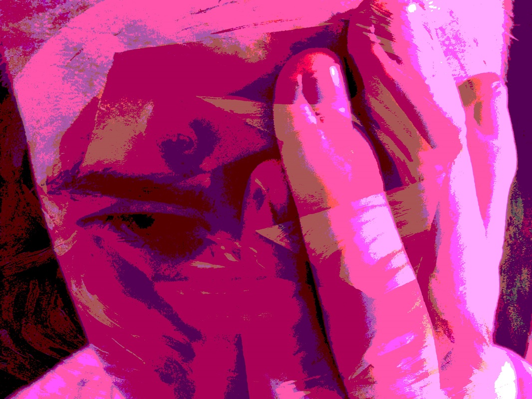
Development 5: Fissured
|
|
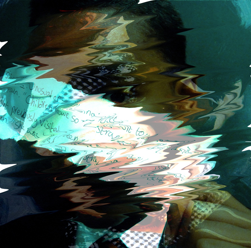
The photograph on the left is from the string category in the disguised faces section. The photograph on the right is the developed version. I made this by opening up photo shop and opening my observation shot from the strings. I then changed the colour to yellow using photo filter and pasted on top a Jeremy Olson portrait and blended them together. I made this photograph because I thought that the colours black and yellow would go well together, and I was right. What went well with this photograph is the colours, the blending, the texture and the quality. In this photograph I don't like that there is too much black especially in the bottom right corner, it would have been better if I had cropped it. I learnt from this that bright colours and dark colours can go well together.
|
|

|
Development 6: Splintered Disguise
|
|
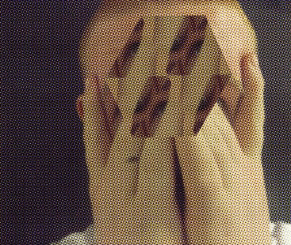
The photograph on the left is a photo I took from the own ideas category in the disguised faces section. The photograph on the right is the developed version. I made this because I wanted to make a photograph in the style of Jeremy Olson. I made this by going on photo shop and opening one of my photographs that I have taken before. I then changed the colour using photo filter and changed the colour to turquoise. I then used the polygonal lasso tool to make a triangle shape around the model's eye. I then copied it and pasted the shape seven times and put them together to make a bigger shape. What went well with this developed photograph is the quality, colour and lighting. It would have been better if I put the triangles closer together, so that there isn't any gaps.
|
|
|
Development 7: Hybrid
|
|
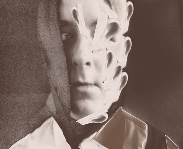
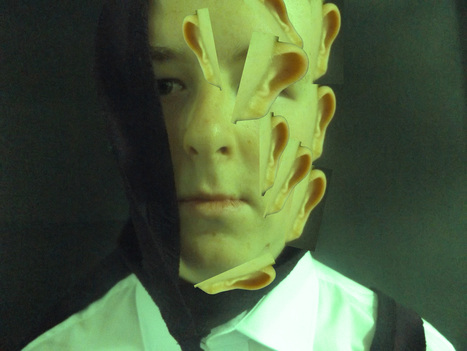
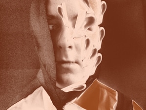
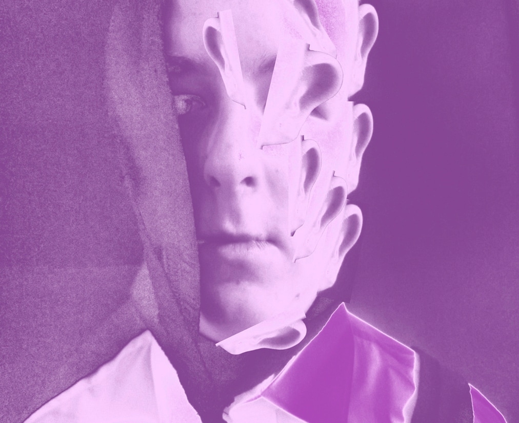
The photograph on the left is a photo from the string category in the disguised faces section. The photo on the right is the developed version. I made this because I wanted to try using a weird shape like an ear and pasted it all over the model's face. I made the developed photograph by opening photo shop and opening one of my own photographs. I then changed the colour using photo filter to green. Next I used the rectangular marquee tool and made a rectangle around the models ear. I then opened a new page to crop the background out of the ear, copied that and pasted it on the models face in different sizes and angles. What went well with the developed photograph is the quality, the colour and the different places the ears are. The photograph would have been better if I had blended in the ears to make it look better.
|

|
|
Development 8: Ruptured
|
|
The photograph on the left is a photograph from the hands category in the disguised faces section. The photograph on the right is the developed version. I made this because I thought it would be interesting to make a weird pattern out of it. I made it by opening photo shop and opening one of the photographs I have taken and changed the colour to turquoise. I then used the rectangular marquee tool to make a square around the model's eye and made a weird 'S' pattern. What went well with the developed photograph is the colour, pattern, quality and lighting. This would have been better if I had expanded the pattern and made it longer.
|
|
