Context
Kurt Schwitters was born 20th June 1887 in Hanover, Germany. He had a wife named Henriette. Kurt's parents rented a house for them to stay in Waldstraße, in 1901. In the following year Kurt had an epileptic seizure, because of this he couldn't participate in the First World War He studied art at the Dresden Academy. In 1909 he returned to Hanover and started his artistic career as a post-impressionists. As the First World War continued, his work grew darker and developed an expressionists tone. He married his cousin, Helma Fischer on the 5th of October 1915, their first son Gerd died on the 9th of September 1916, in first week of birth. Their second son, Ernst, was born on the 16th of November 1918. Kurt carried on creating expressionists art in 1919, he was influenced, by Hans Arp, to start abstract art. By the end of 1919 he became famous after his first one-man exhibition at Der Sturm Gallery, with his poem 'An Anna Blume', a Dadaist non-sensual love poem.
In 1918 Kurt asked to join the Berlin Dada but was turned down by Richard Huelsenback because of his application and link to the Der Sturm Gallery and his expressionist’s art, seen by the Dadaist as hopelessly romantic and obsessed with aesthetics. Raoul Haussmann wrote an anecdote about Kurt to join the Berlin Dada but was dubious for there was well-documented evidence that Schwitters and Huelsenback were on amicable terms at first. When they first met in1919, Huelsenback was enthusiastic about Schwitters work and promised his assistance. In mid-1920 these two men had a fall out because of Schwitters successful poem An Anna Blume.
In 1918 Kurt asked to join the Berlin Dada but was turned down by Richard Huelsenback because of his application and link to the Der Sturm Gallery and his expressionist’s art, seen by the Dadaist as hopelessly romantic and obsessed with aesthetics. Raoul Haussmann wrote an anecdote about Kurt to join the Berlin Dada but was dubious for there was well-documented evidence that Schwitters and Huelsenback were on amicable terms at first. When they first met in1919, Huelsenback was enthusiastic about Schwitters work and promised his assistance. In mid-1920 these two men had a fall out because of Schwitters successful poem An Anna Blume.
Analysis
What can I see?
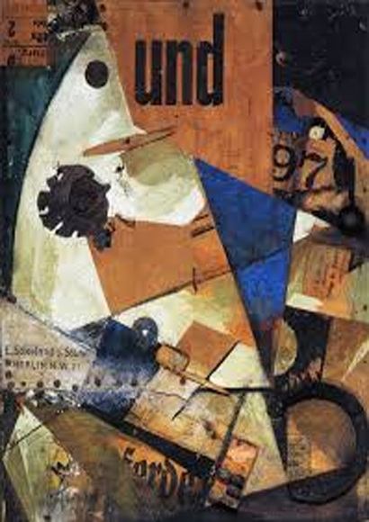
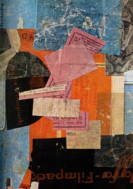
The genre of this painting is portrait, abstract and a collage. I can see that on the top left corner, there is a penguin, made out of white, blue and black cardboard. The white is for the base, the blue is the outside to show the skin of the penguin, and to make it look a lot more like a penguin, and the black is what makes the eye, so we can clearly see the penguin. Next to the penguin are the letters 'und' on top of brown cardboard in the shape of a quadratic. On the top right corner is a bunch of cardboard that has collapsed, revealing a hole that shows darkness. Underneath this is the number 97. From the top downwards is a lot of cardboard cut up into shapes randomly placed together, to give the photograph a better affect.
The genre of this painting is portrait, abstract and a collage. I can see that on the top left corner, there is a penguin, made out of white, blue and black cardboard. The white is for the base, the blue is the outside to show the skin of the penguin, and to make it look a lot more like a penguin, and the black is what makes the eye, so we can clearly see the penguin. Next to the penguin are the letters 'und' on top of brown cardboard in the shape of a quadratic. On the top right corner is a bunch of cardboard that has collapsed, revealing a hole that shows darkness. Underneath this is the number 97. From the top downwards is a lot of cardboard cut up into shapes randomly placed together, to give the photograph a better affect.
Feelings and Mood
This picture reminds me of what something would look like after a war or natural disaster, the aftermath and how the battlefield would look from all the destruction. I think that the randomness of this photo is what makes it interesting, the collage style and the way it all fits together. I chose this piece because it was the only one that stood out to me, from the photographs that I looked at. I think this photo has a chaotic style to it.
My own opinion on this work is that the random objects and photos stuck together in a collage is what gives this photo effect. I think he had done this because he had wanted to show what is in his mind. The many thoughts that come together look chaotic from how much their is and how they clash. I think what makes it interesting is the choice of the colours he chose.
Composition:
The focal point of this photograph is on the left hand side. The reason for this is because it is because of the colour white. Everything else is brown and a dull colour, while the left is white and really stands out. Also there are leading lines directing me towards the left of the photograh, from the triangles and quadrilaterals pointing towards it. This photo is asymmetrical because on the left looks like a picture of a penguin and on the right is a bunch of cardboard stuck together. When I look at this photo my eye looks to the left first because it is the largest and brightest part of the photo. My eye then looks at the centre second because after the penguin, it is the second thing to stand out because it is a blue triangle whereas everything else is brown or black. My eye looks third at the top of the photo because there are three big letters 'UND'.
The focal point of this photograph is on the left hand side. The reason for this is because it is because of the colour white. Everything else is brown and a dull colour, while the left is white and really stands out. Also there are leading lines directing me towards the left of the photograh, from the triangles and quadrilaterals pointing towards it. This photo is asymmetrical because on the left looks like a picture of a penguin and on the right is a bunch of cardboard stuck together. When I look at this photo my eye looks to the left first because it is the largest and brightest part of the photo. My eye then looks at the centre second because after the penguin, it is the second thing to stand out because it is a blue triangle whereas everything else is brown or black. My eye looks third at the top of the photo because there are three big letters 'UND'.
Colour and Mood
The colours that have been used in this photograph are brown, blue, white and black. These colours are muted colours. I think the artist choose these colours to be in the photograph because he had wanted to show dullness or the emptiness in the mind from boredom. The mood this picture gives is a collective piece of everybody's personality put together in a collage, such as excitement from the colour white and the penguin, boredom from the boring and dull colours, and creativity from all the different shapes.. The dominant colour in this photo is white. I think the artist chose this colour to be the most dominant colour to probably reflect his own personality which is probably purity, hygiene or elitism.
The colours that have been used in this photograph are brown, blue, white and black. These colours are muted colours. I think the artist choose these colours to be in the photograph because he had wanted to show dullness or the emptiness in the mind from boredom. The mood this picture gives is a collective piece of everybody's personality put together in a collage, such as excitement from the colour white and the penguin, boredom from the boring and dull colours, and creativity from all the different shapes.. The dominant colour in this photo is white. I think the artist chose this colour to be the most dominant colour to probably reflect his own personality which is probably purity, hygiene or elitism.
Light and Tone
The direction the light in this photograph is coming from the bottom left. I can tell because this area is the brightest area in the photograph. Also, just underneath the penguin, you can see a reflection of a torch or lamp shining on the photograph. The brightest part of the photo is on the left, the mid-tone of the photo is around the centre and the darkest area of the photo is in the top right-hand corner. The light does bring some weight and depth to the work, as it changes the way the colours look, giving a whole new feeling to the photograph. The mood the light gives the picture is a joyful mood because the light sorts of make the colours brighter and bright colours represents happy emotions.
The direction the light in this photograph is coming from the bottom left. I can tell because this area is the brightest area in the photograph. Also, just underneath the penguin, you can see a reflection of a torch or lamp shining on the photograph. The brightest part of the photo is on the left, the mid-tone of the photo is around the centre and the darkest area of the photo is in the top right-hand corner. The light does bring some weight and depth to the work, as it changes the way the colours look, giving a whole new feeling to the photograph. The mood the light gives the picture is a joyful mood because the light sorts of make the colours brighter and bright colours represents happy emotions.
Texture and Pattern
The textures used are rough textures, reflective textures, shiny textures, corroded textures, silky textures, rusty textures and an old paper texture in this photograph. I can tell that the photographer used these textures because in the photo you can see that the bright part of the photo is reflective and the paper is old. Also the blue parts look like a silky texture. The pattern he used is random and half drop. I can tell he used these patterns because there is no specific order on the objects and the photo looks cut out.
The textures used are rough textures, reflective textures, shiny textures, corroded textures, silky textures, rusty textures and an old paper texture in this photograph. I can tell that the photographer used these textures because in the photo you can see that the bright part of the photo is reflective and the paper is old. Also the blue parts look like a silky texture. The pattern he used is random and half drop. I can tell he used these patterns because there is no specific order on the objects and the photo looks cut out.
What can I see?
The genre of this image is old wartime pieces put together. In this image I can see lots of angular shapes such as triangles. I can see things that look like they've been cut out of newspapers. I can also see the word und which means and in German. There are shades of electric blue, some rust orange colours, black and white. The focal point of the image is an angular shape in the general centre, that gives the appearance of a penguin; in my opinion. The deep and light shades give more depth and definition; for example under all the pieces is a dark, navy colour.
Feelings and mood
This image makes me feel respectful towards the war, as it makes you aware of the bigger picture and people weren't just fighting, normal life still had to continue. I like that it includes things from different aspects because it means unheard stories are being told and shown. It gives recognition for the people who weren't fighting, but still doing important jobs. I also like that all the seperate components come together to make one image that is tied together by the similar colours.
Composition
The focal point of this image is a white angular shape that I think resembles a penguin. There could also be a second focal point which is the word und, meaning and in German. This image doesn't really have any symmetry but I think it is well balanced, because the colours make everything fit. There isn't a shape to the composition, the different parts have been spread out in a collage manner.
Colour and Mood
The colours used in this image are fairly dull, the burnt orange, black and white. However, the bright pop of blue ties the duller colours together and makes it more interesting. The blue is the dominant colour in the image as it contrasts with the rest of the image. The mood these colours give off is fairly boring, but the blue brings a bit of fun into the image, making it more interesting for the viewer.
Texture and Pattern
There isn't really a pattern, but there is a repetition of angular shapes in the image, such as triangles. Some of the items in the picture have an aged and rusty texture, and some look almost dirty. You can tell everything in the image is quite old becuase of the texture, for example the newspaper cuttings are brown and ripped.
What have I learnt and how will I use it?
- I have learned that using a bright pop of colour can make the image more interesting, and draw people to the picture. I will use this by adding bright colours in certain areas of my image.
- I have learned that texture can make things look old and new. I will use this by changing what the texture looks like to make the thing I am photographing look older or newer.