Unit 1: Fantastic & Strange
Julian Opie
Context
Julian Opie was born in 1958 in London. He is a sculpture and digital artists associated with the New British Sculpture movement. He was born in Oxford and studied at Goldsmith’s school of Art from 1979 to 1983, where he was taught by conceptual artist and painter Michael Craig-Martin. In this time he made the series Eat dirt, Art history of tongue-in-check copies of famous artworks. In 1985 he exhibited at the institute of Contemporary Arts in London. In 1995 he was awarded the sargent fellowship at the british school in rome.
Julian Opie became very well known in the British art scene of 1980 after producing a series of painted metal sculptures that humorously combined loosely painted imagery with steel shapes. The portraits were mainly animated walking figures, rendered with minimal detail, in black line drawing. These are hallmarks of the artist’s style. He named this ‘engagement of art history’.
Julian was inspired by his teacher Michael Craig-Martin and Patrick Claufield.
Analysis
What Can I See
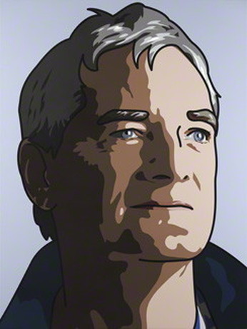
The genre of this photograph is portraiture. I can see that this is a photograph of a fairly old man, maybe in his forties, looking up in the sky, or ceiling with light shinning in his face, on the left side of his face. The only thing that makes this photograph different from any other portraiture photo, is that this has been drawn over on photo shop using the paint tool. The background is light blue and plain, there is no foreground and in the centre is the actual photograph of the model, drawn over to make him look like a cartoon. I can see that the model in this photograph is wearing a dark blue hoodie. The only part of his body you can see is from his neck onwards.
Feelings & Mood
This photograph reminds me of a sunset. The reason for this is because it looks like the model is looking at the sun, and the way the light is shinning on his face, it looks like the light just rose up, or appeared. It also reminds me of someone with two personalities, one bright and happy side, and one dark and gloomy side. This photograph makes me feel sad and upset because the man in the photo looks upset and miserably, which can put an impact on the viewer. My opinion on this photo is that it is very good and gives a sense of worry, as that is what the models facial expression looks like to me. What makes this interesting is that the artists had put so much work in this, as he had also drew out all the shading and the lighting, this is also why I chose this photograph for analysis.
Composition
The focal point of this photograph is the left side of the models face. I look here first and this is the focal point because that is the brightest part of the image, which catches my eye. I think that this is the focal point because it is the brightest and has the most light, so that's why I look there first. There are no leading lines directing me to this part of the image. The image is asymmetrical. I can tell this because, one, the photograph is of a person, a face and a face isn't symmetrical, and two one side of the models face is really bright, while the other side is very dark, shaded. My eye looks second in the centre, towards the bottom of the photograph. The reason for this is because it is the mid-tone of the photo, and isn't the brightest or the darkest . My eye looks third at the left side of the photograph because it is the darkest part of the image and it isn't very noticeable compared to the other parts of the photo.
Colour & Mood
The colours that have been used are light blue, grey, white and black. The mood the colours give is a sad mood, and depressing. The reason for this is because the colours are very dull, and creates a depressing atmosphere. The dominant colour in this photograph is light blue, the background. This is the dominant colour because it is the background and it is the most used colour. It also gives off the mood of lost. The reason for this because he is looking in the distance for something, and to look for something means that it is lost.
Light & Tone
The direction the light is coming from is from the right side of the photograph. I can tell this because the right side is the brightest part of the image, and on the opposite side it is shaded, dark tone. So this means that that area is the shadow, from the light shining on the model's face. The highlight areas are on the right side of the model's face. The mid-tones are in the centre and the bottom of the part of the model's face. I can tell this because compared to the other lighting, it isn't the darkest part of the image and it is not the brightest part. The dark shadows of the photograph is on the right side of the model's face. I can tell this because it is in the opposite side to where the direction of light is coming from. The light and tone does add a weight and depth to the photograph. This is that it creates the feeling of wonder, as the light makes it look like he focusing in that direction.
Texture & Pattern
The texture that has been used is 'wavy'. I can tell that it is a wavy pattern because the shadows are making the pattern on the model's face, where the mid-tones and dark tones are. There has been no pattern that has been used.
What Have I Learnt
I leant:
- How to use the style that Julian Opie uses
- How to use my combine two different artists together
- That drawing in the light can give affect to the photograph.
Ryan Warnberg & Michelle McSwain
Context
Ryan Warnberg and Michelle McSwain from Queens Brooklyn, USA turned their light art fascination into a local New York metro area business branded MRI, also known as M::R::I. Other than peculiar brand signatures such as the above, the couple go with the slogan "Long exposures. Bright lights." and make unique kaleidoscopic portraits with original look and their own original style. They started in 2007 by starting to get the hang of using long exposure and collaboration between the two, Ryan Warnberg and Michelle McSwain. In an interview I had searched up Ryan Warnberg stated that they had gotten into light graffiti because he had seen some on the internet and fell in love with the style, but he had one problem. He didn't know how to take the photographs so he had called Michelle McSwain, while they were currently dating, to help him out.
The first images they made were of themselves holding a gun and drew on some wings.
The first images they made were of themselves holding a gun and drew on some wings.
Analysis
What Can I See
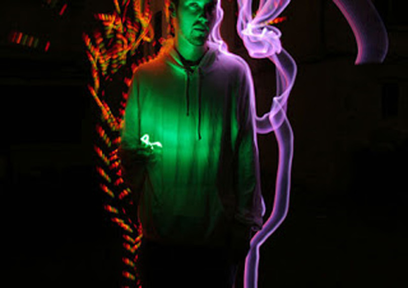
This photograph is landscape, abstract and 'light graffiti'. I can see that there is a man wearing a hoodie with light around him and in his hand. His legs and some of his head is cut out, and the light on either side of him are different patterns and colours. In the centre is the man with the hoodie, with a green light in his hands, which look like keys and looks like he is throwing them into the air. On the left side of the photograph is 'light graffiti' outlining the man. The colour of the light is red, orange and green, in a leaf-like pattern. On the right side is the other pattern of 'light graffiti'. The colour is purple and in a smoke-like pattern. The background of the photograph is the different patterns of light graffiti and the foreground is the man in the hoodie.
Feelings & Mood
This photograph reminds me of trees and nature. The reason for this is because of the 'light graffiti' pattern on the left side of the photograph. The pattern looks like how leaves would look like on a stem, like a plant, and plants make me think of trees and nature. It could make the viewer feel lucky or jealous. This is because the colour green is the colour that stands out and the colour green gives off the feeling of tranquillity, health, good luck and jealousy. My opinion on the work is that it is very aluminous, which gives it an effect of mysterious. The reason why I chose this photograph is because out of all the ones I found, this one stood out with the aluminous glow and the mysterious feeling.
Composition
The focal point of this photograph is in the centre where the green light is. The reason for this I because it is the brightest part of the image and is given off an aluminous glow. There are no leading lines directing me to the focal point. The image is asymmetrical. I can tell this because on the left the colours of light is orange, green and red, and on the right it is just purple. Also the patterns are different. My eye looks first at the centre of the image because of the brightness of the light, the colour green, it really stands out. My eye looks second at the right-hand side of the image. The reason for this is because of the colours and patterns of the light. My eye looks third on the left-hand side. The reason for this is because it doesn't really stand out with the brightness of the colours, and it very dark compared to the other lights.
Colour & Mood
The colours that have been used are purple, green, orange and red, contrasting and subtle. The mood the colours give the work is a mysterious feeling. The reason for this is because of the colour green, and how it aluminates off of the model, and also the shade of the green gives it an aluminous look. The dominant colour of this photograph is green. I think this because green is the colour you see first and is the one that stands out. I think the artists used this colour for the dominant colour because they probably wanted to reflect their personality which, the colour green represents, is a down-to-earth person, or a very caring and compassionate person.
Light & Tone
The direction the light is coming from is from the front of the model, in the centre. I can tell because that's where the light is shining off from, and also because it is the brightest part of the image. The highlight areas of the photograph is in the centre, left of the man, and right of the man, in the photograph. The mid-tones are in the centre of the photograph, on the man where the green light shines off of him. And the dark tones are in the background where it is pitch black. The light adds a weight and depth to the photograph from where the light reflects off of the model, giving it more depth. The mood the light and tone creates is mysterious from the way the light aluminates.
Texture & Pattern
The texture used in this photograph is silky and sharp. The pattern used is spilt in half, on the left the pattern is more sharp and jagged with different colours and styles, and on the right is more of a wavy and fluid pattern. On the left of the picture, the pattern looks like a fire and on the right looks like the smoke caused from the fire.
What I Have Learnt
From this artists I have learnt:
- How to how effective light graffiti can be depending on the texture
- That when the light shines, it gives it a deeper effect
- Using different colours can also make it effective
