Context
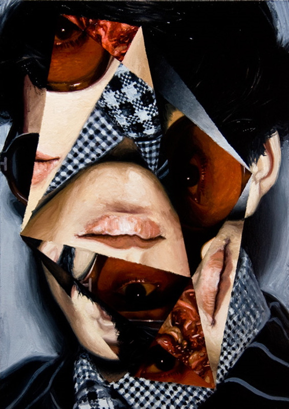
Jeremy Olson is an artist from Brooklyn, New York. He was interested in geometry and simultaneous perspective. Unlike many other artists using the Cubist style works, like the artists Picasso and Braque, Olson takes a different approach. He likes to scramble the geometric pieces that make up the models face and places them back in the outline of the head. He makes it so the viewer has to concentrate on portrait to figure out what the model looks like and figure out where the pieces go on a whole.
The artists uses traditional portrait painting including the three elements geometry, traditional portraiture and hyperreal portraiture. Jeremy Olson likes to stimulate the beauty of the model while also displaying pain, at the same time, using the variety of fragments.
The artists uses traditional portrait painting including the three elements geometry, traditional portraiture and hyperreal portraiture. Jeremy Olson likes to stimulate the beauty of the model while also displaying pain, at the same time, using the variety of fragments.
Analysis
What can I see?
The genre of this painting is portraiture. I can see in a painting of a man, but all his facial features are put in individual shapes and shuffled around his face. The shapes are mainly triangles and semi circles. In the painting the model has two mouths, one on his fore head and one on his left cheek. They're all triangles. He has four eyes, one on his chin, one on his left cheek above the mouth, one where his mouth is meant to be and one on his forehead next to his mouth. They're all shaped like triangles, as well. In this painting I can tell that the model is wearing a checkered shirt and a black jumper with thin white stripes.
Feelings & Mood
This portrait reminds me of sorrow. The reason for this is because the mouths are straight and emotionless, and the eyes look a bit droopy. It also reminds me of someone with a split personality. I think this because the different facial parts are from different people and those different people could his different parts of his personality. This painting makes me feel like I am being watched because of all the eyes, and how they are emotionless. What makes this painting interesting is the different lightings and different tones. For example, the parts with light shading has a sort of paint effect whilst the ones with the darker shading looks like it was taken from a camera.
My Opinion on the Work
My honest opinion on the work is that it is very messy with the way its all jumbled up but that is what also gives the photograph effect. I chose this photograph is because to me this one stood out compared to all the other ones I saw. The reason why this photograph stood out is because of the different lighting and tones of the photograph, like when I said how some parts look like painting and other looks like photo. What makes this photo interesting is the colours used and the different positions of the facial features.
Composition
The focal point of this painting is the centre, the section where the chin is. The reason why this is the focal point is because it is the biggest shape and is the brightest part of the painting. In the painting there are no leading lines directing me to the focal point. This painting is asymmetrical, I know this because on the left hand side of the face, you can see the person wearing sunglasses, but on the right hand side it shows the persons ear. When I look at this painting my eye first looks at the centre, because it is the brightest and biggest shape. My eye looks second at the shape next to the brightest part, on the left. I look there second because it is the next one down for the brightness. My eyes look third at the shape on the right of the centre shape, the eye. I look at this shape third because it is the darkest part of the painting, which makes it stand out, after the other two shapes.
Colour and Mood
The colours used are muted colours. The mood the colours give is authority and power from the colour black, innocence and purity from the colour white, and sad and wistful from the colour brown. The dominant colour in this painting is black. I think the artist used this, so that it didn't look too bright form the other parts of the painting, or to make it so there isn't too much bright colours.
Light & Tone
In this painting it is really hard to tell where the direction is coming from as all the bright parts of the painting are jumbled up and all over the place, but from what I can see, it looks like the light is coming from the left hand side. I can tell because that part looks like to be the brightest part of the painting. The highlight areas in this painting is the top parts and some bottom parts, the mid tones are some of the middle and top parts and the dark shadows are mostly in the centre and some at the top. The light and tone does not add a depth to the painting because the lighting is mixed up and thrown everywhere in the painting. I also think that the light and tone doesn't add a mood to the painting because, again, the lighting is jumbled around the painting.
What have I learnt & how will I use what I have leant
From this artists I have learnt :
That mixing things up in a random way can give an effect, I will use this for my GCSE's to get a higher grade,
How to take photographs in the style of Jeremy Olson
I should experiment with colour to give the photograph more effect
That mixing things up in a random way can give an effect, I will use this for my GCSE's to get a higher grade,
How to take photographs in the style of Jeremy Olson
I should experiment with colour to give the photograph more effect
